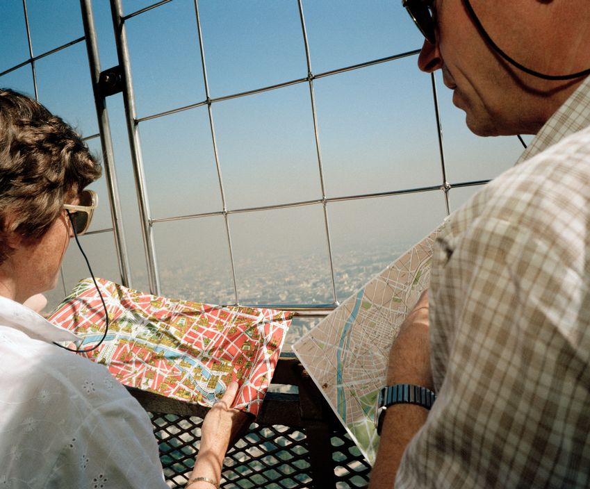
Digital media has changed photo books, and the way they are viewed. Physical photo books are more appreciated because of the uprise of digital media, and the mass availability of images through the internet, making photo books seem more original and rare. Another reason is because they don't have the same aesthetic value as a real photo book would, as having the book will give the creative sense of what the photographer was trying to portray rather than looking at the images online. Photo books are an important way to get things out, trying to tell a story, or it's the best way of getting their work out there in a cohesive way. The photo book has encouraged photographers to think about their work differently, and it changed the way they think about photographing, as often a photographer will try find a story in their images, therefore they'll try and focus on what they might want to portray and not just take an array of images. For example Matthew Connors - "I was often thinking about how the images would look in sequence and in relationship with each other." For many photographers photo book are the most significant platform for the display of their work and the communication of their vision to a mass audience.
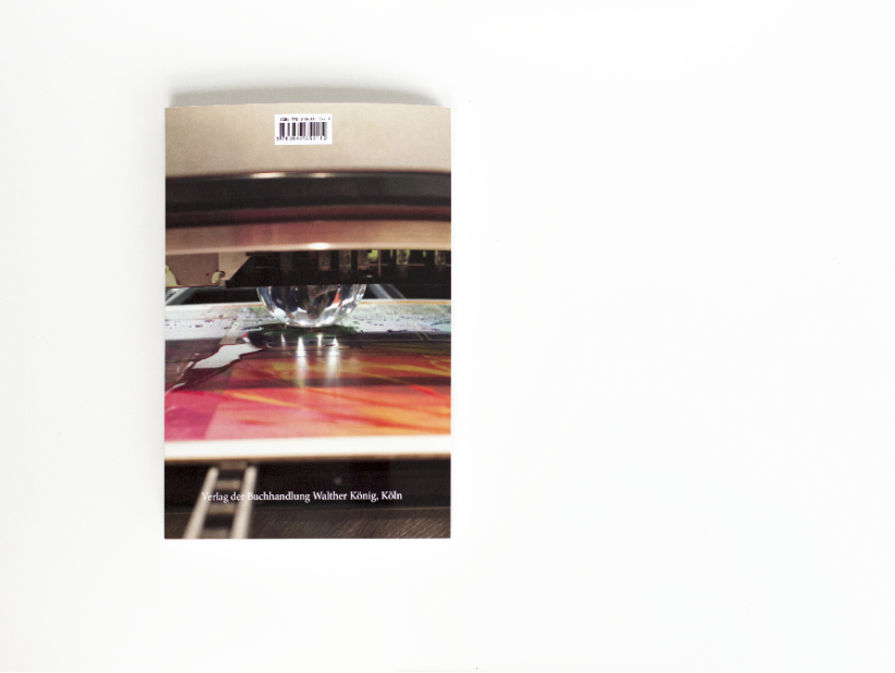
The History of the Photobook reveals a secret of web influence and inter-relationship between photographers and photographic movements around the world. The book is divided into a series of thematic and broadly chronological chapters; each featuring a general introductory text that offers background information and highlights the dominant political and artistic influences on the photo book in the relevant period.
The History of the Photobook reveals a secret of web influence and inter-relationship between photographers and photographic movements around the world. The book is divided into a series of thematic and broadly chronological chapters; each featuring a general introductory text that offers background information and highlights the dominant political and artistic influences on the photo book in the relevant period.
Gregory Halpern - ZZYZX
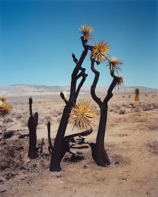
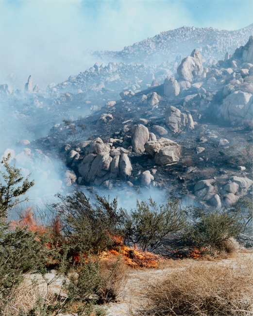
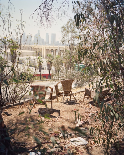
Gregory Halpern (born 1977) is an American photographer and teacher.
Halpern has published five books of his own work. Omaha Sketchbook is an artist's book portrait of the titular city; Harvard Works Because We Do is a book of photographs and text, presenting a portrait of Harvard University through the eyes of the school's service employees; is a photographic ramble through the streets of the American Rust Belt; East of the Sun, West of the Moon is a collaboration with Halpern's wife, the photographer Ahndraya Parlato; and Zzyzx (2016) is a book of photographs from Los Angeles.
Halpern has published five books of his own work. Omaha Sketchbook is an artist's book portrait of the titular city; Harvard Works Because We Do is a book of photographs and text, presenting a portrait of Harvard University through the eyes of the school's service employees; is a photographic ramble through the streets of the American Rust Belt; East of the Sun, West of the Moon is a collaboration with Halpern's wife, the photographer Ahndraya Parlato; and Zzyzx (2016) is a book of photographs from Los Angeles.
Jane Bown - Unknown Bown 1947-1967
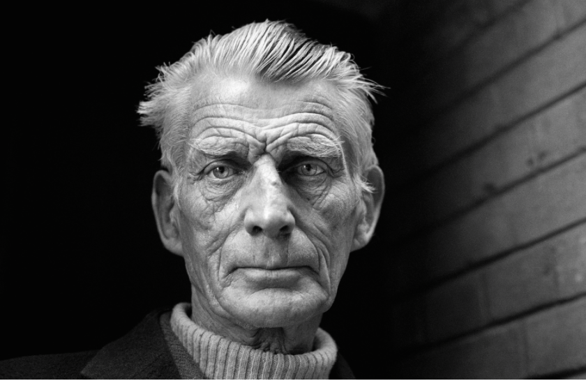
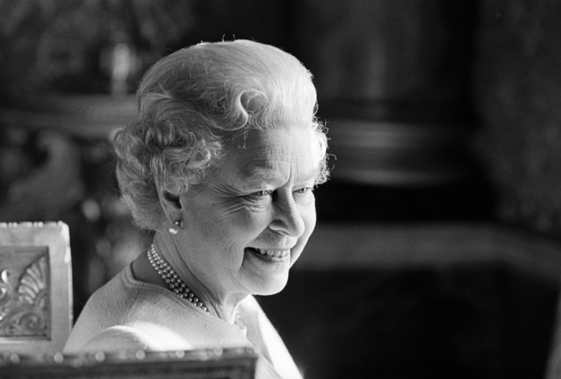
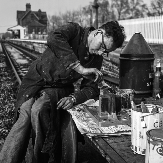
Jane Bown, was an English photographer who worked for The Observer newspaper from 1949. Her portraits, primarily photographed in black and white and using available light, received widespread critical acclaim and her work has been described as "a kind of English Cartier-Bresson. She is known for her intimate black and white portraits of well-known people.
Bown worked primarily in black-and-white and preferred to use available light. Until the early 1960s, she worked primarily with a Rolleiflex camera. Subsequently Bown used a 35mm Pentax SLR, before settling on the Olympus OM-1 camera, often using an 85mm lens. "She doesn't rely on tricks or gimmicks, just simple, honest recording, but with a shrewd and intellectual eye."
Bown worked primarily in black-and-white and preferred to use available light. Until the early 1960s, she worked primarily with a Rolleiflex camera. Subsequently Bown used a 35mm Pentax SLR, before settling on the Olympus OM-1 camera, often using an 85mm lens. "She doesn't rely on tricks or gimmicks, just simple, honest recording, but with a shrewd and intellectual eye."
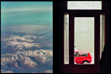
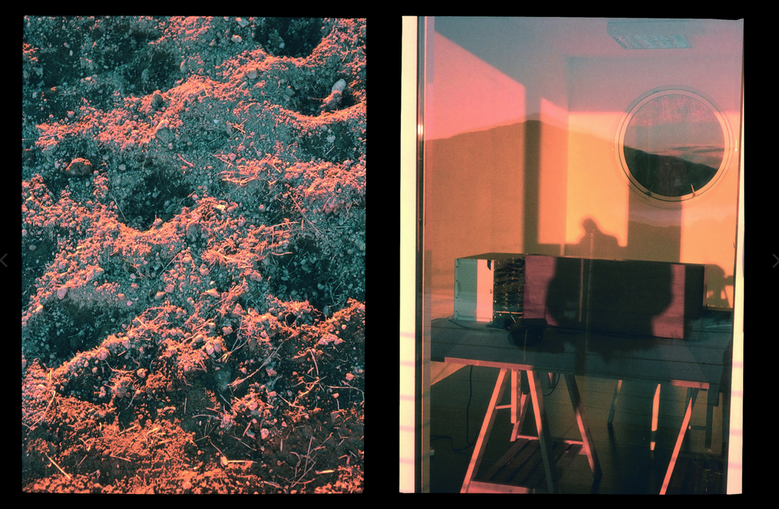
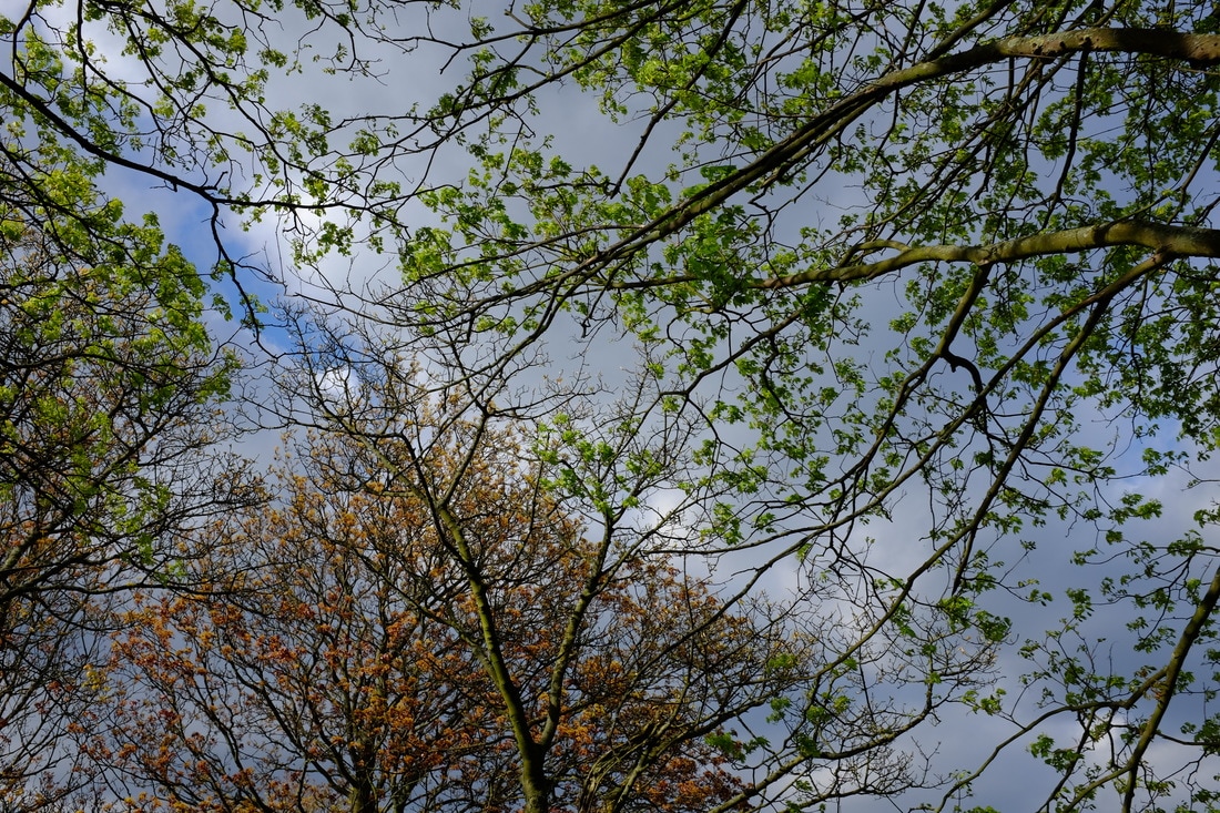
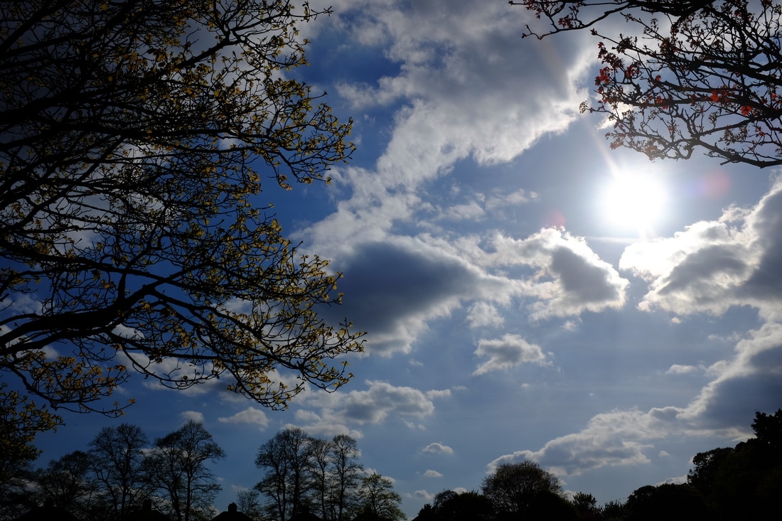
Two-Frame Films
Luke Fowler’s Two-Frame Films explores the relationship between the artist and the still-image.
|
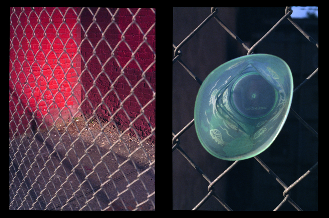
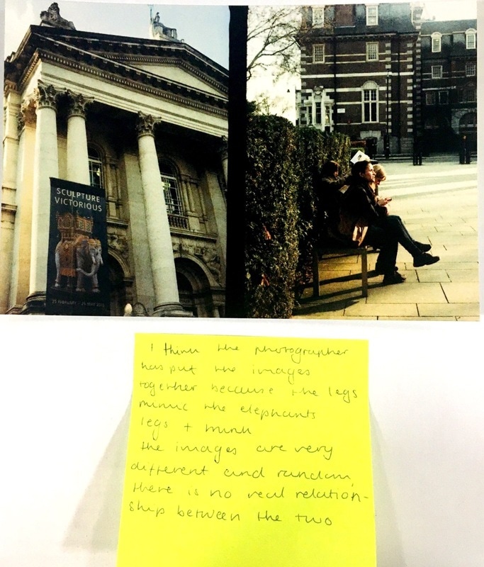
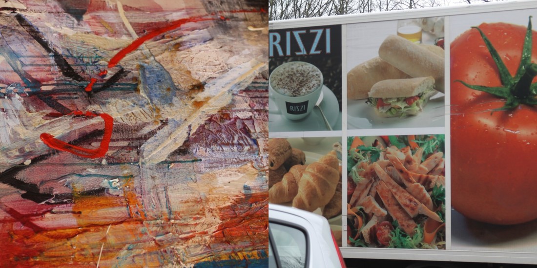
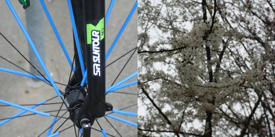
For this image, we discussed why the photographer chose to put these two images together, and discussed the possibilities of why. For example the the blue and red colours contrasting, as they're both very bold colours which compliment each other as they're primary colours. Also the negative space that both the images had, the first image was above the sky, with clouds, open spaces, and the second image had a lot of white light coming through and creating the black space. Both giving the images a lot of depth, as when you look at the images it's focused on everything.
|
More of Luke Fowler's Two-Frame Films:
Wolfgang Tillmans - Neue Welt |
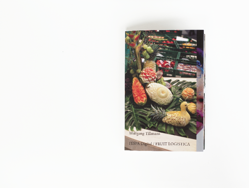
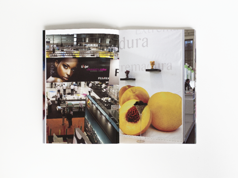
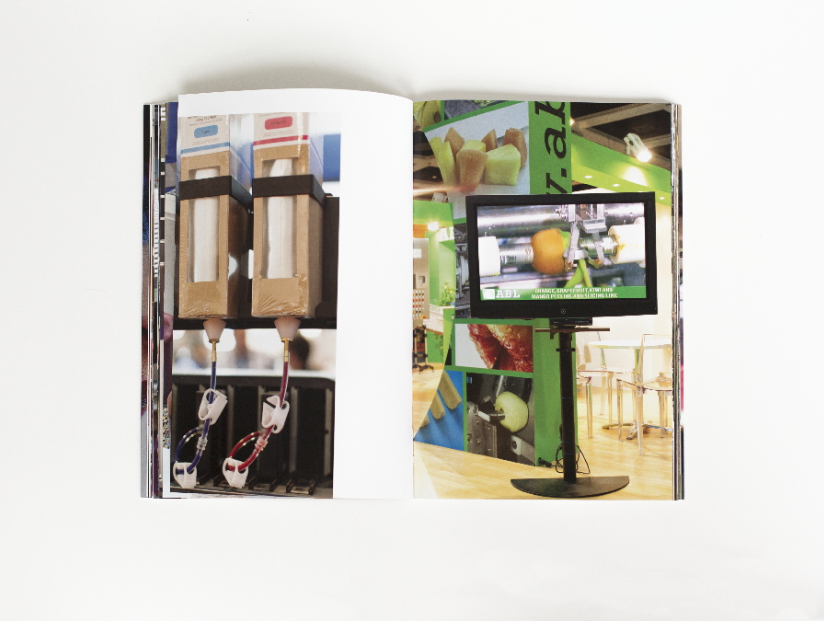
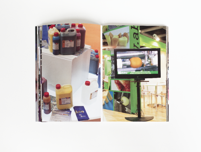
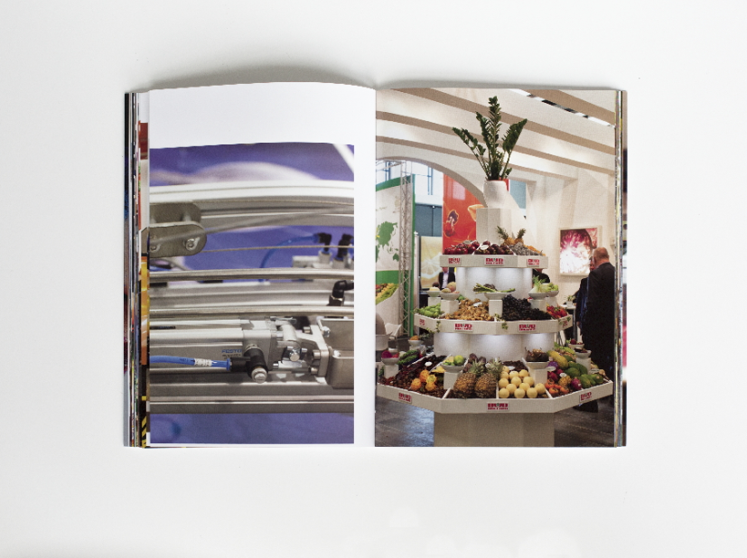
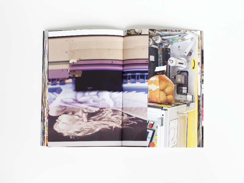
Wolfgang Tillmans - FESPA Digital / FRUIT LOGISTICA
|
|
|
|
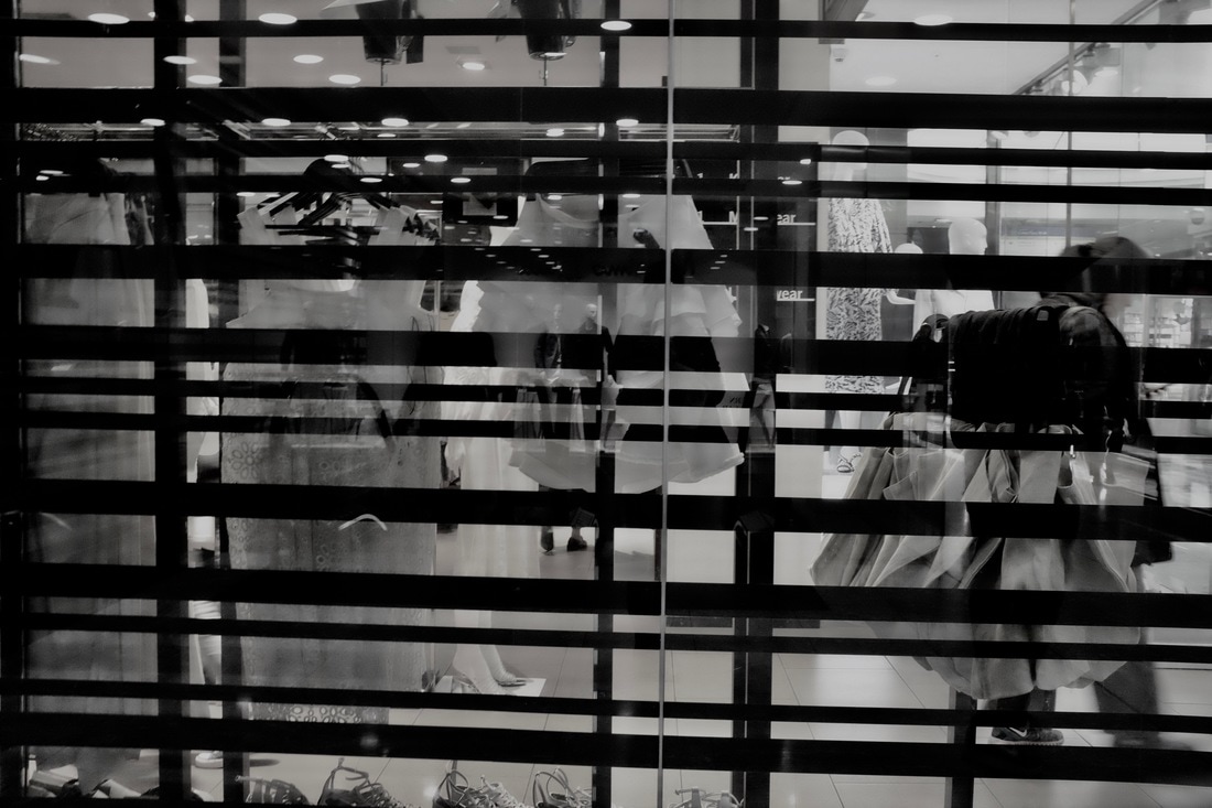
What I like about Wolfgang Tillmans photo books are that they very random, but they all seem to relate without any explanations, some just work. I like that Neue Welt has images are busy, and work without having any reasoning behind them, I also like how he's layered some of the images, it looks like a collage, but I also think this gives the images more suspense and mystery because people will want to know why, and what were the original images. Both of these books are quite random, if you were looking through the book you wouldn't be able to just come up with a context for the book, its all too random. But you can also tell the "FESPA DIGITAL/ FRUIT LOGISTICA" that the book is mainly fruit related. The images really stand out because the fact that they're quite random, but also the images that he has used contrasts quite well, the series of images are bold, busy, but they work. I really like his work and his photo books, I feel more inspired when I look at his images and see my own work comparing to his, with how I like how random things are without an actual explanation. The layout of the book is very different, they're not all the same, and composed really differently, which I think adds to the quirky, randomness to the photo book. For some images I can tell he's paired them because of the colours. His books are the type people will look over again, and again because they still haven't grasped the concept of it just yet, which will allow them to look at the images with more detail.
Martin Parr - Home and Abroad
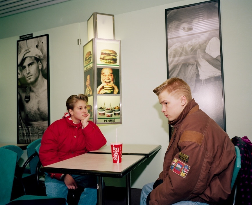
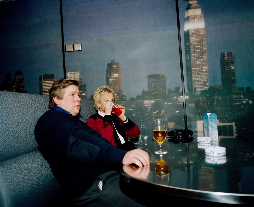
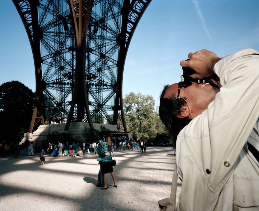
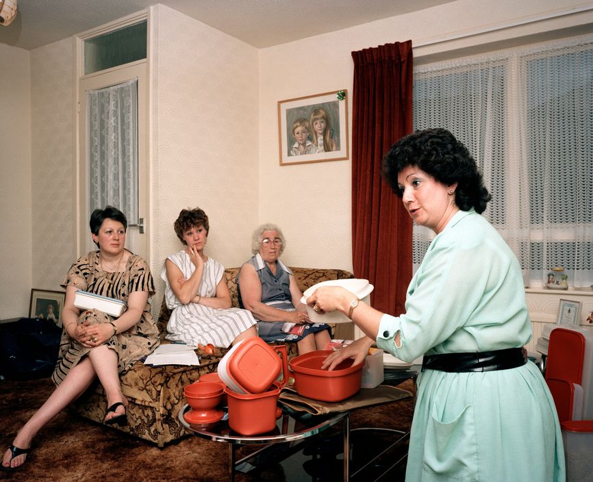
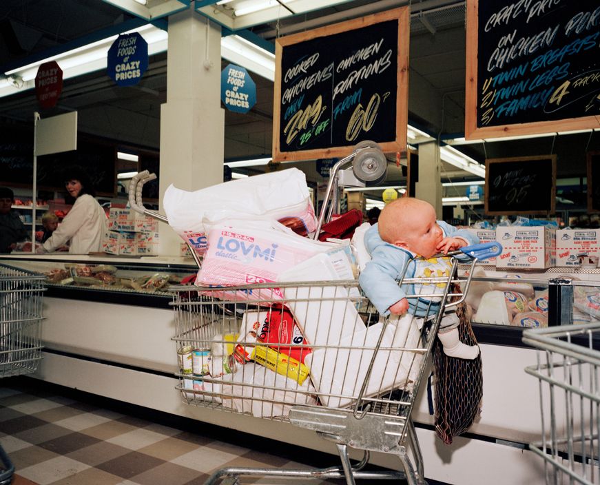
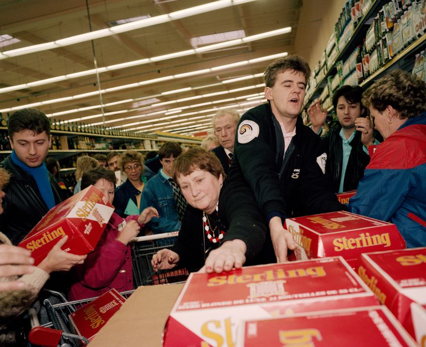
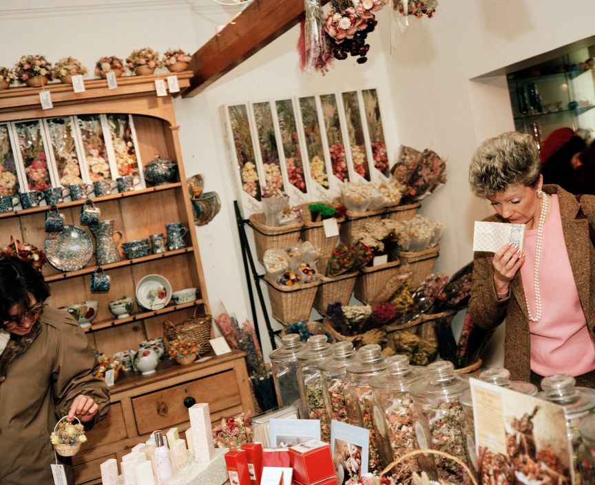
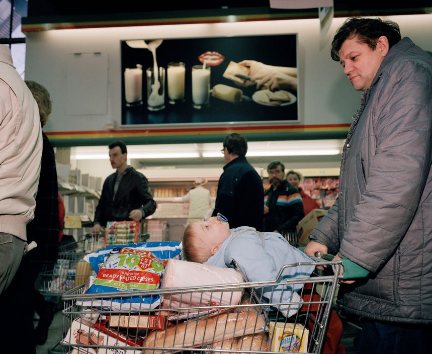
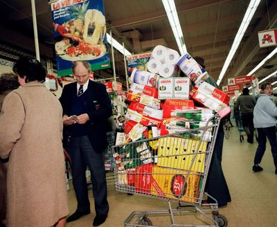
What I like about his photo book is that its a series of images of people, in a everyday situation, they're not all staged, its just him capturing anything that he finds different or interesting. I also like that the images have an 'old' feel to them, being that they're quite dull but some of the colours really stand out. But obviously being in that 'time' everything isn't as developed and modernised, and you can see the style and trends of what it used to be like compared to the present day. You can see how different it is from the way people used to dress, how their homes were decorated, etc. I also really like his images because of the softness the images have, I personally like my images that are soft, and the quality isn't so harsh because it's too clear, which is why I find it more easier to relate and gather inspiration from his images. With some of his images there's always something to look at, it isn't a straight forward image which people will take one look at and turn the page, its something people will likely spend time analysing every bit of the image. Similar to Wolf Gang Tillmans, they're busy but they work, and there's always more than one thing to look a
Creating a sequence
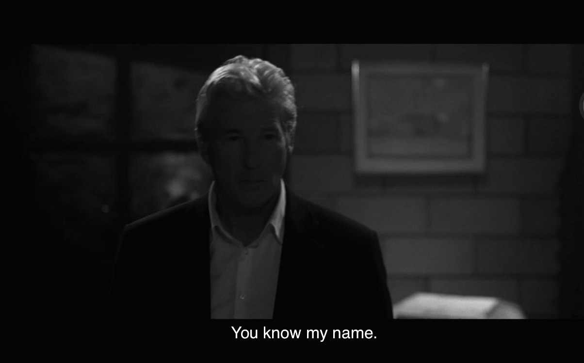
For this project, the part I found most difficult was finding a story or a sequence to relate my images, which meant I didn't know what to take images of, also being in school limited my choices of finding things to include. I think it was more difficult being given the task and not having any explanations given to us in detail, as we were just given instructions and we had to follow what was told, and not having any help from the teacher. This task had shown me how reliant I was on the teacher giving and explaining instructions, and gave me the responsibility of figuring out and doing my own work. I don't think I read the instructions carefully, as when I went off to take some images I didn't find myself taking images for the task, and rather taking images of random things, although when I did take images it was half-hearted and the whole time I felt like I didn't know what I was doing, and wasn't sure I was doing it correctly. My final outcome was better than I expected, when put together all into a sequence the images worked, especially when I had to screen shot subtitles from a scene of a movie. I thought my images had an eery, suspenseful feel to them after I put them into a sequence with the screen shot from a movie, as my images were all black and white, and they had very dark tones, which darkened a lot of the images and gave it the mysterious sense to it. I've learnt that my approach to projects shouldn't be doubtful of myself, I shouldn't be so half-hearted and instantly slander my images, as myself lacking self confidence in my work meant that I wasn't enjoying the task, or completing it to its fullest as I have no motivation towards it. This has definitely started to prepare me for my phonebook project, as it gave me the feel of being given small instructions and the freedom to take whatever I like, and then sequencing them after to find some connection within the images.
Instructions
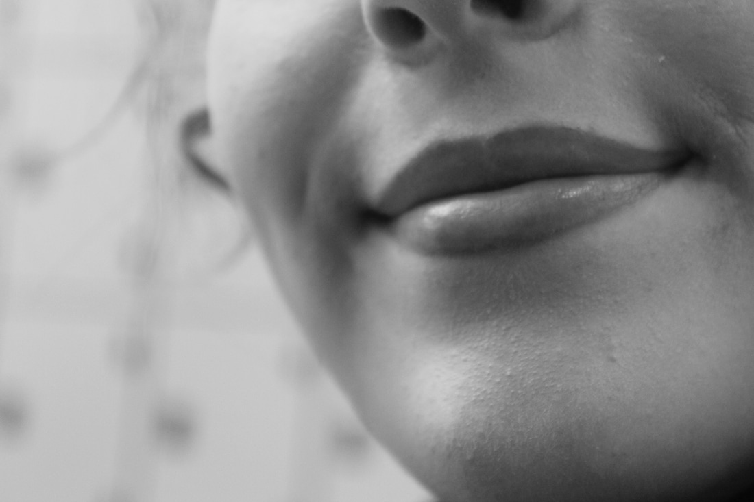
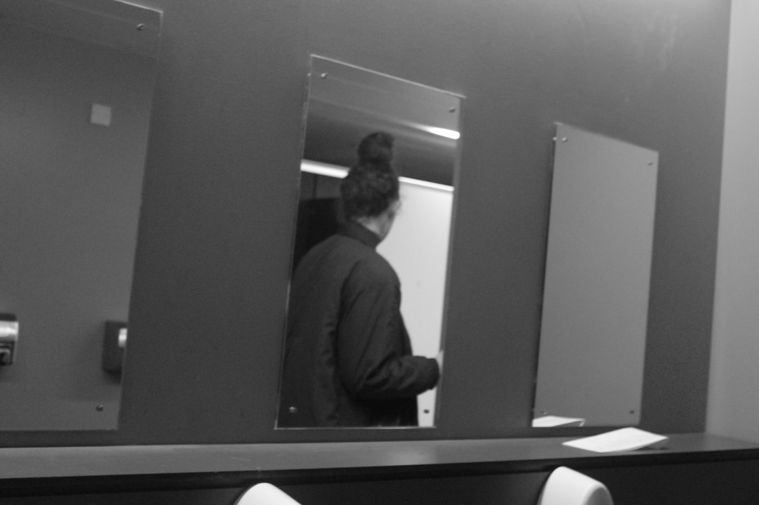
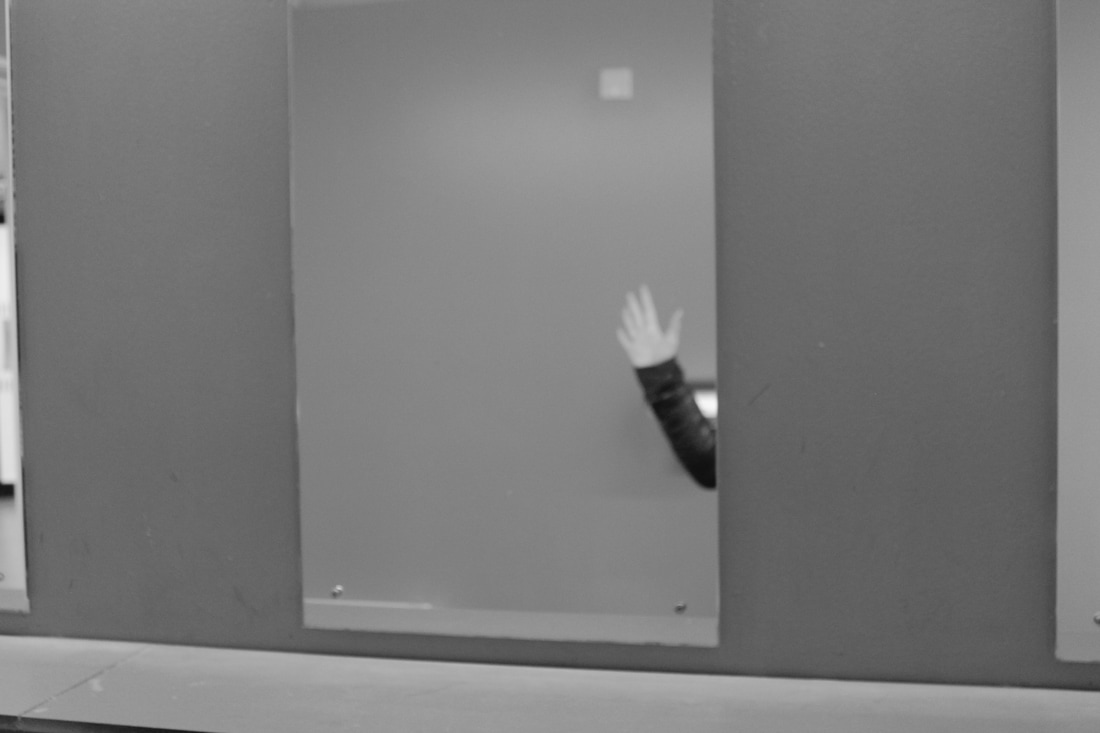
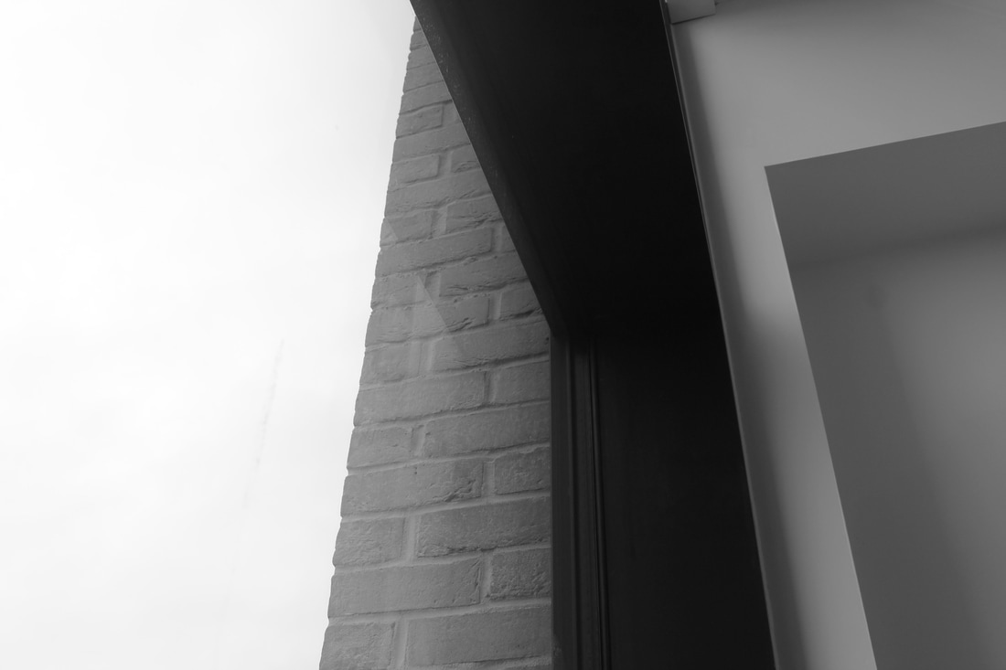
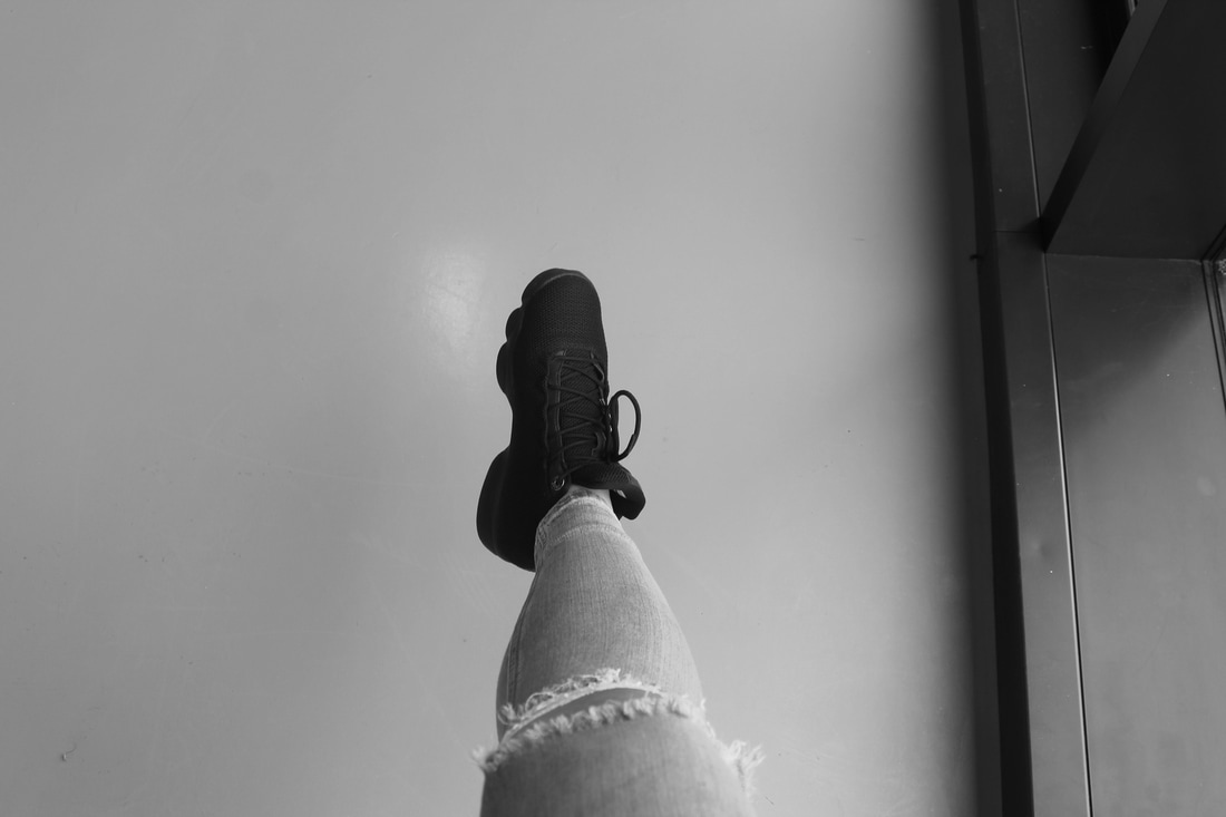

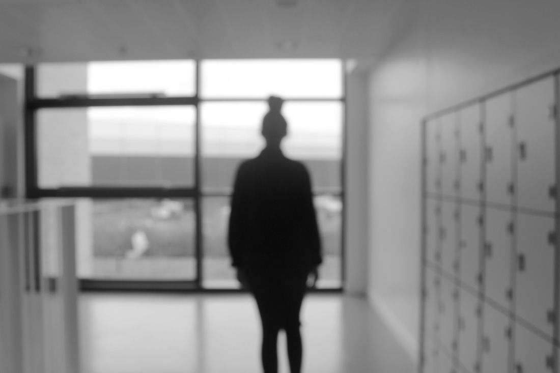
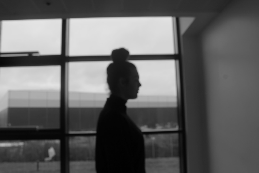
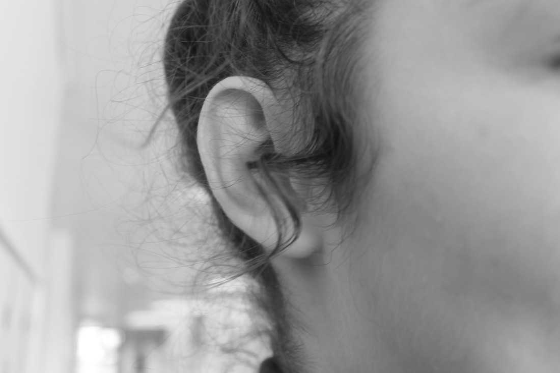
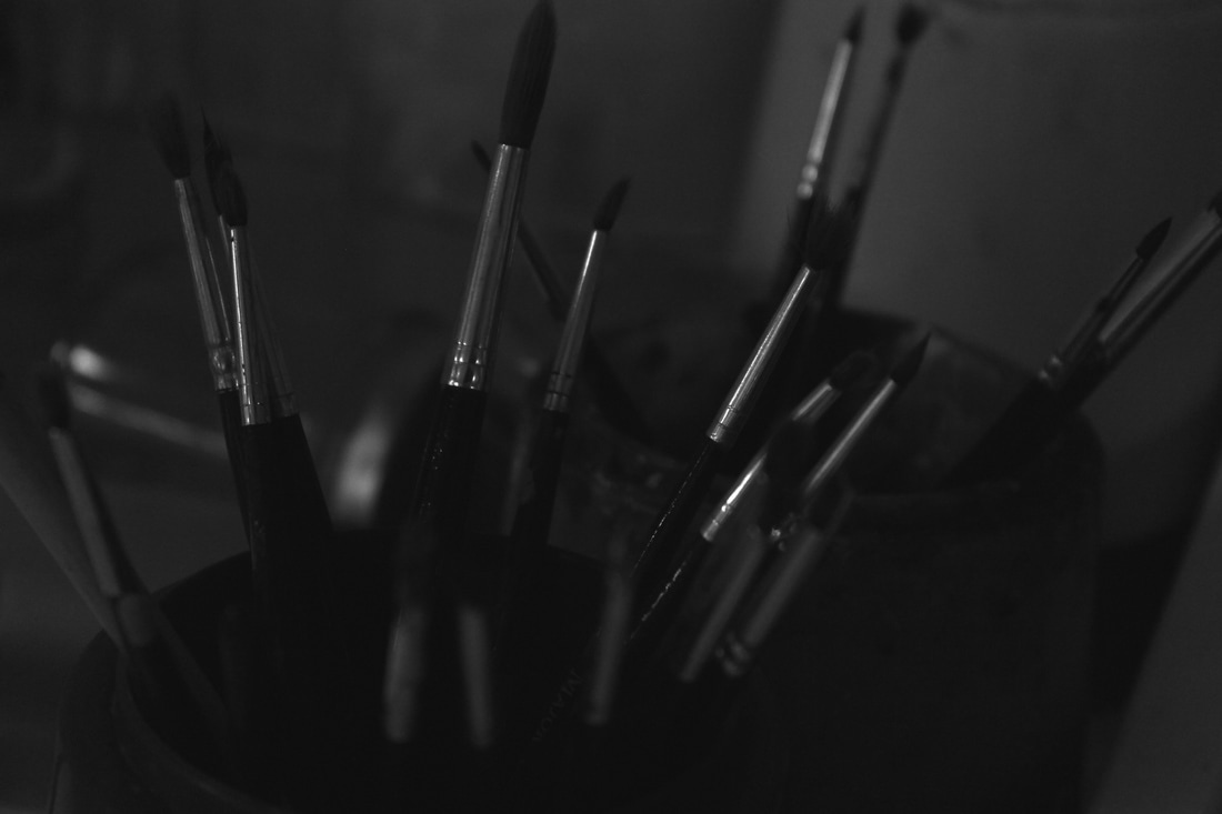
For this task, we had a list of things which we had to tick off the things we wanted to take images of. My list were reflection, silhouettes, non-erotic part of the body, lips, someone else's shoe,
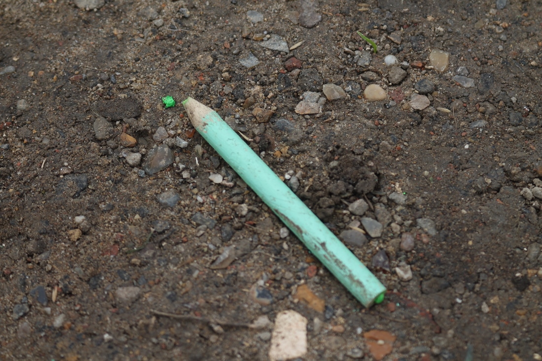

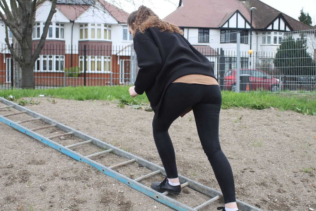
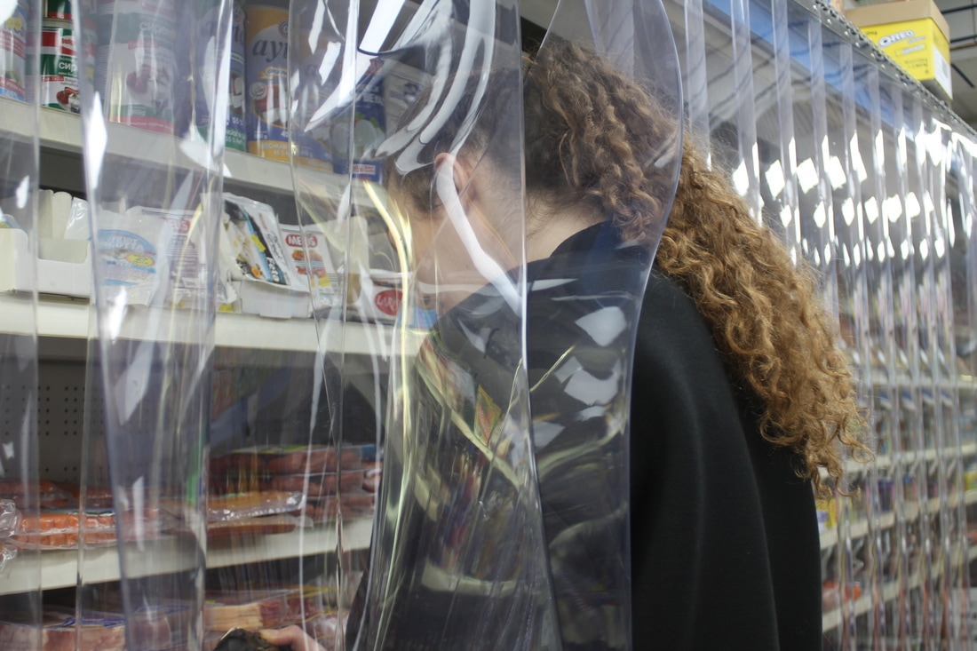
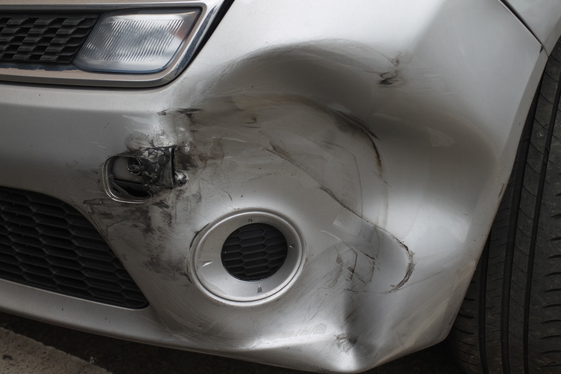

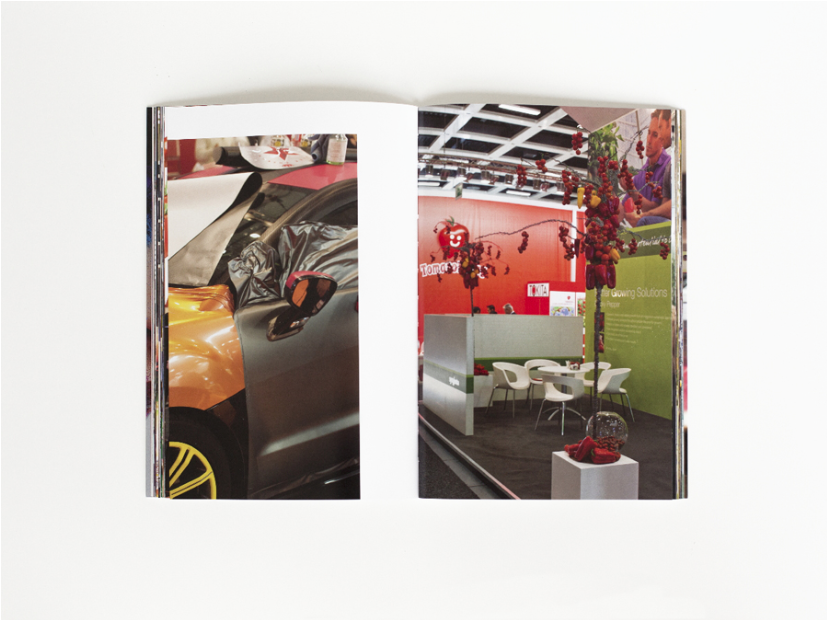
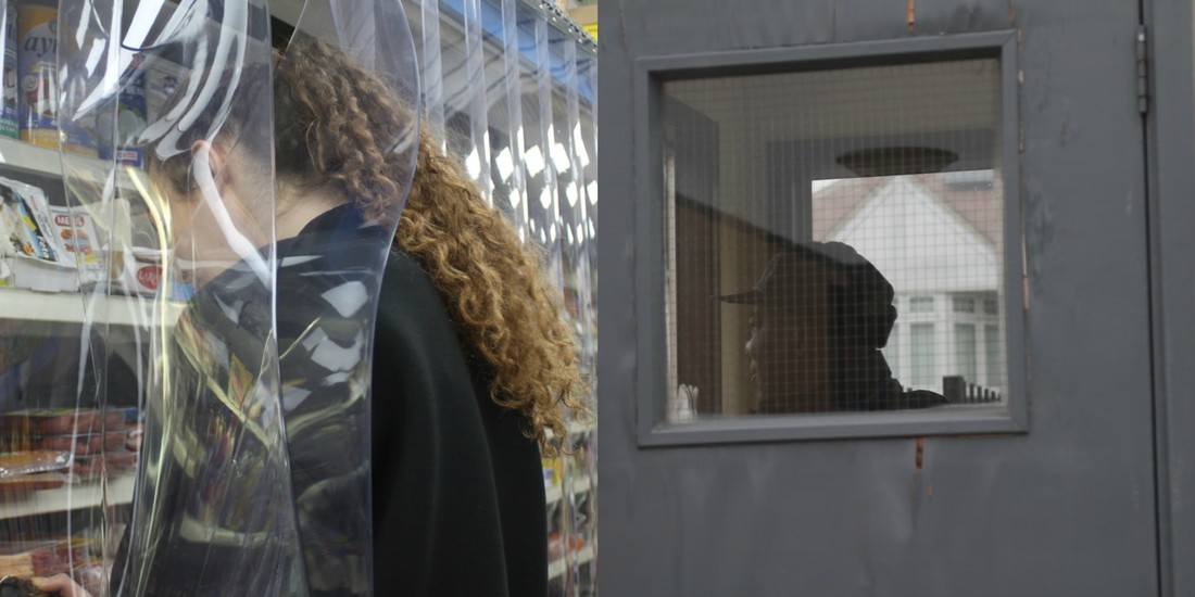
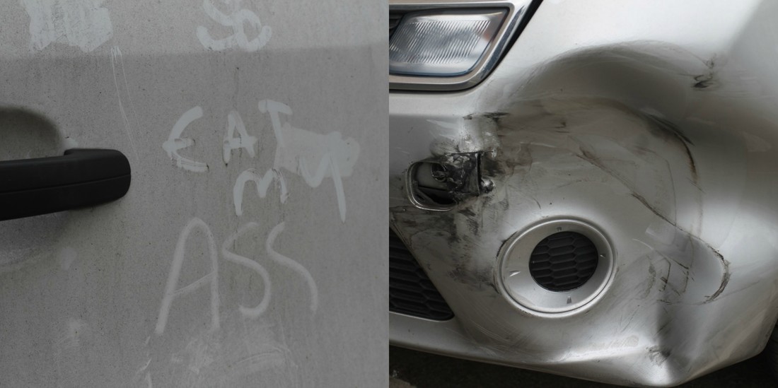
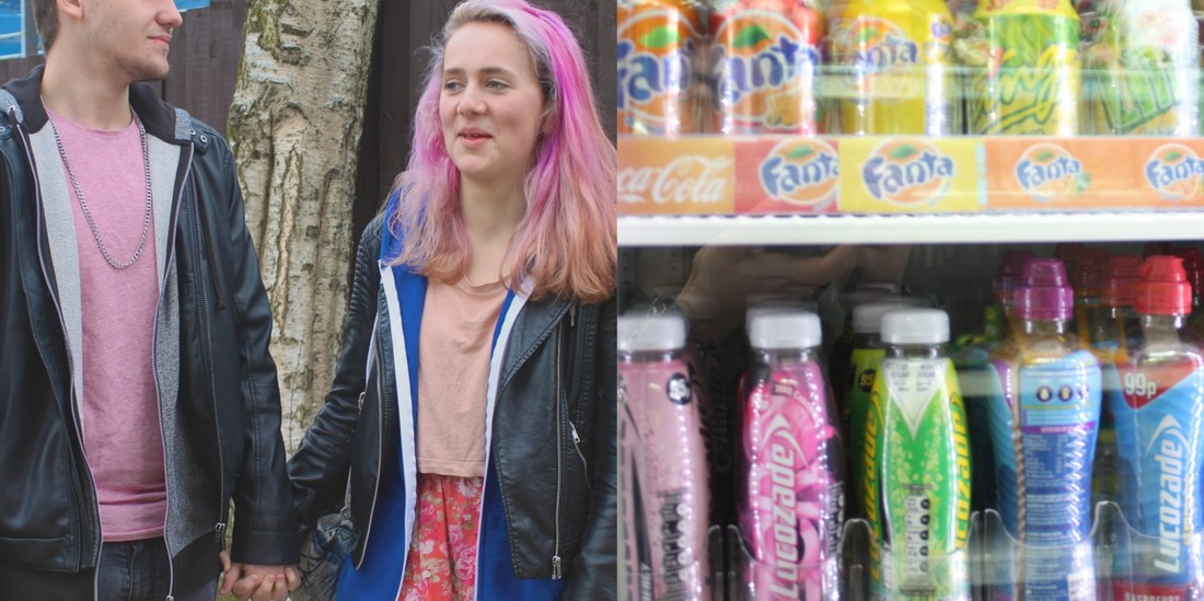
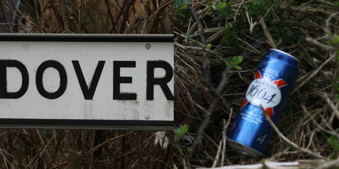
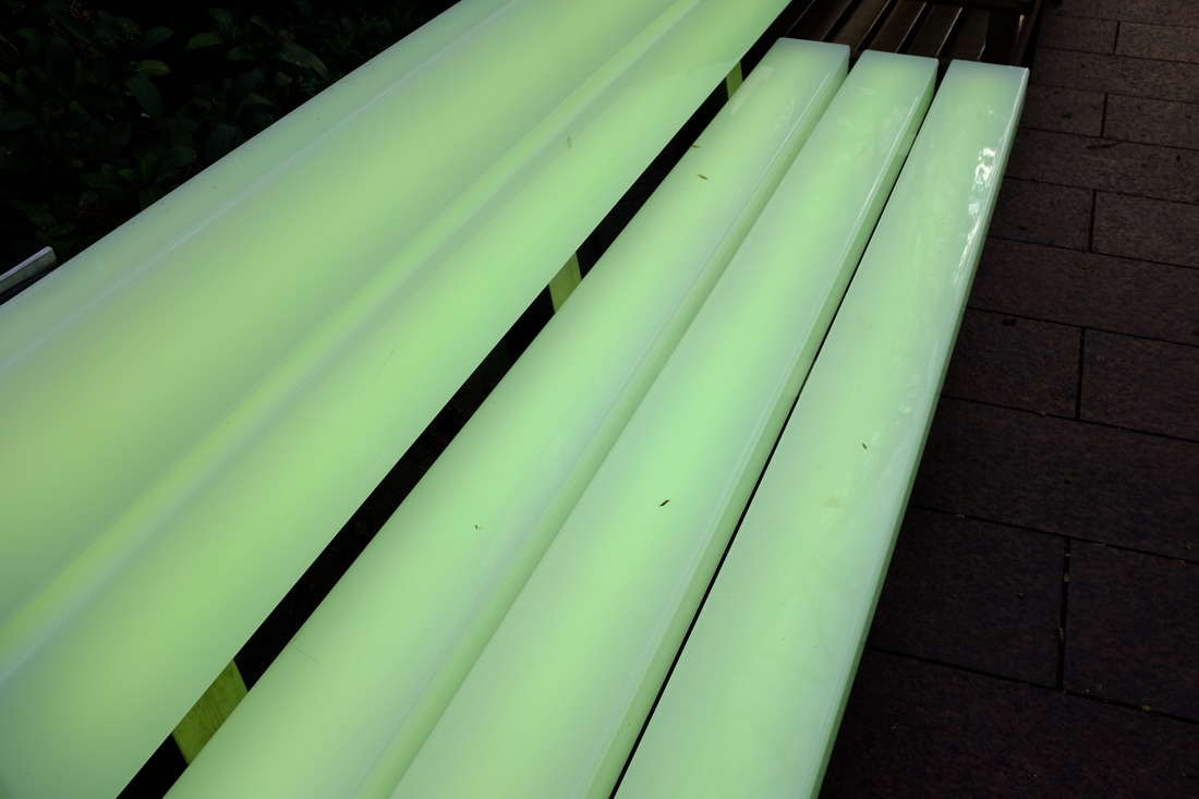
For these set of images, we had to write down a list of things we had previously observed during the day, but my list wasn't easy to take images of, so instead I went off and took images of things I had observed and thought what was most interesting to take images of, and what had caught my attention the most. This task was to also to take images and then joining them to make diptychs. One of my favourite images was the girl in between the plastic covers, I liked the light reflecting on the plastic. Another favourite is the front of the car that was pushed in, I thought it gave a lot of dimension to the image, and the range of tones and shaped, especially as the car was silver which reflected the light on all the crevices better.
Diptychs
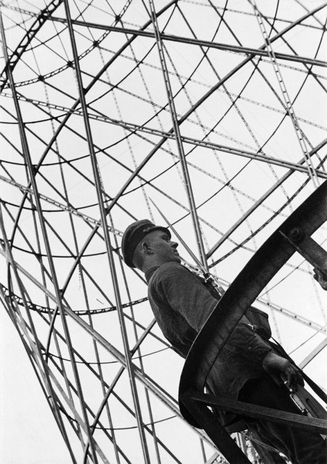
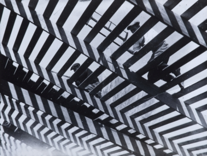
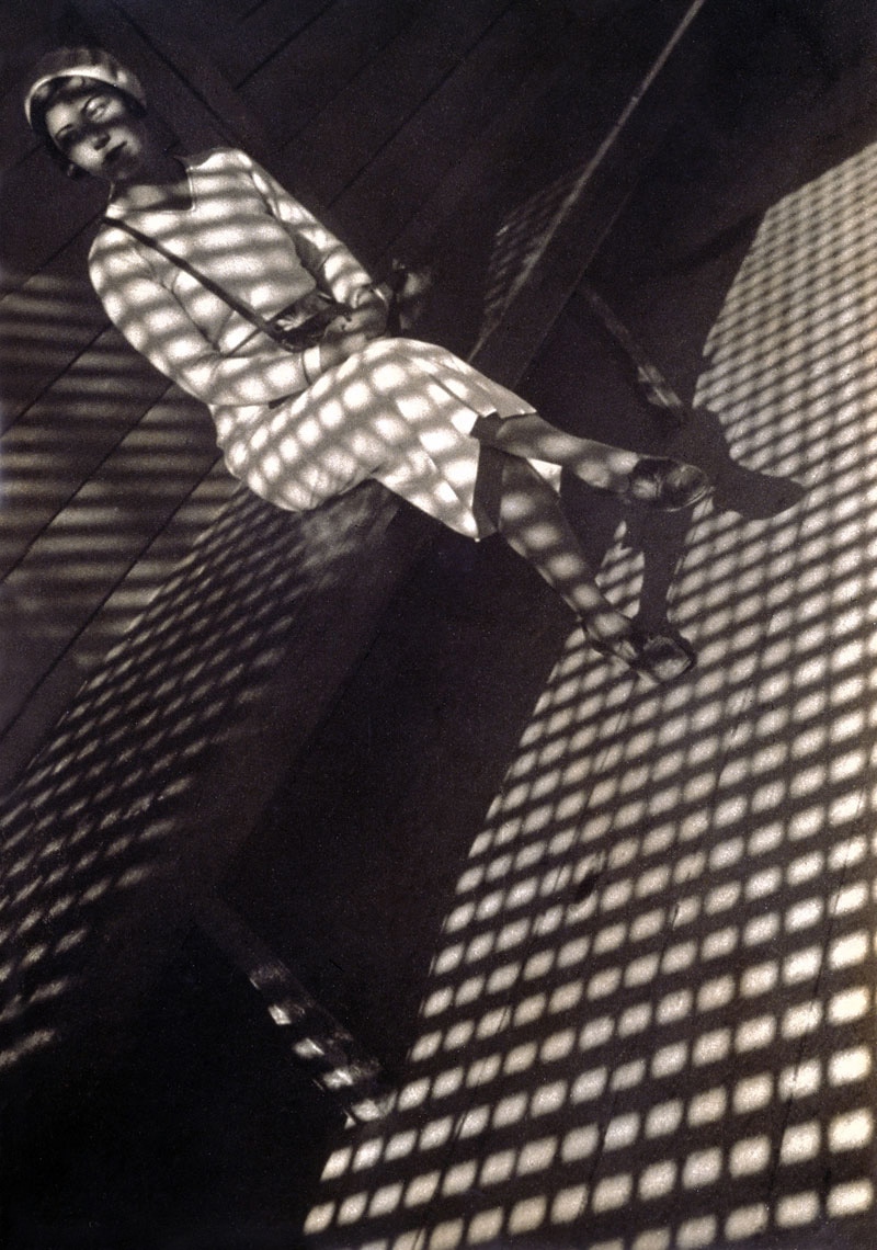
Alexander Rodchenko
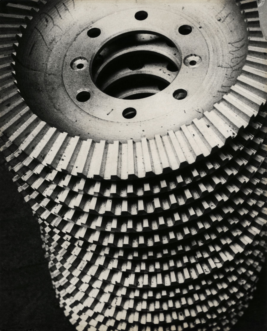
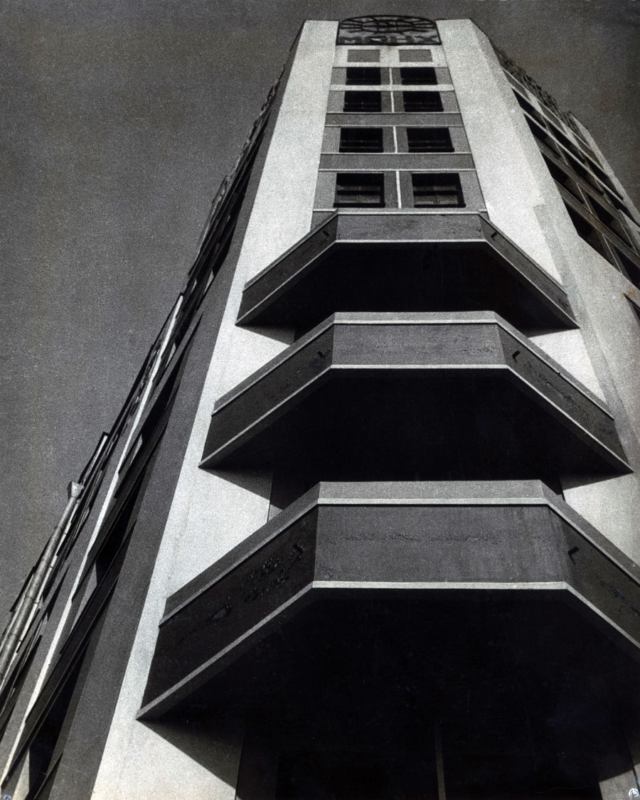
Berenice Abbott - Architectural Photography
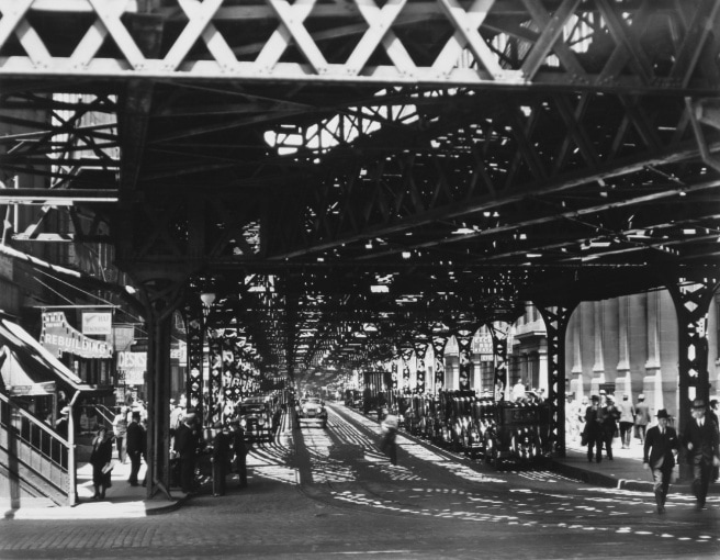
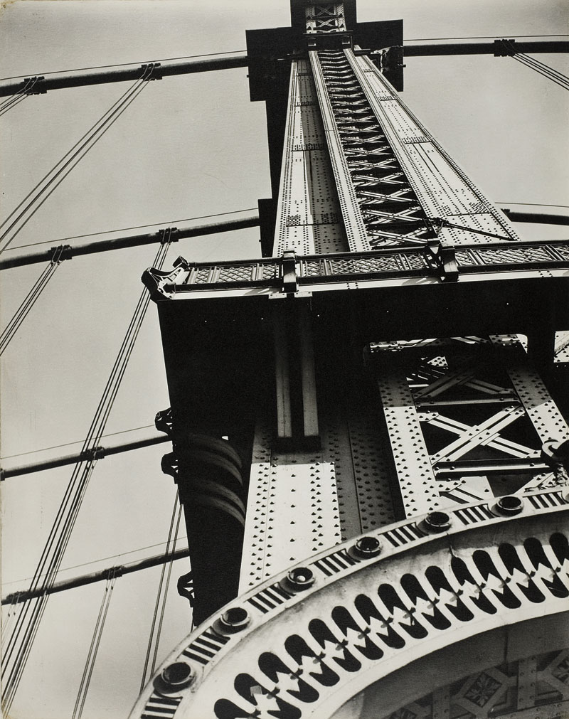
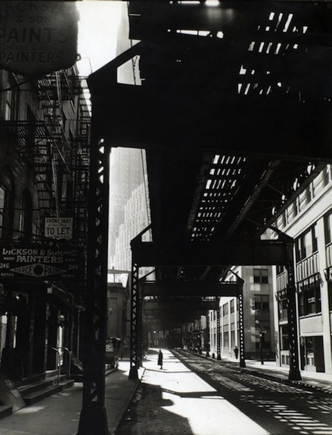
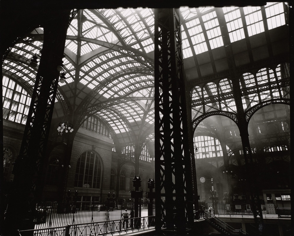
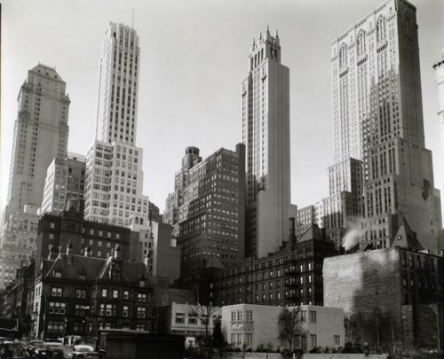
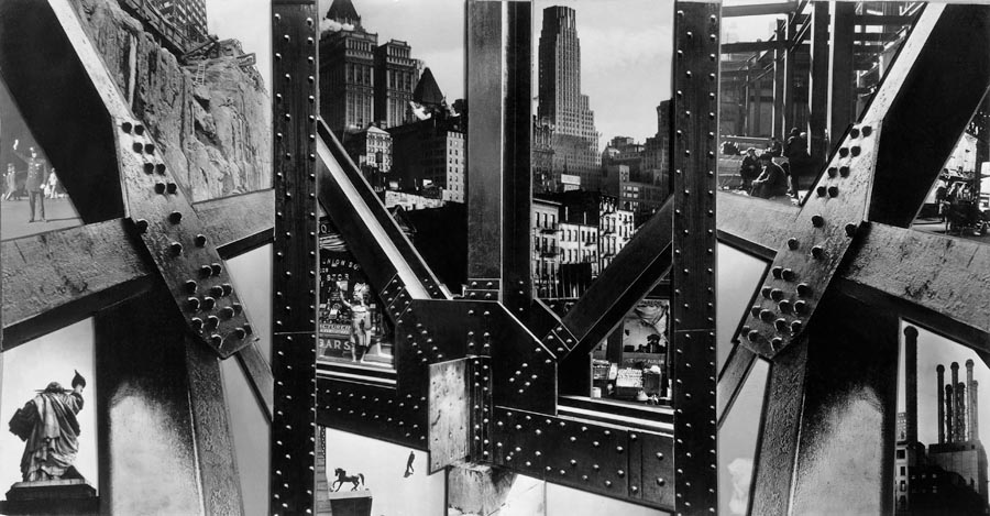
I was recommended to look at the work of Rodchenko and Abbott as they have series of images which relate to my own, I really liked Abbott's images of New York, as the city itself is full of buildings and structures, theres so much variety, its just how she chose to compose those images. As her images are in the 1930s I really liked the 'old' feel of her images, showing what it was like in those years. The camera she uses and the filters it gives also contributes to the look of her images, making it feel more sentimental.
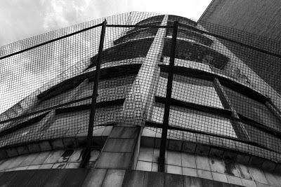
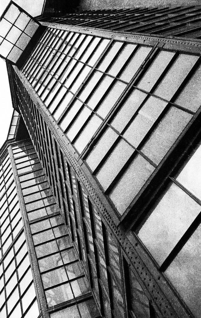
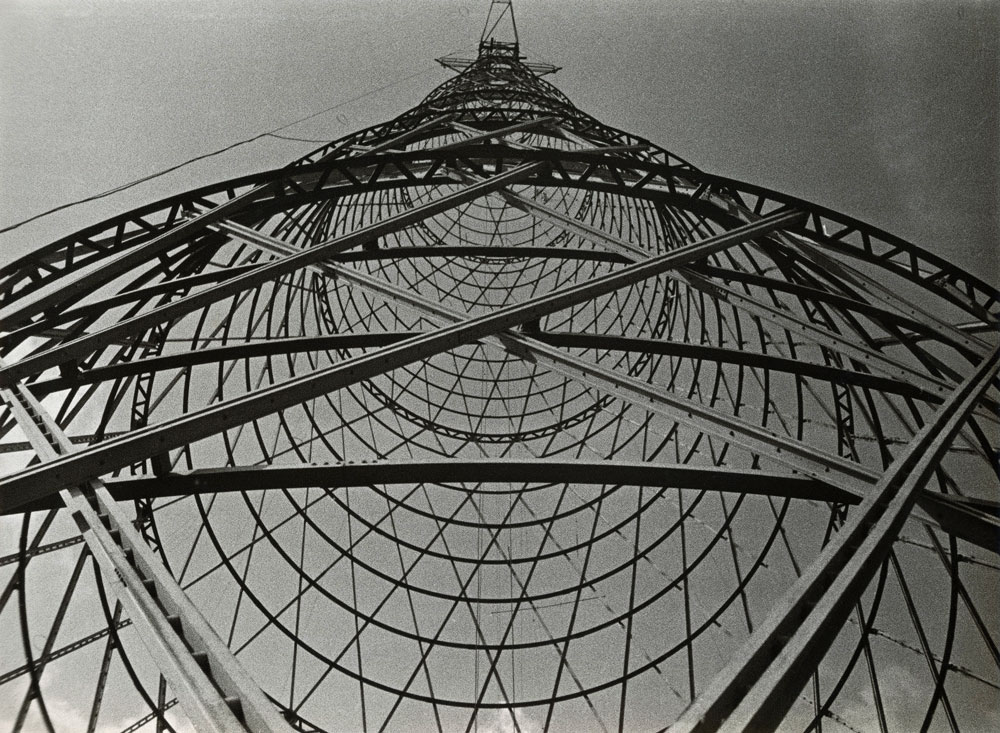
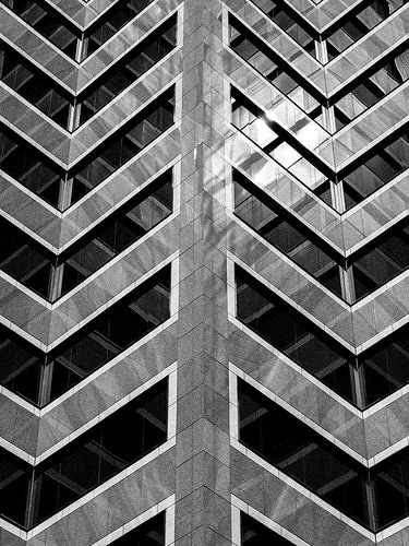
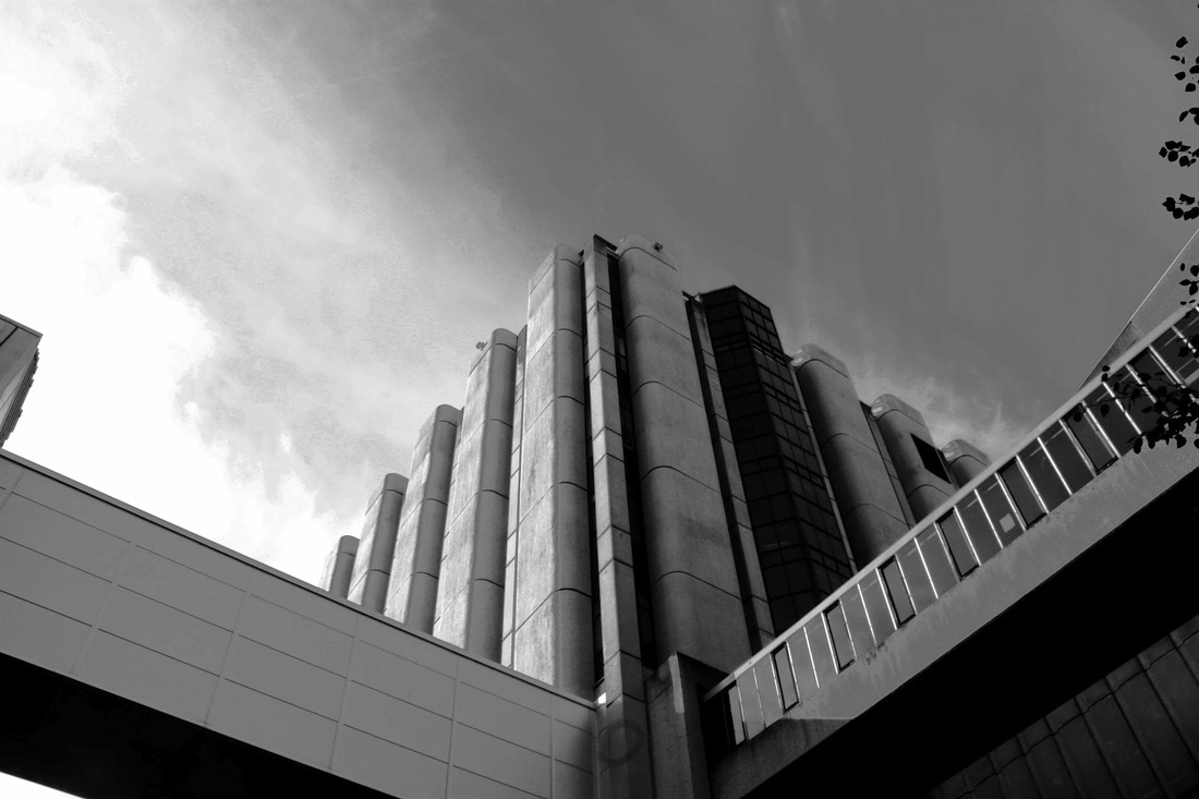
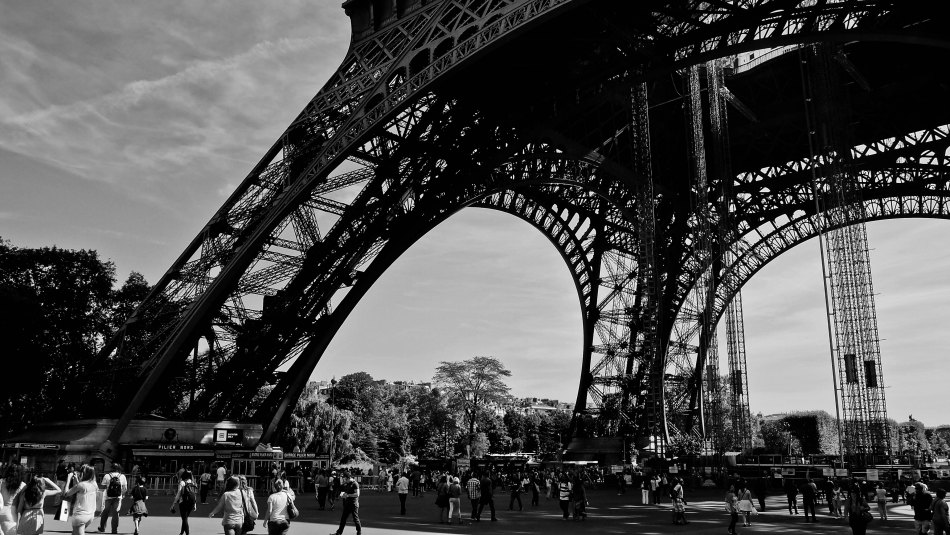
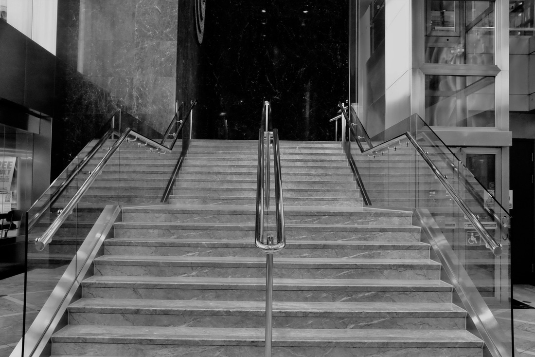
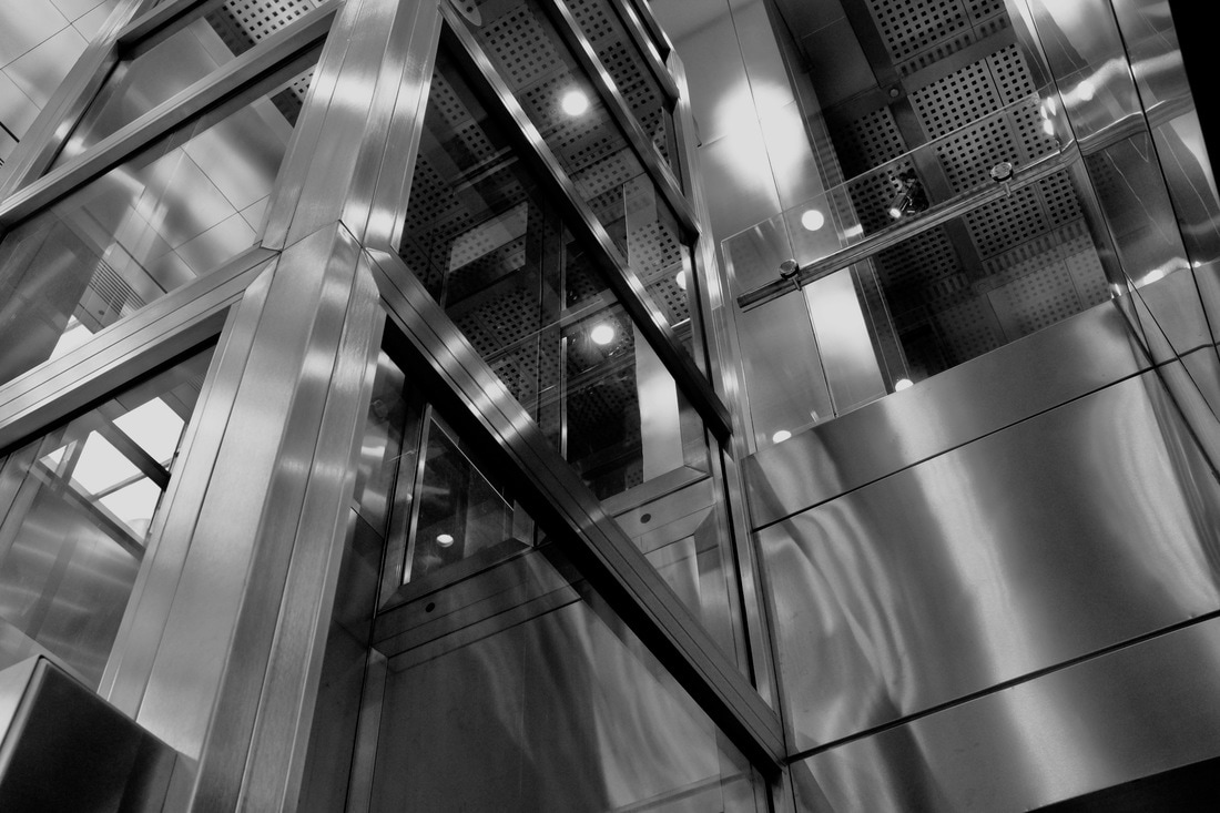
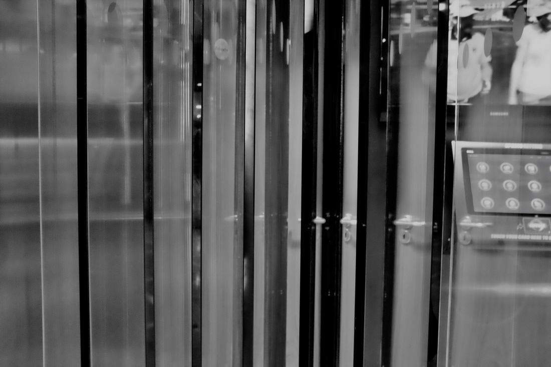
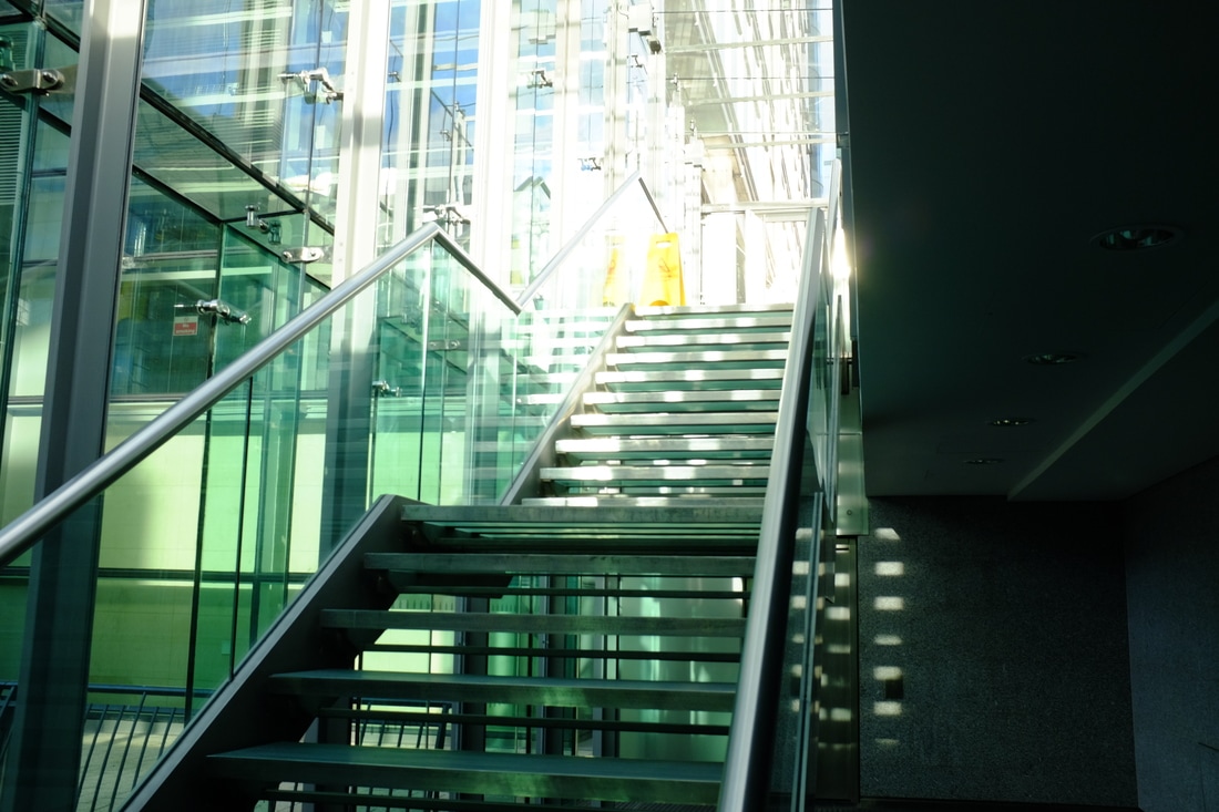
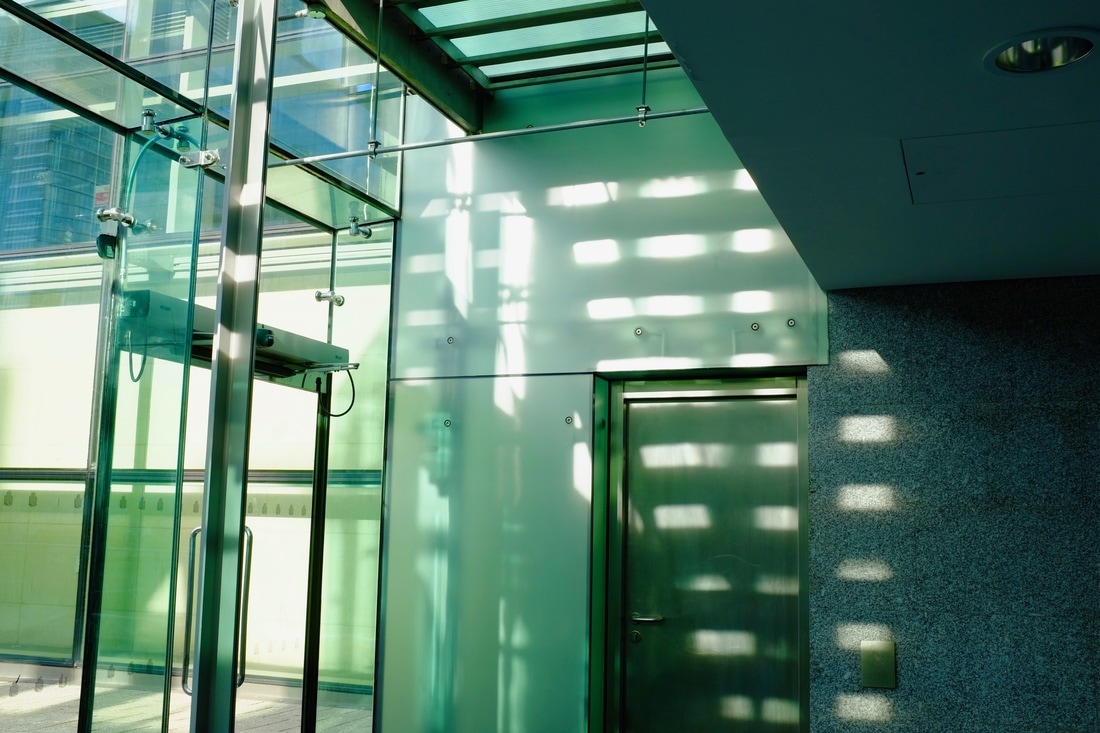
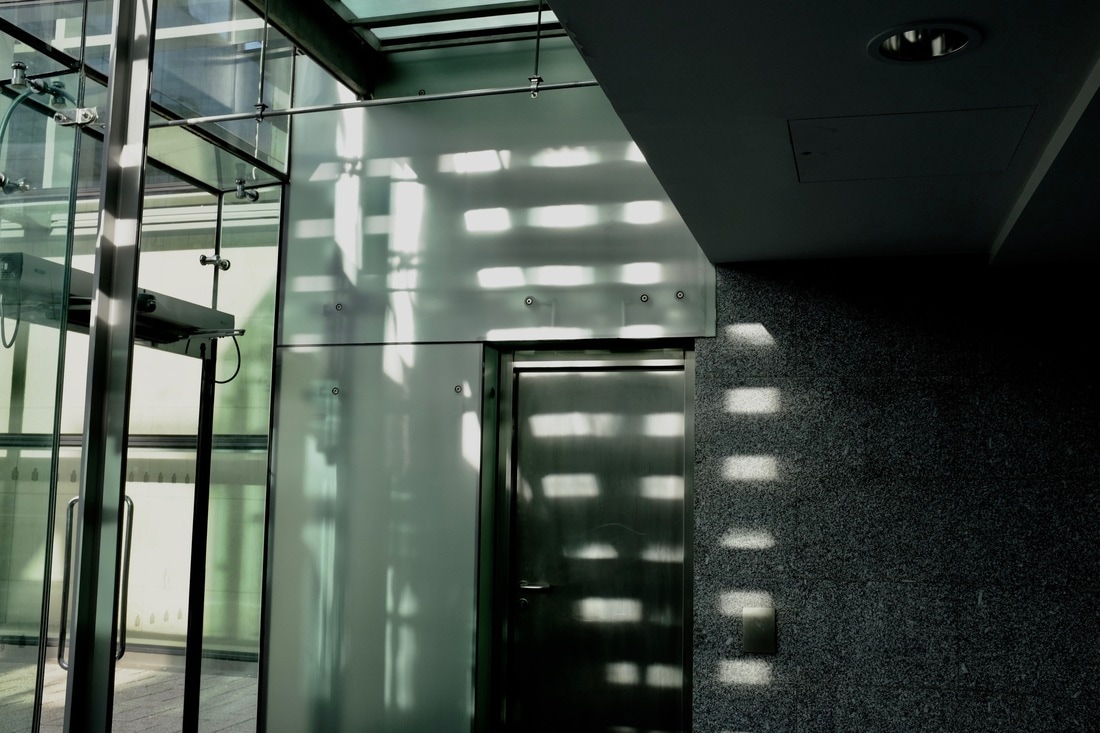
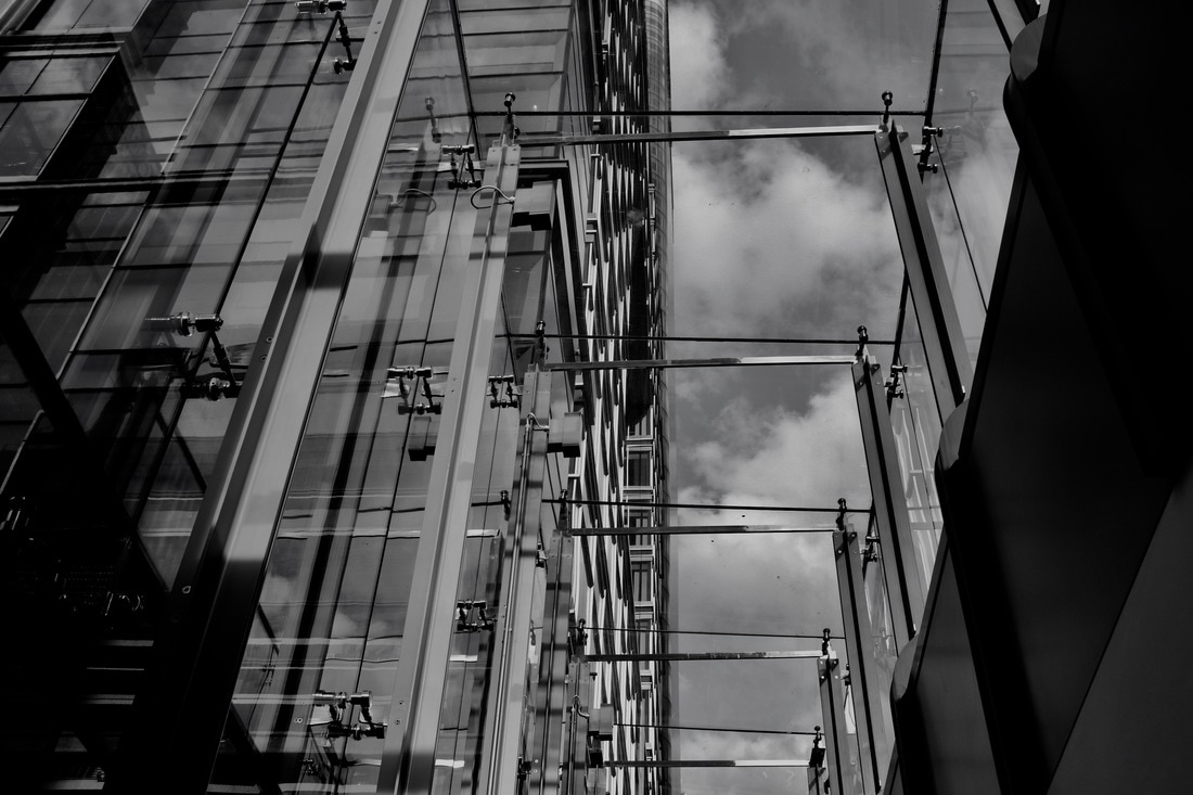
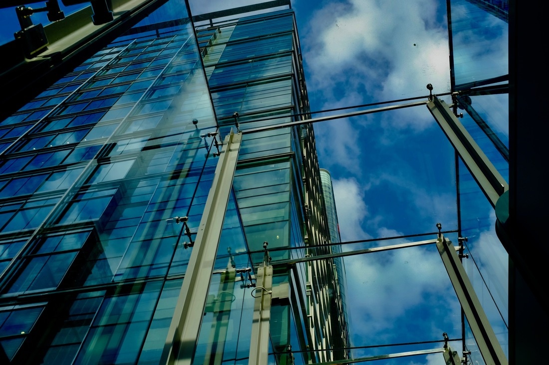
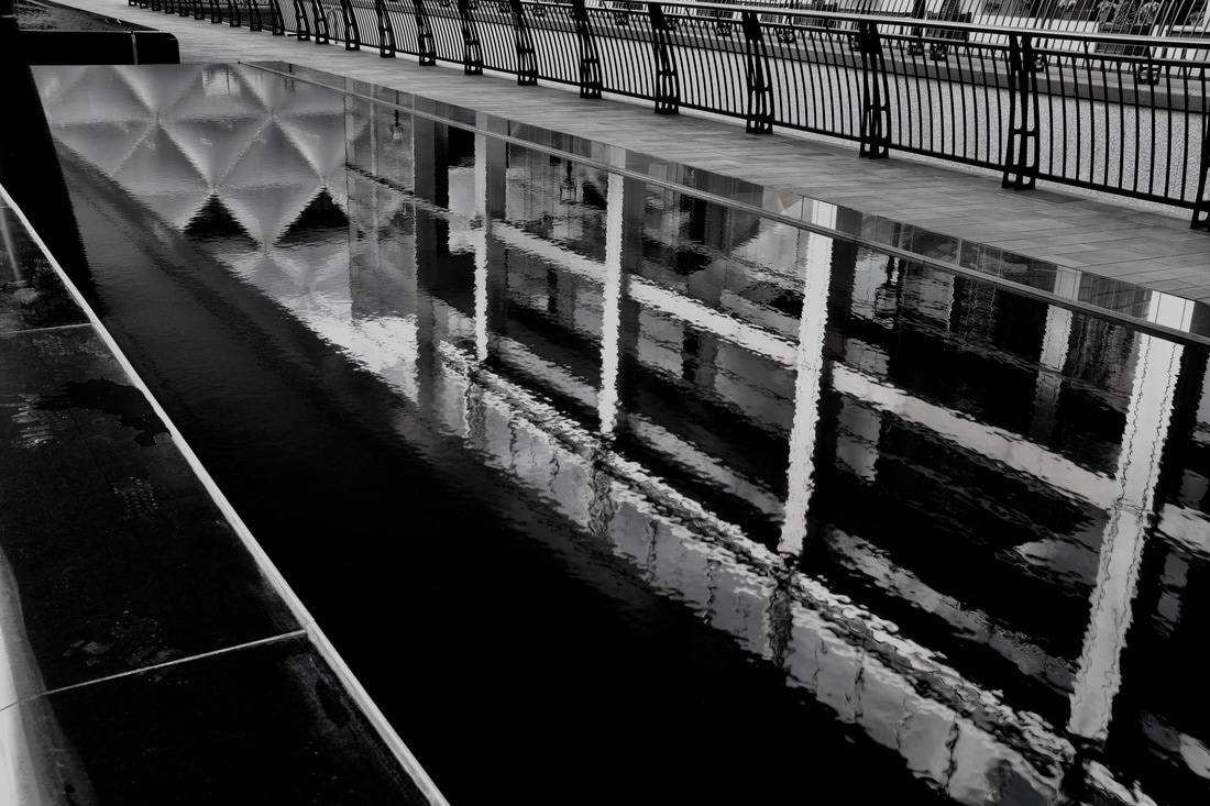
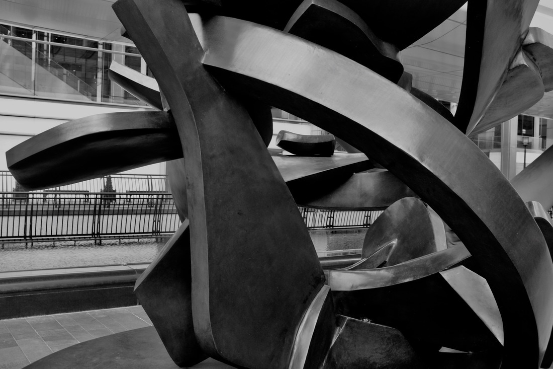
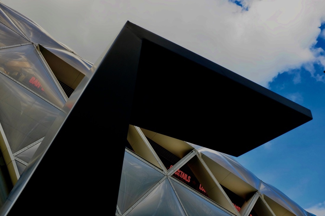
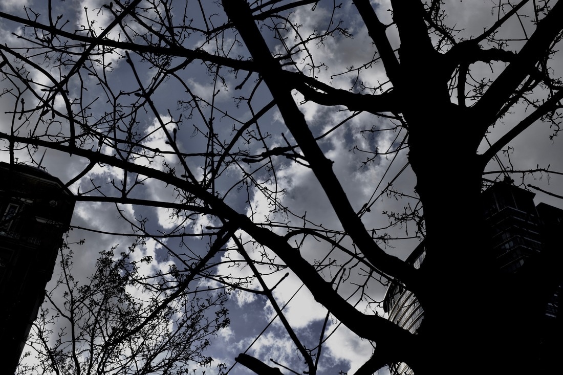
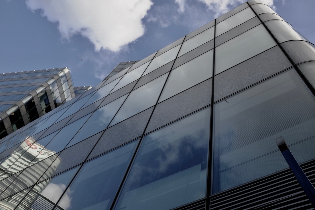
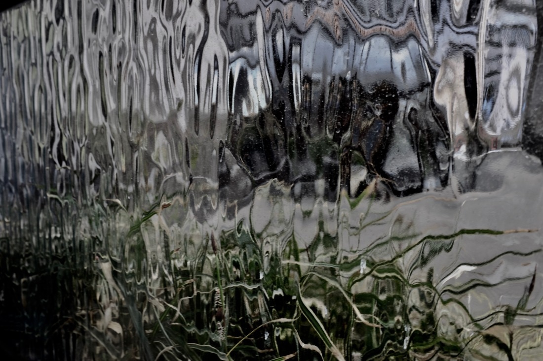
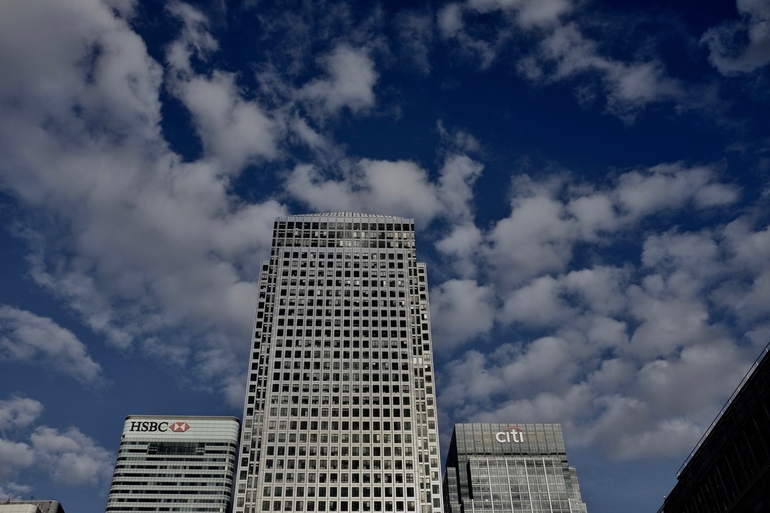
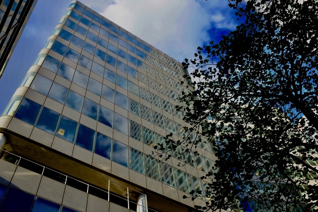
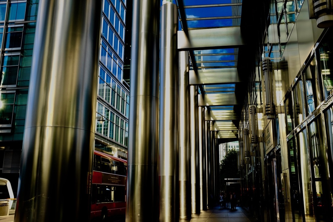
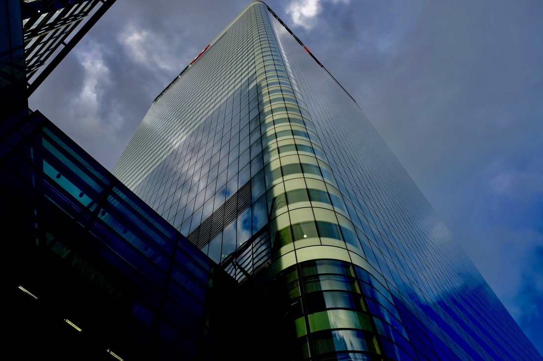
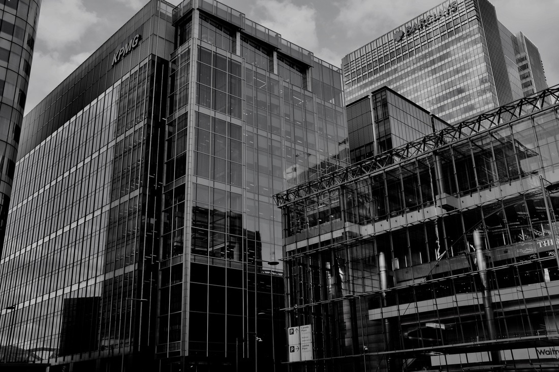
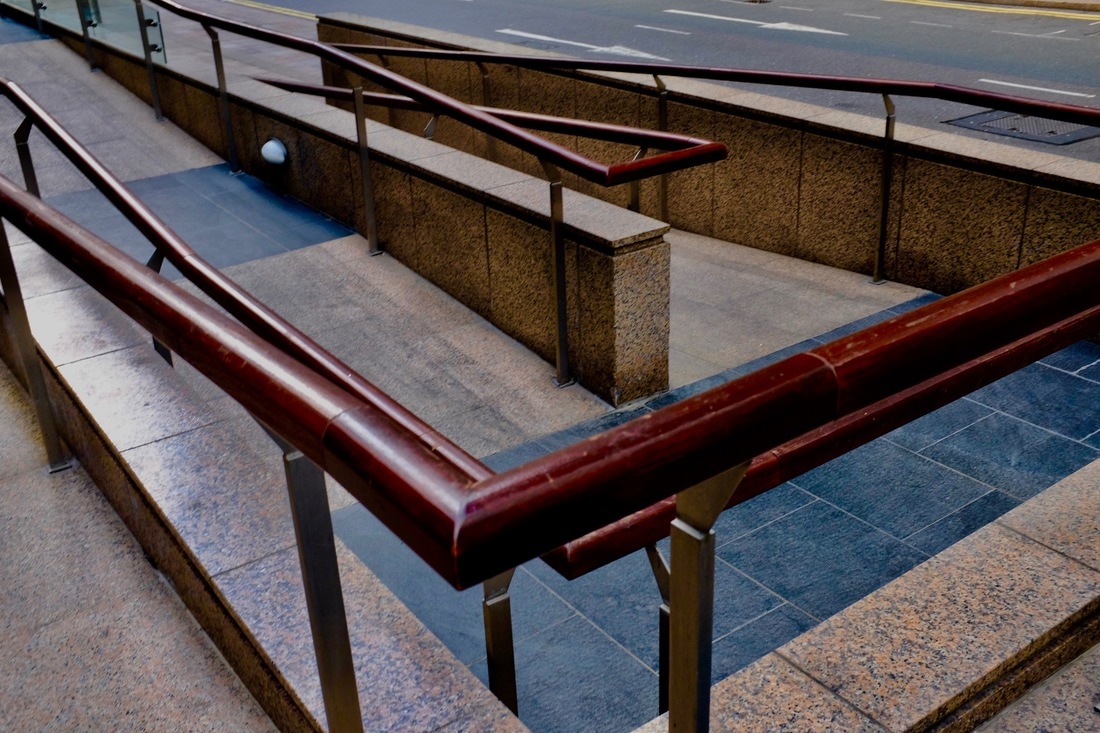
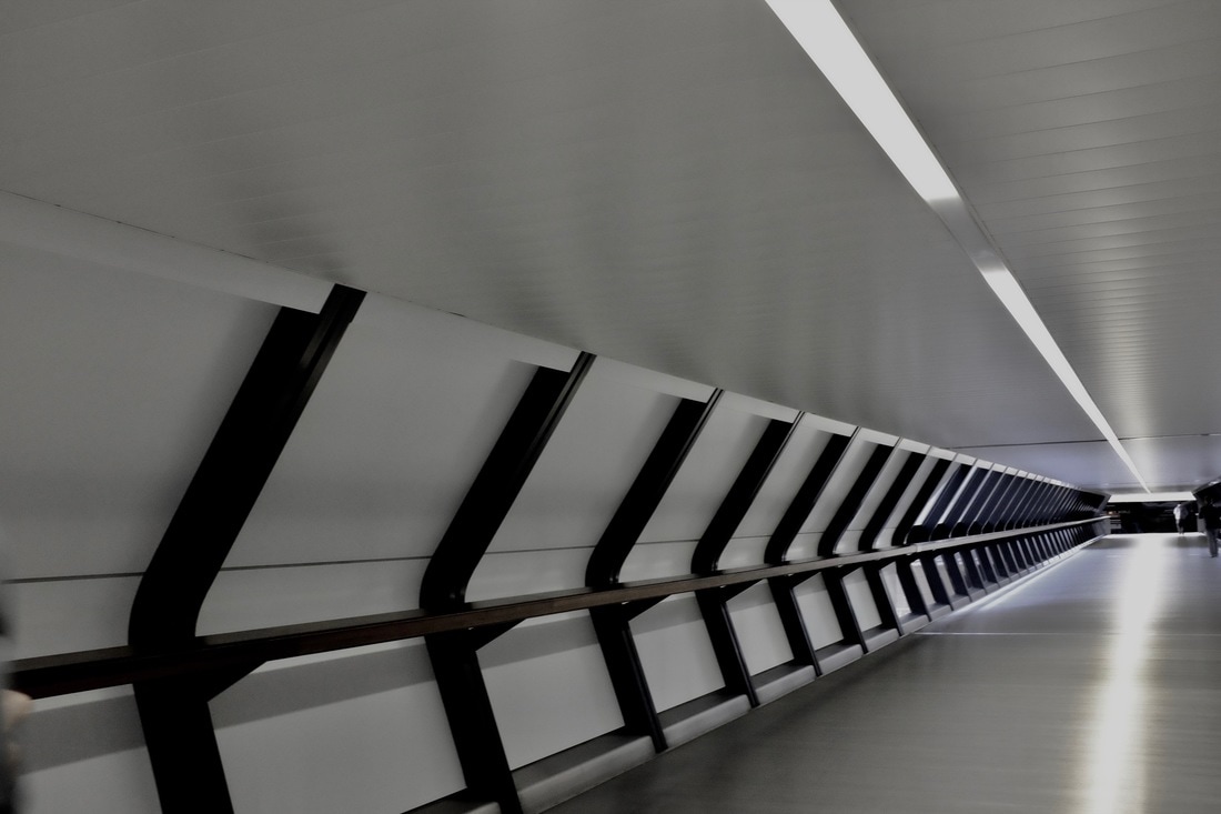
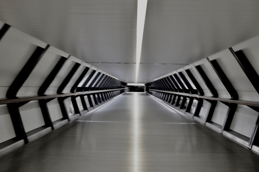
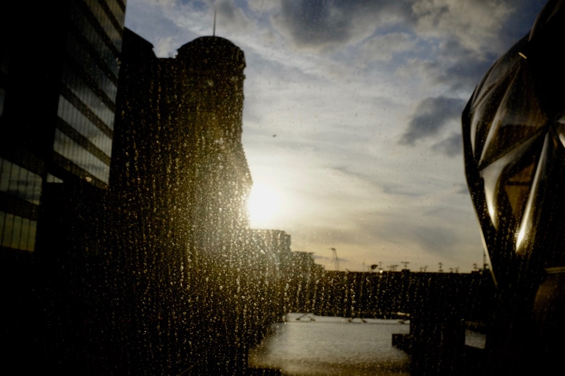
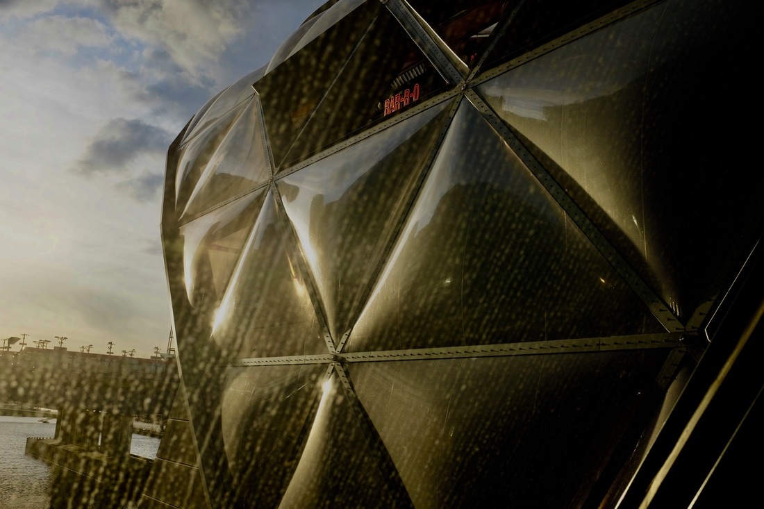
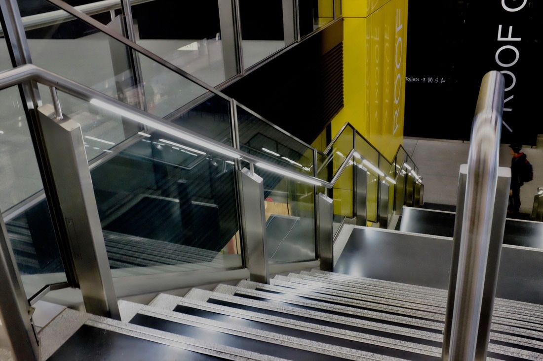
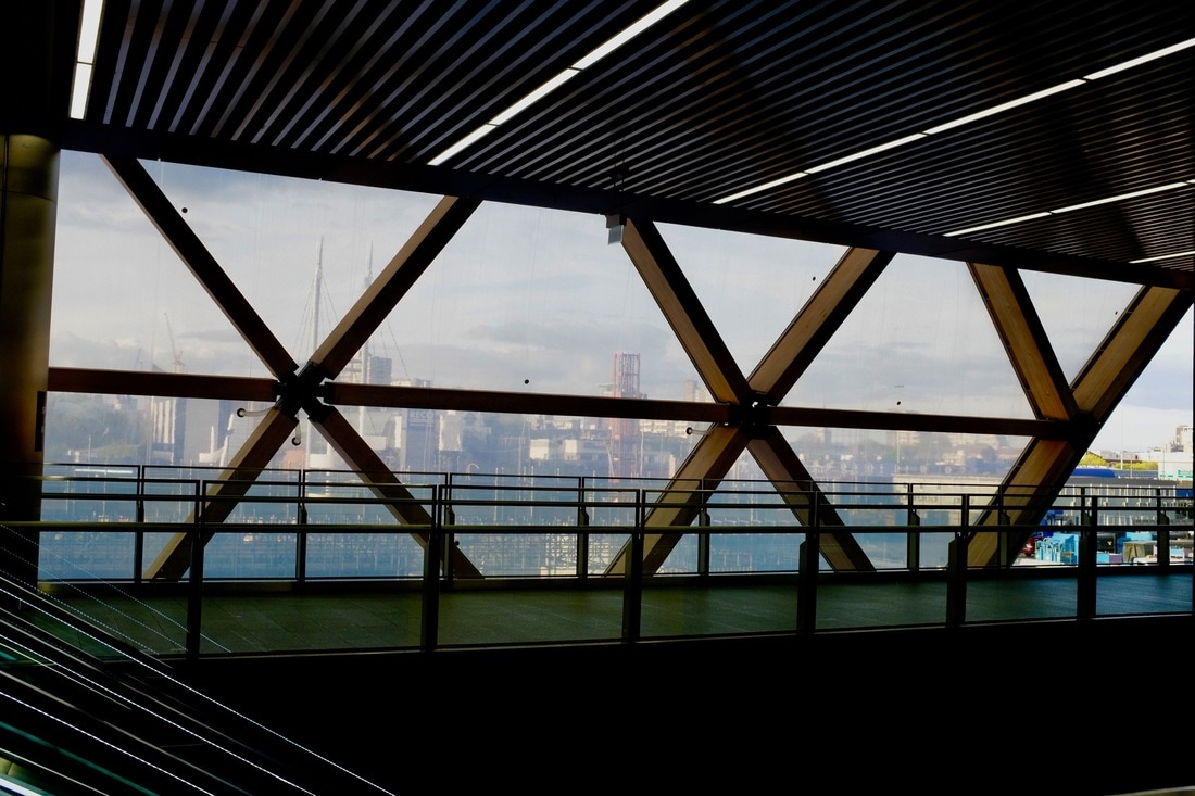
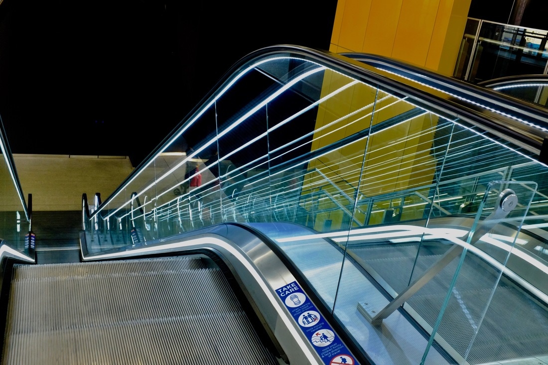
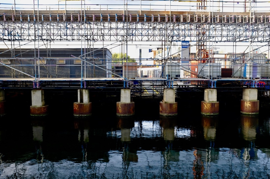
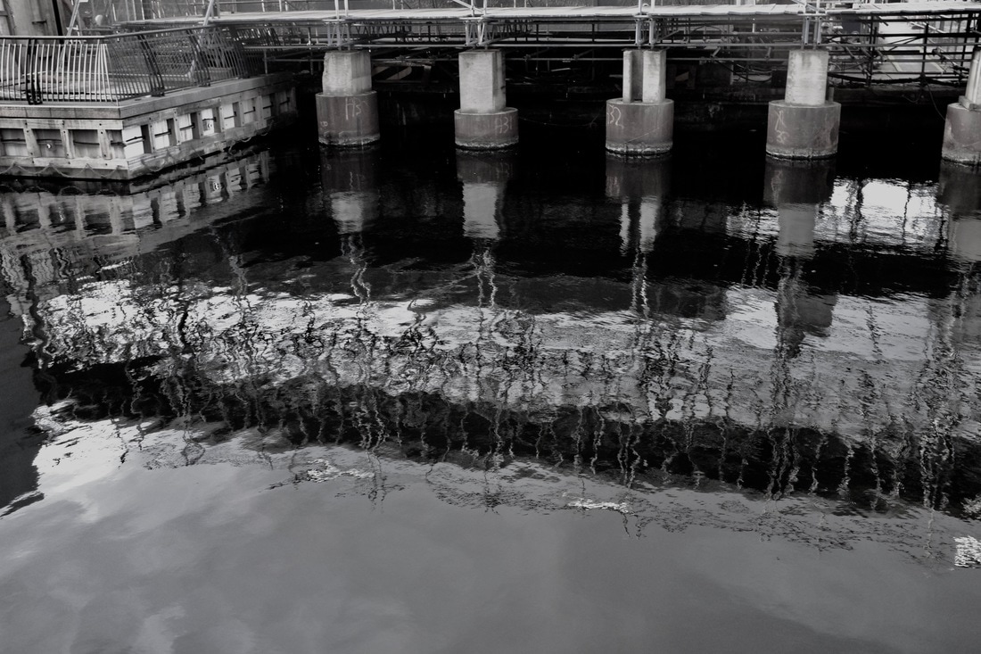
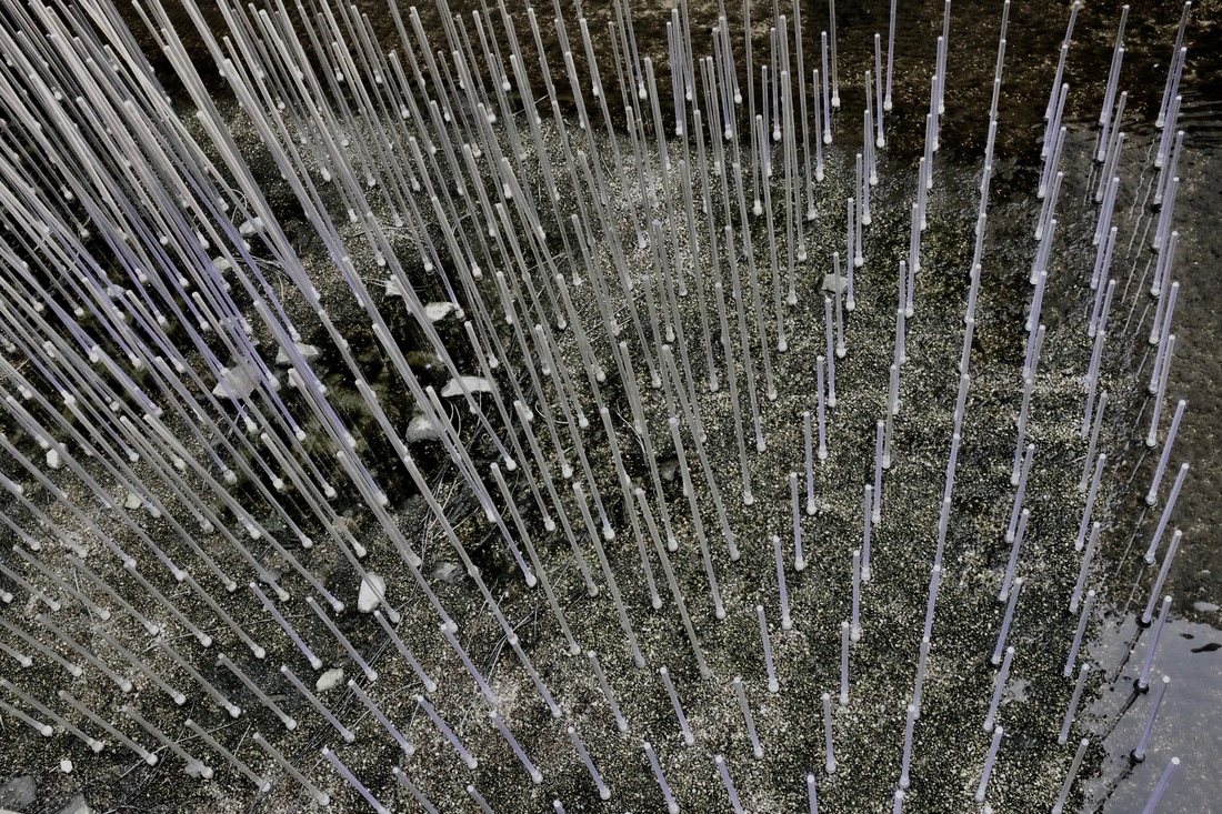
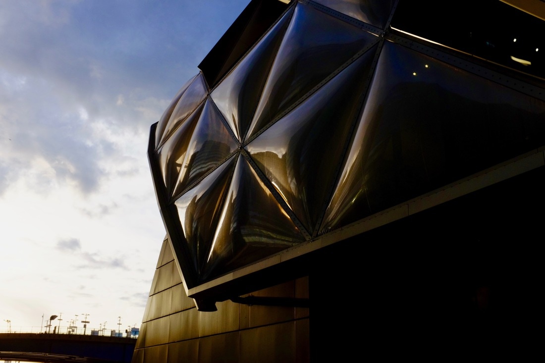
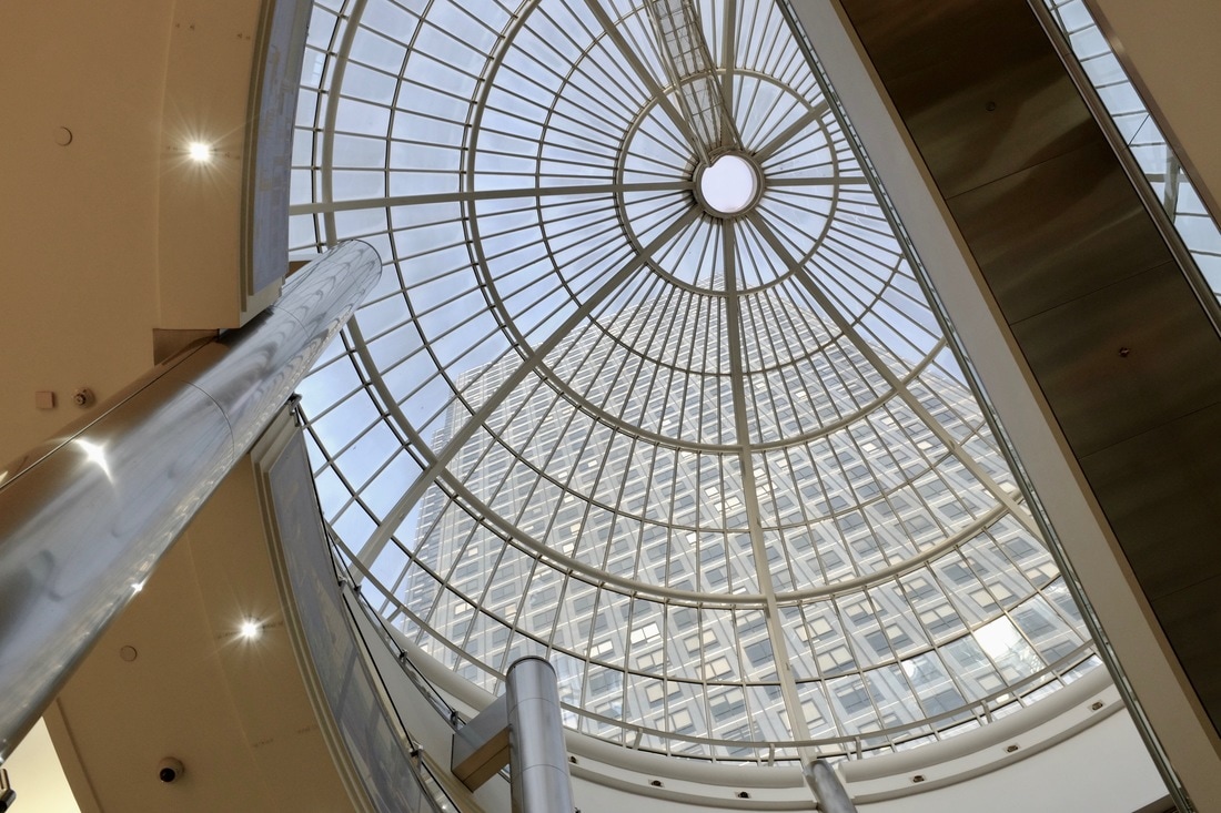
Theme: Abstract/lines/contrast
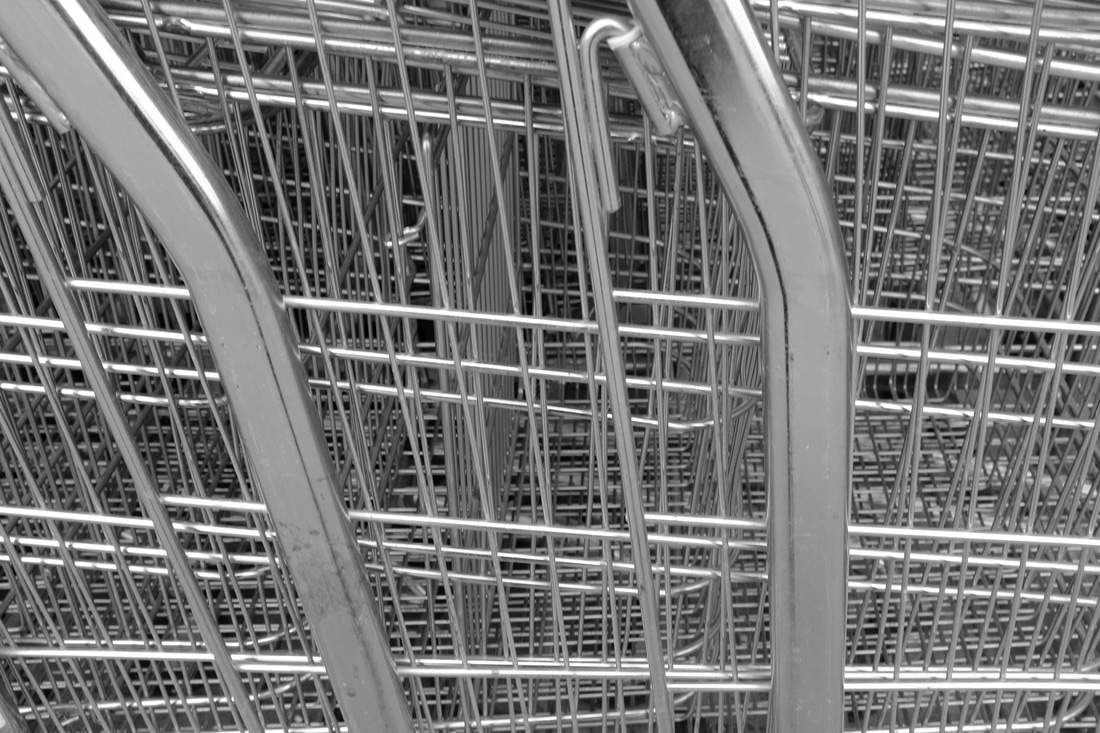
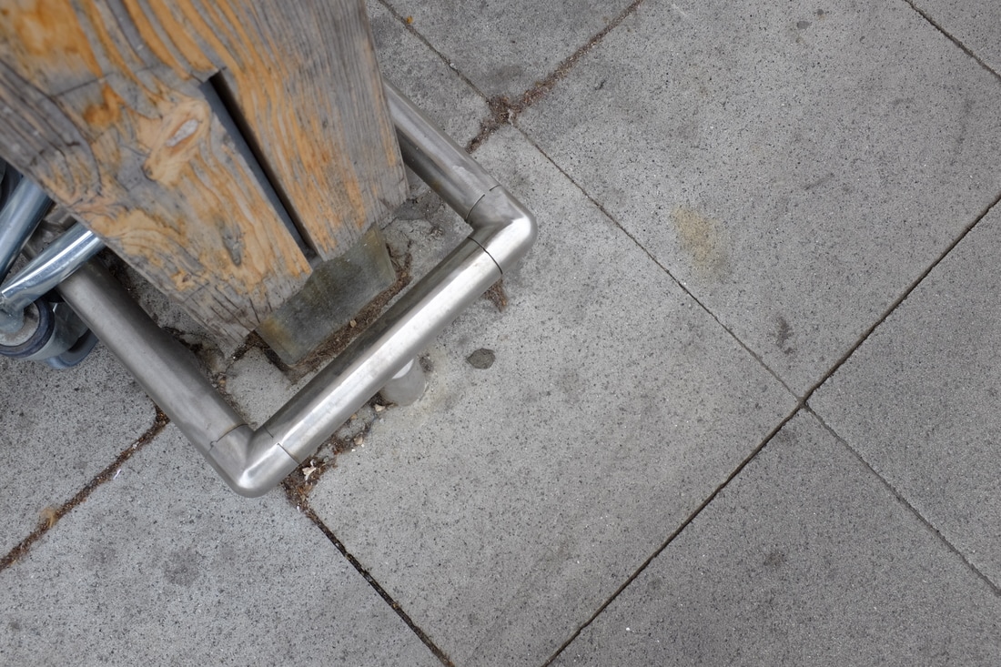
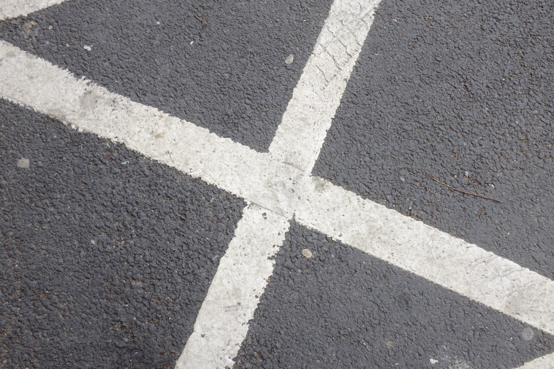
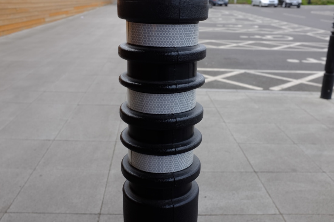
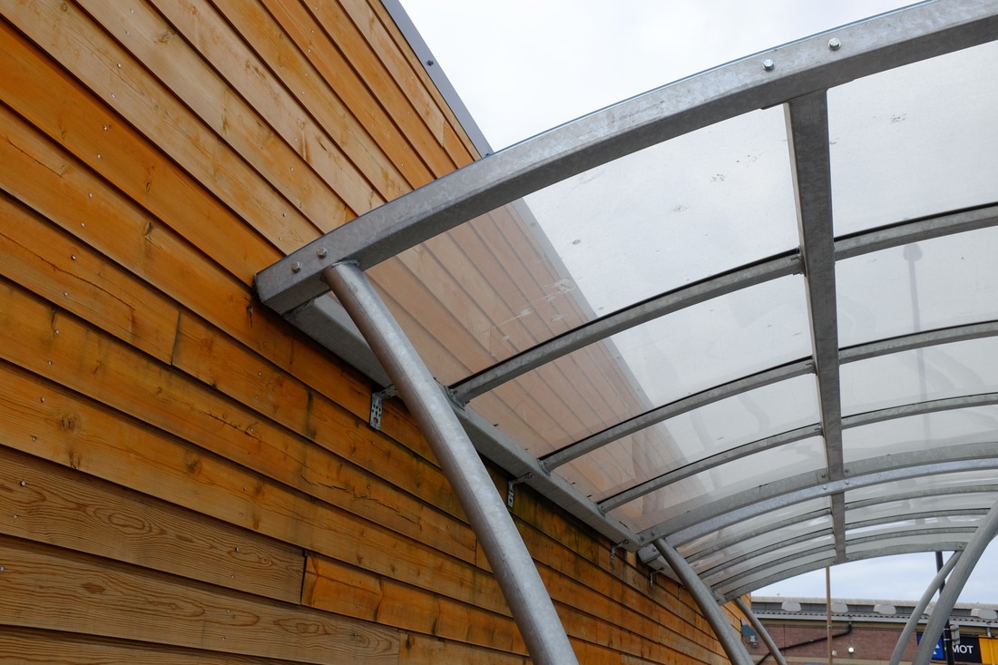
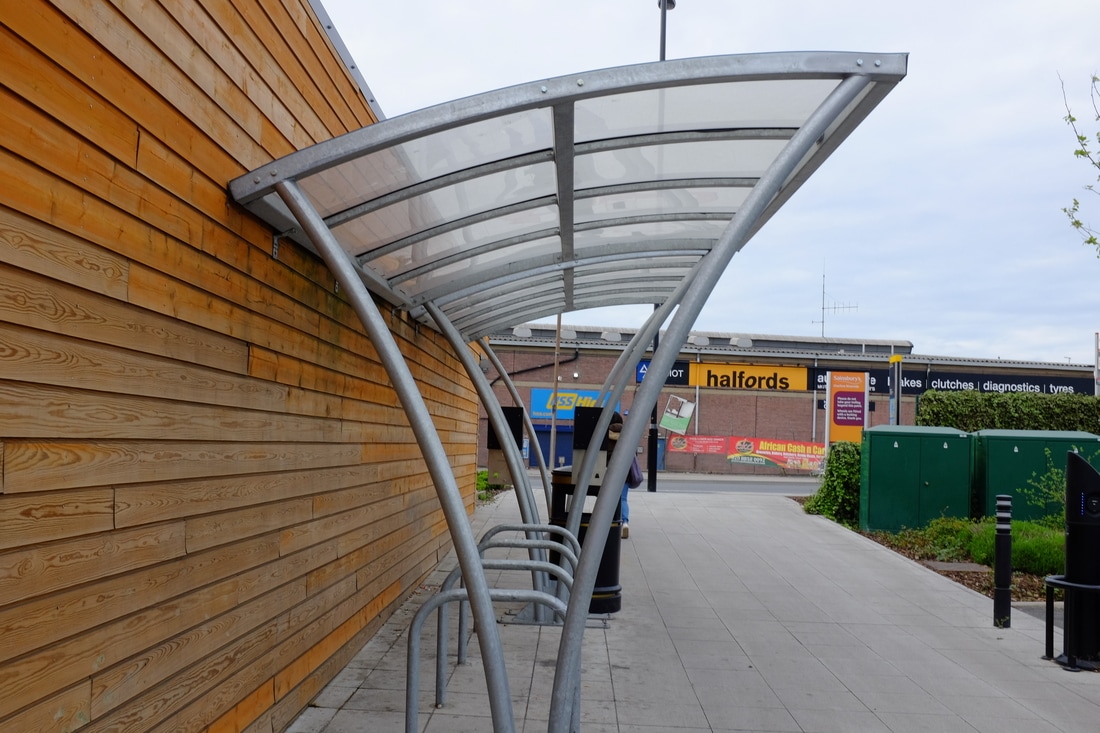
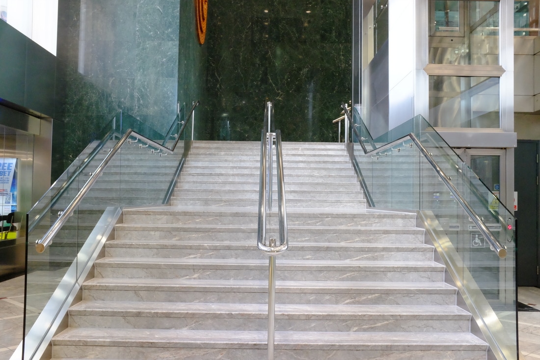
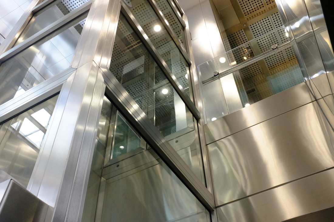
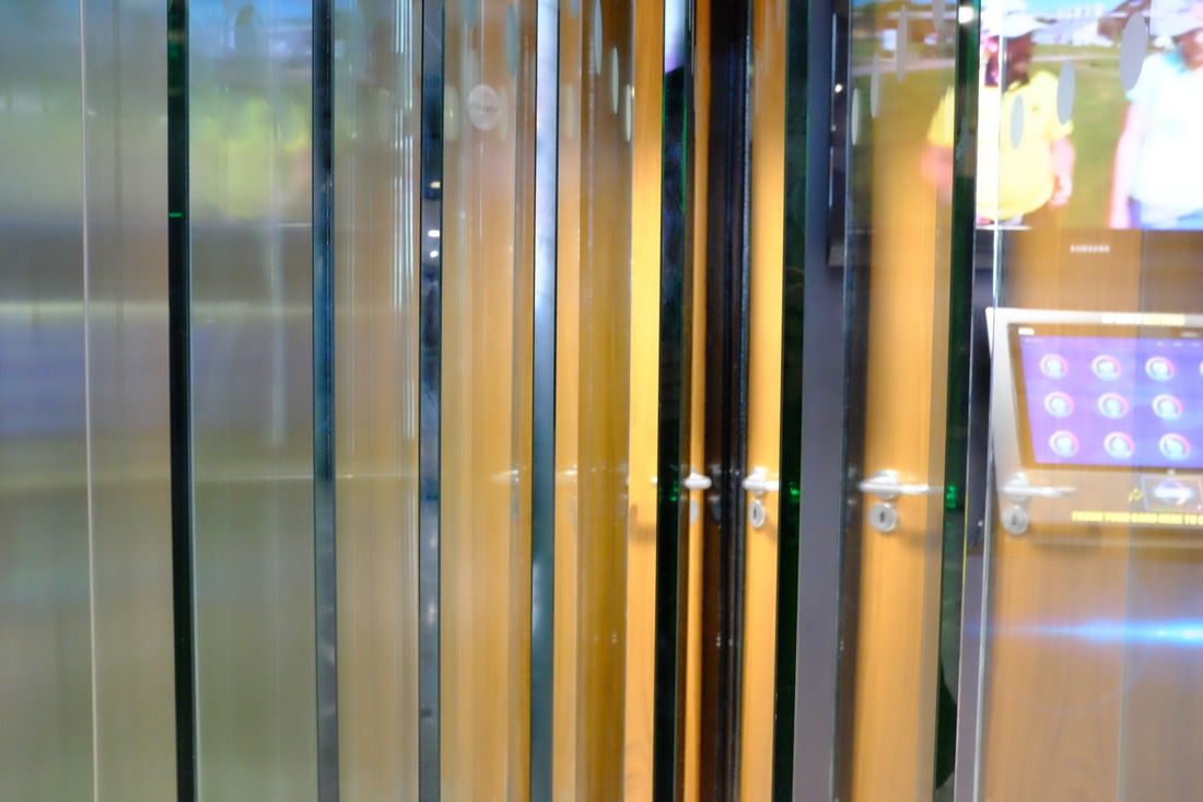

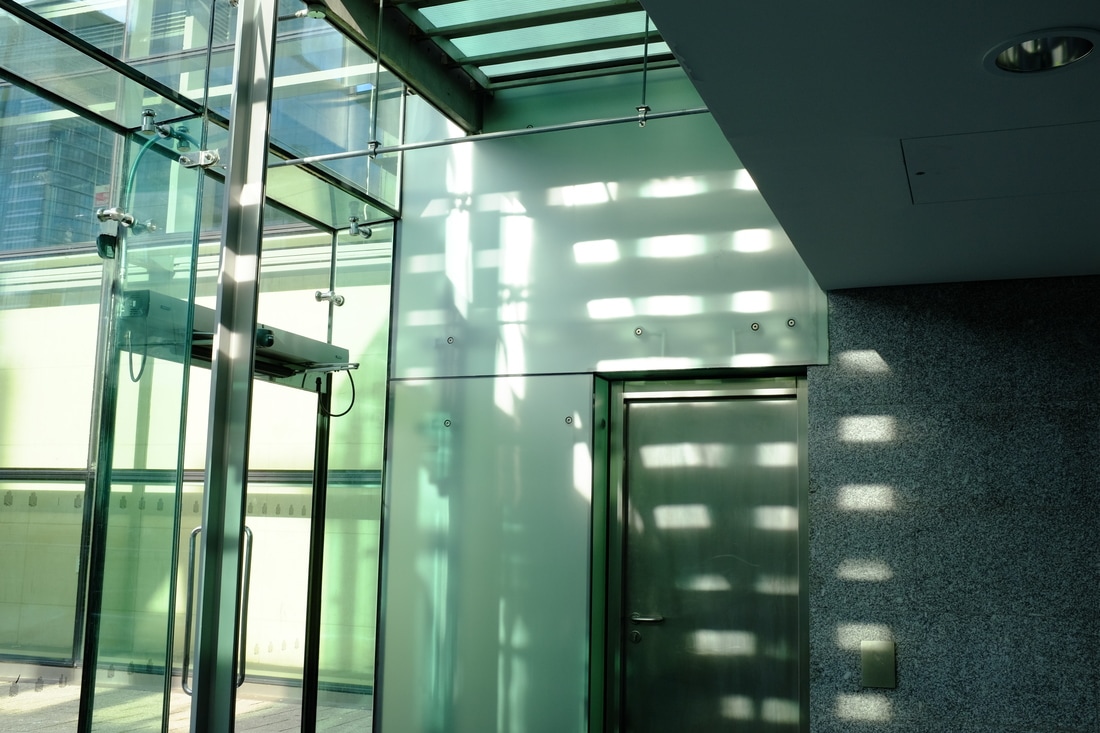
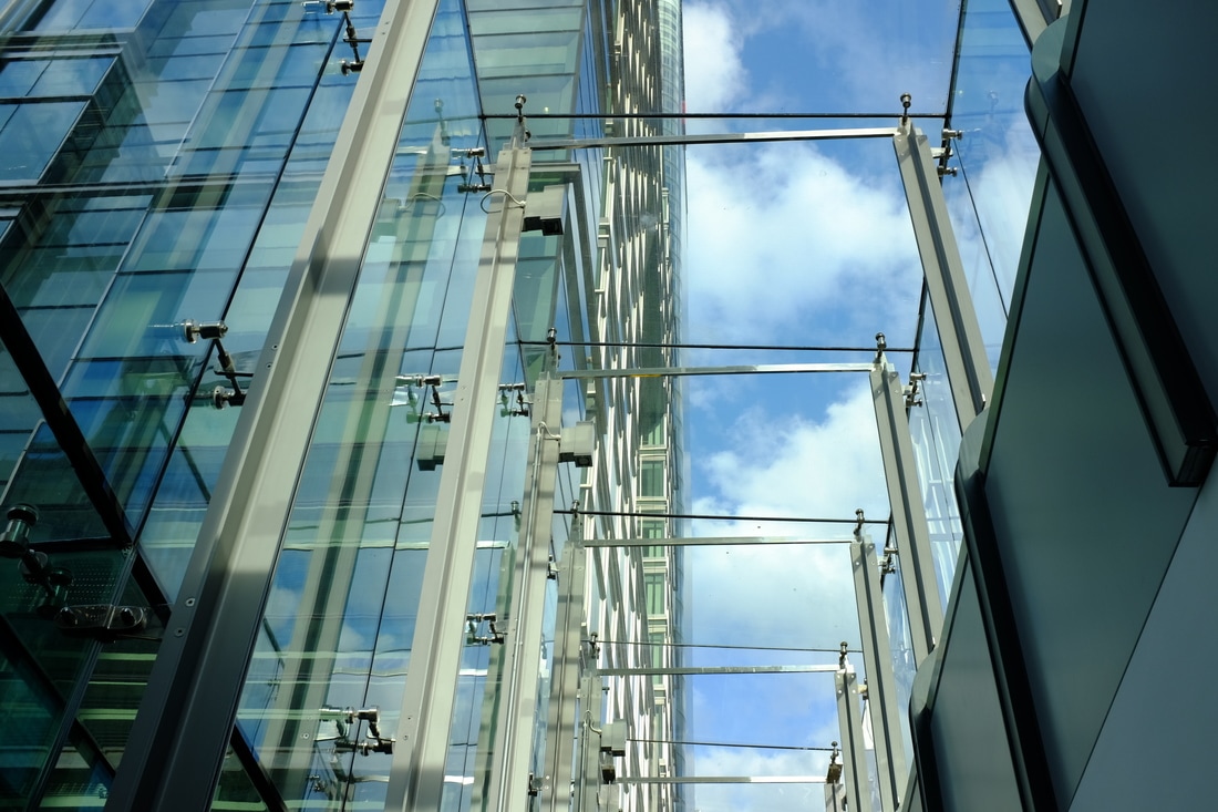
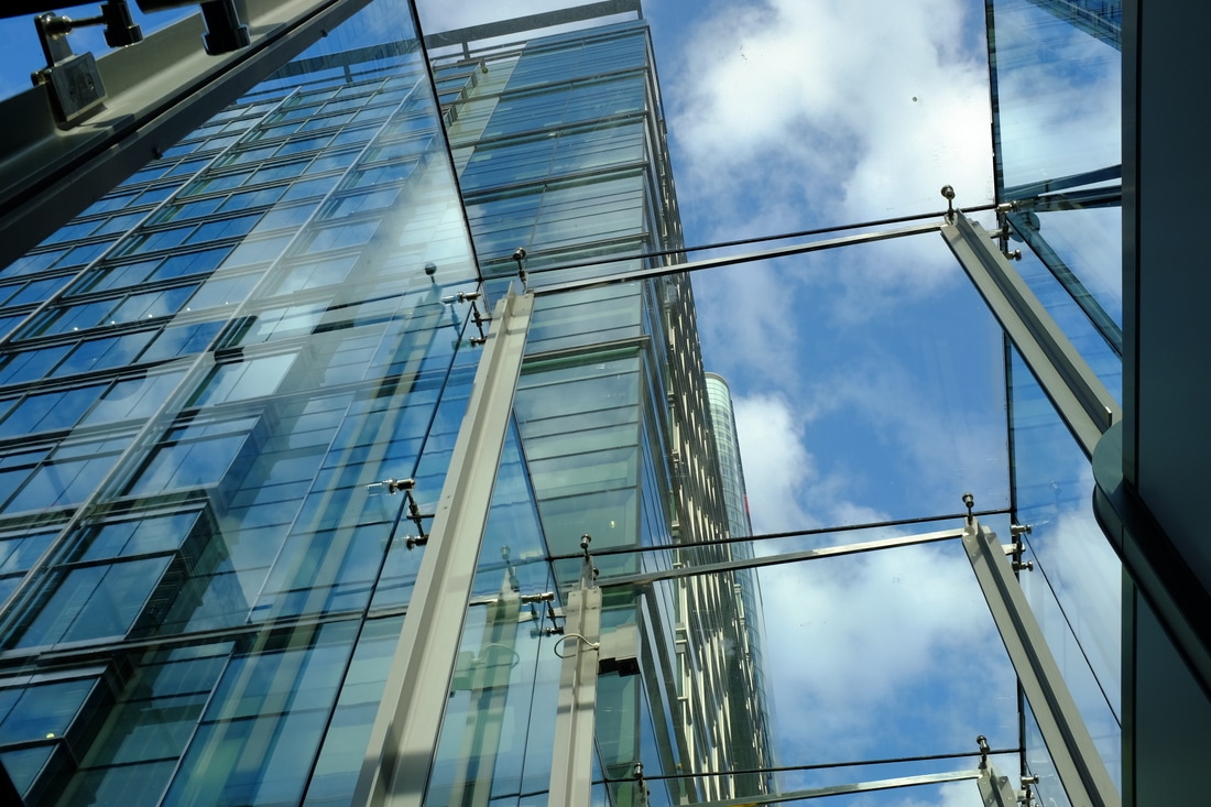
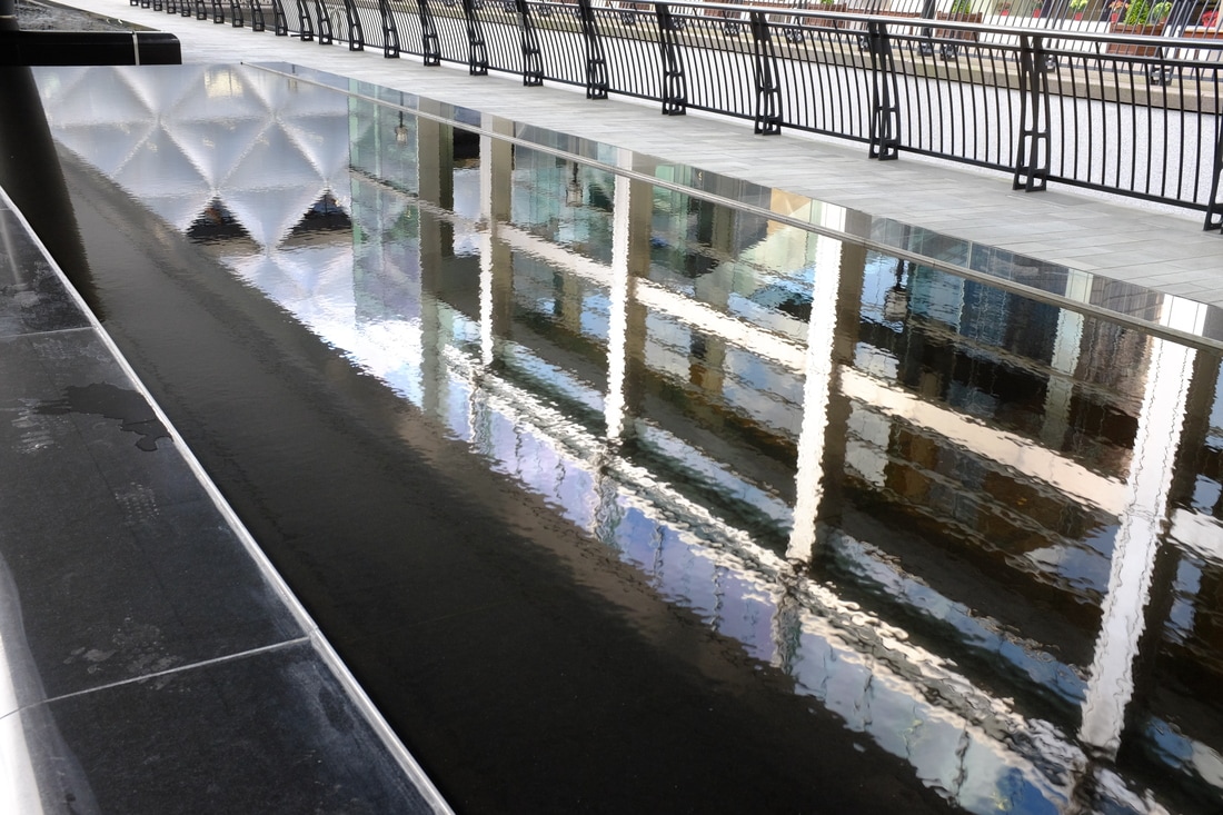
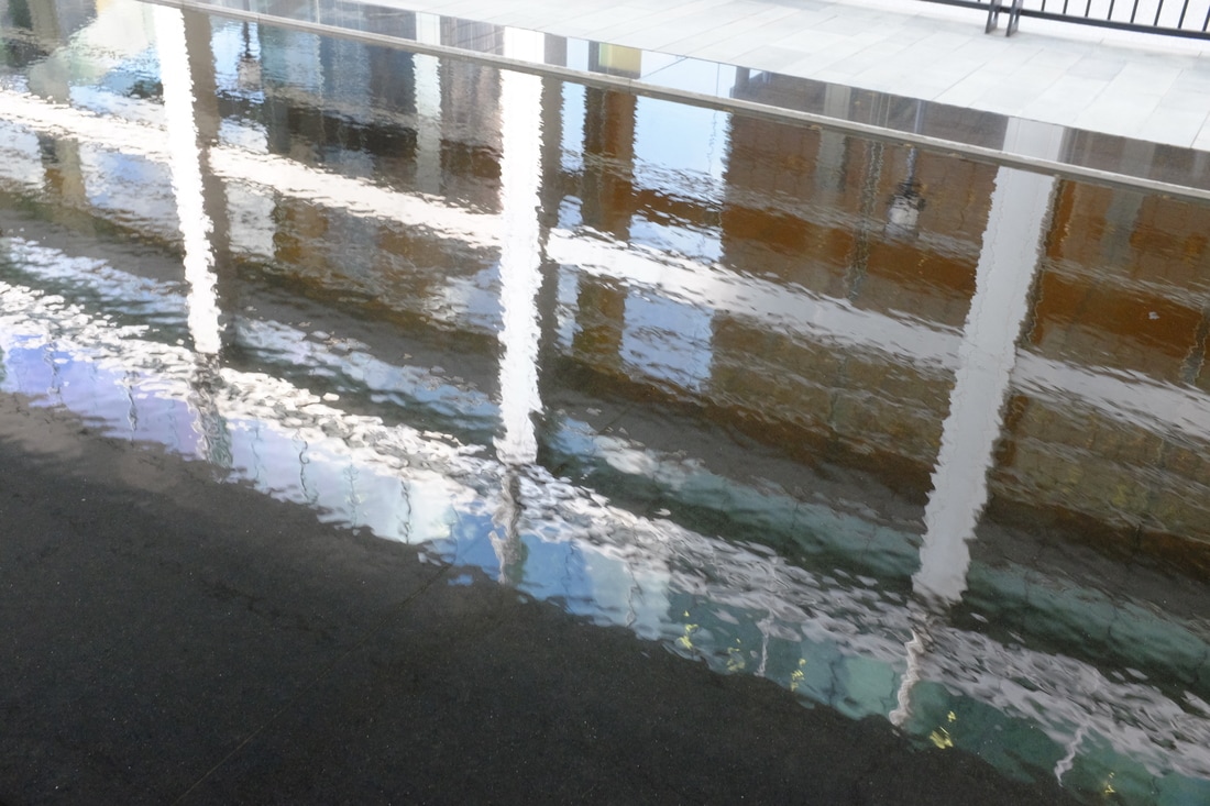
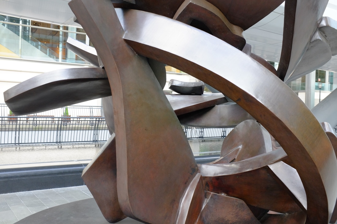
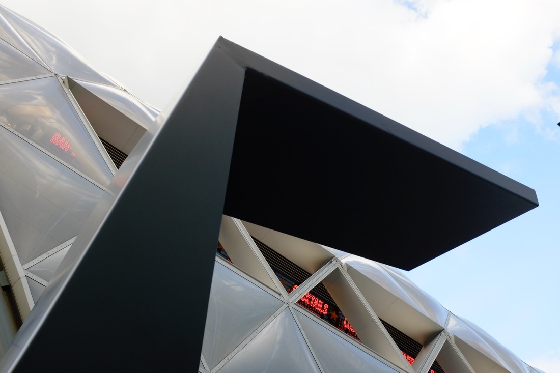
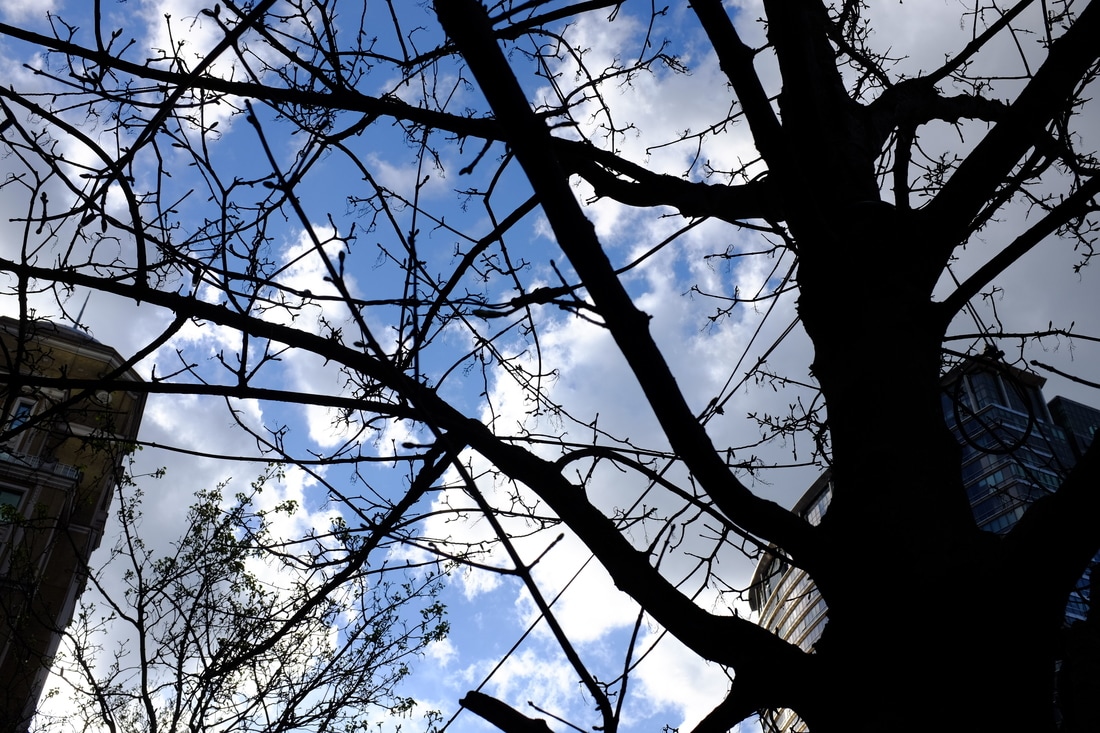
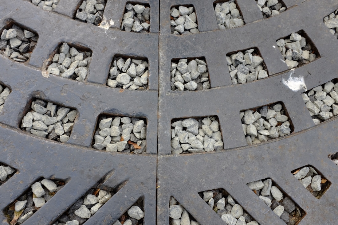
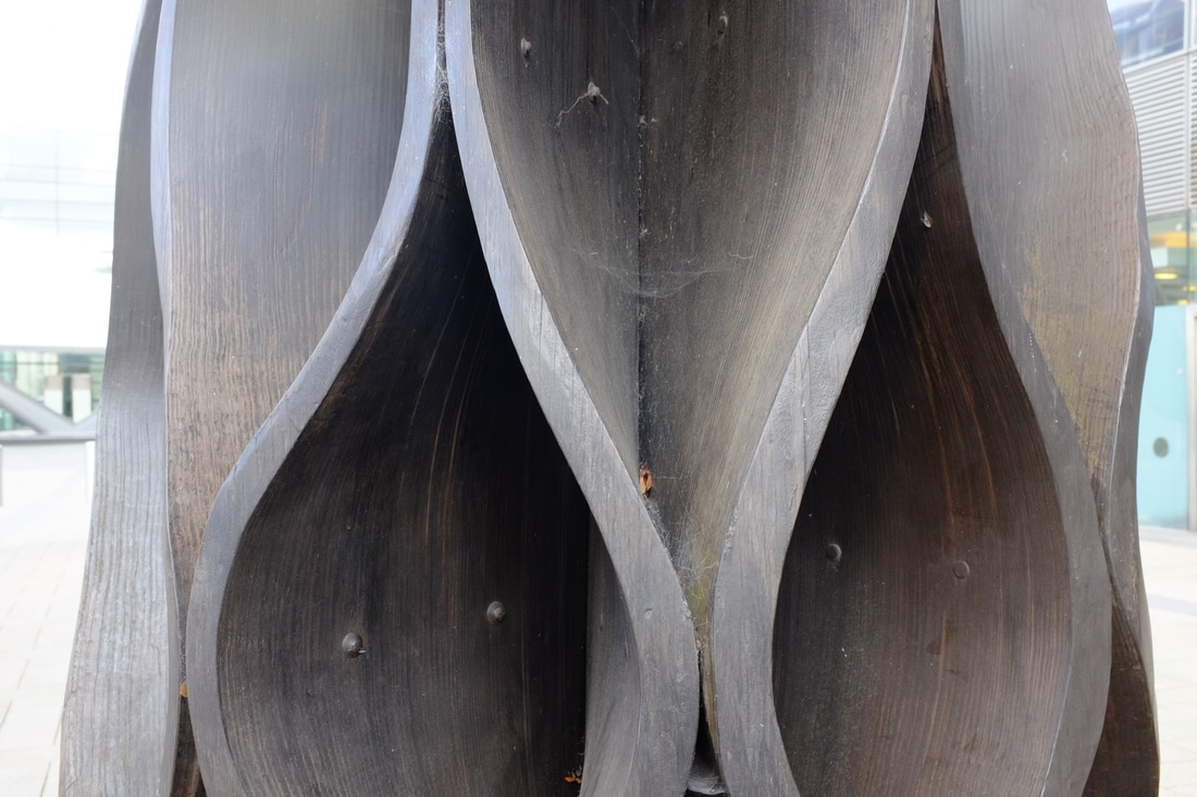
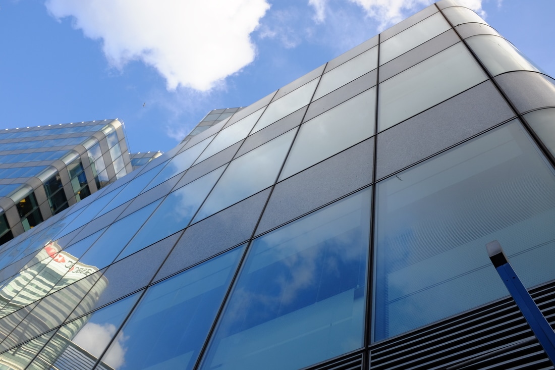
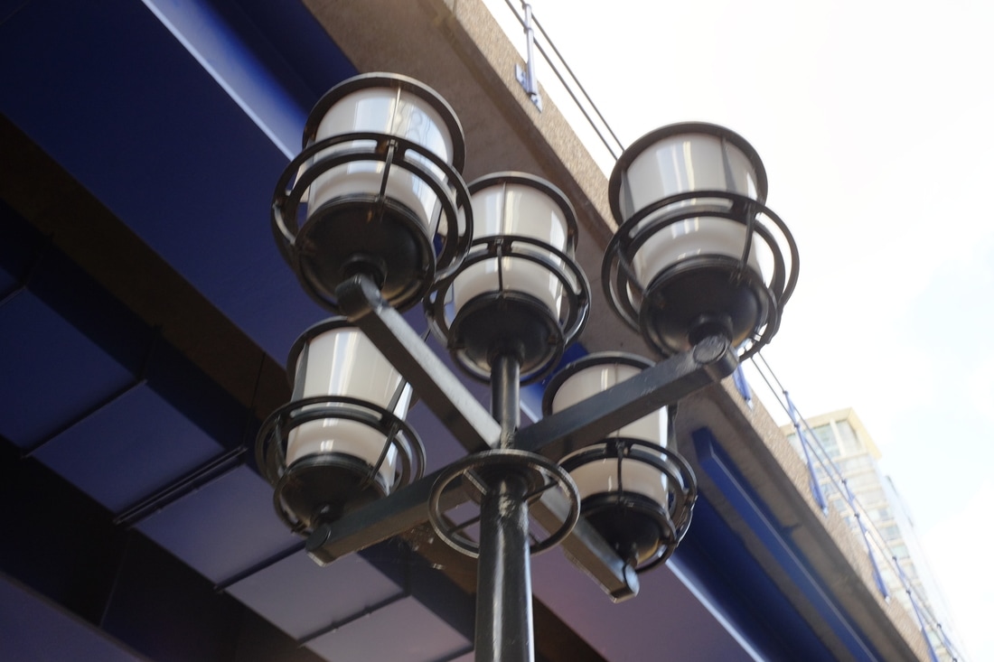
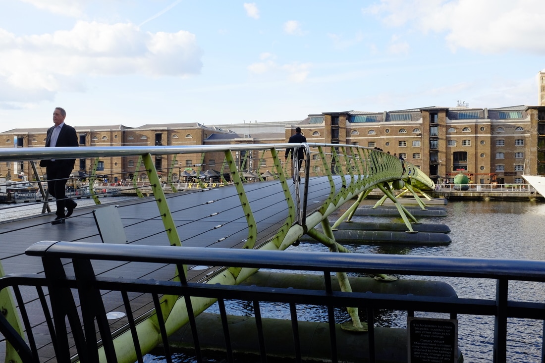
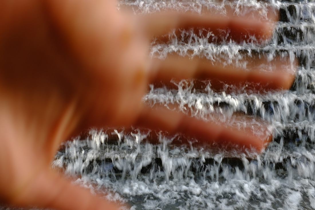
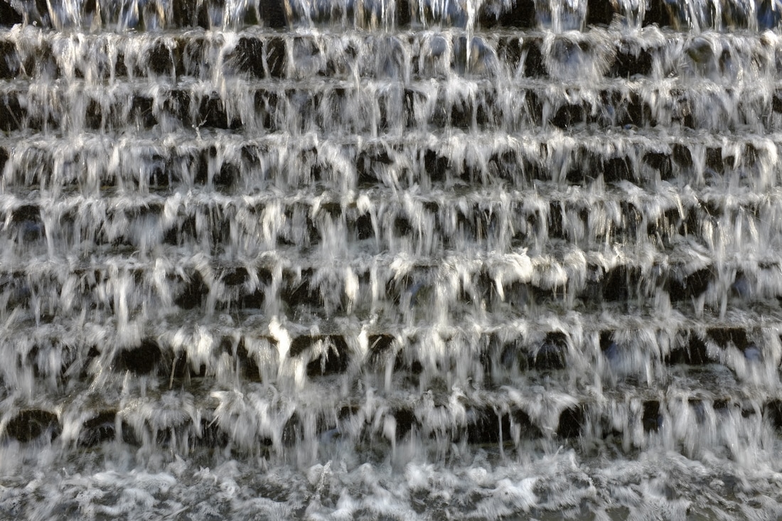
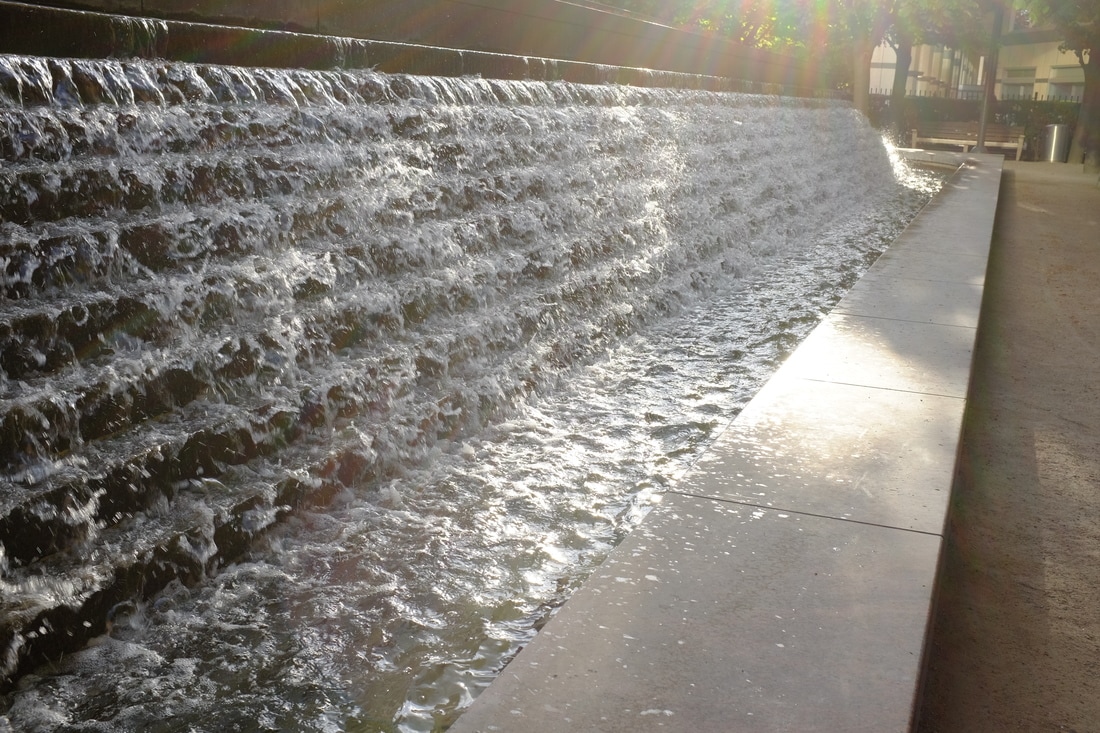
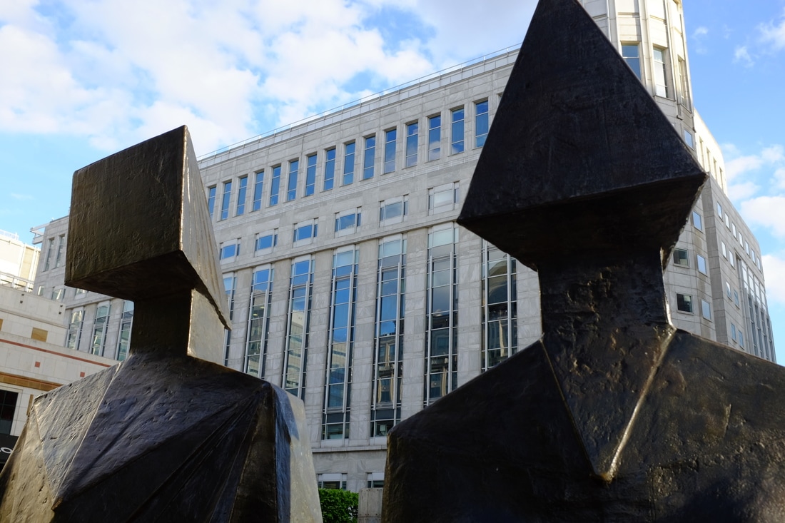
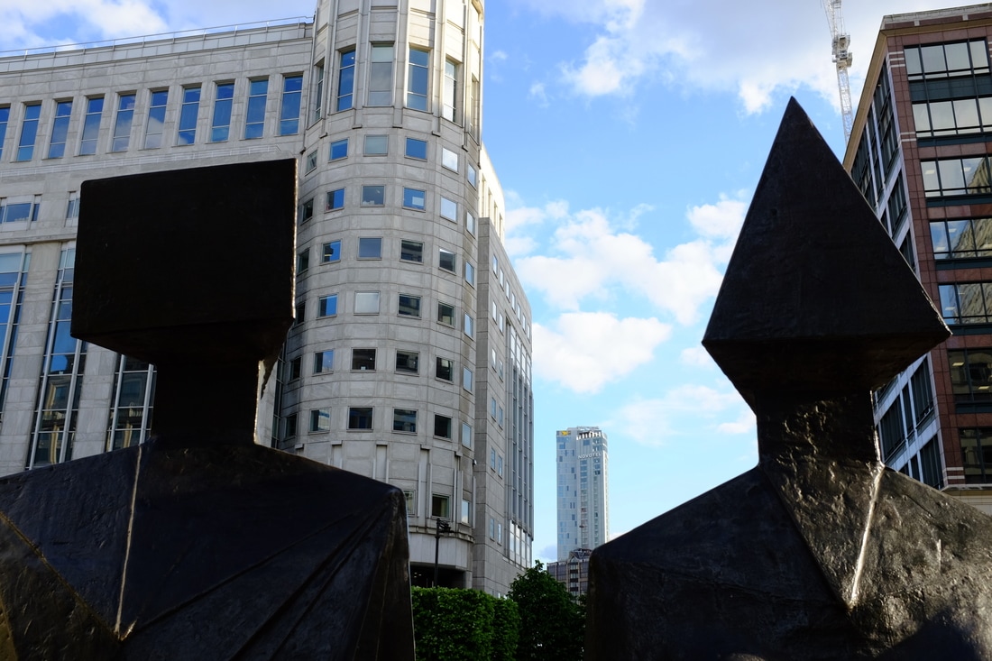
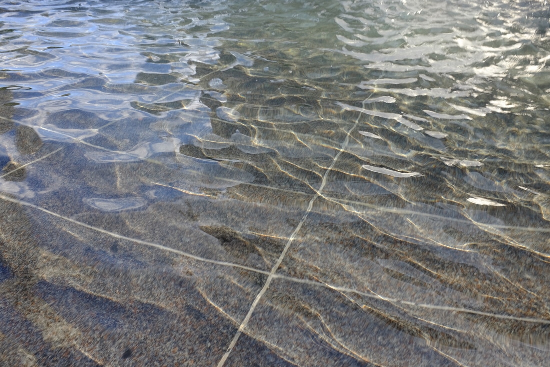
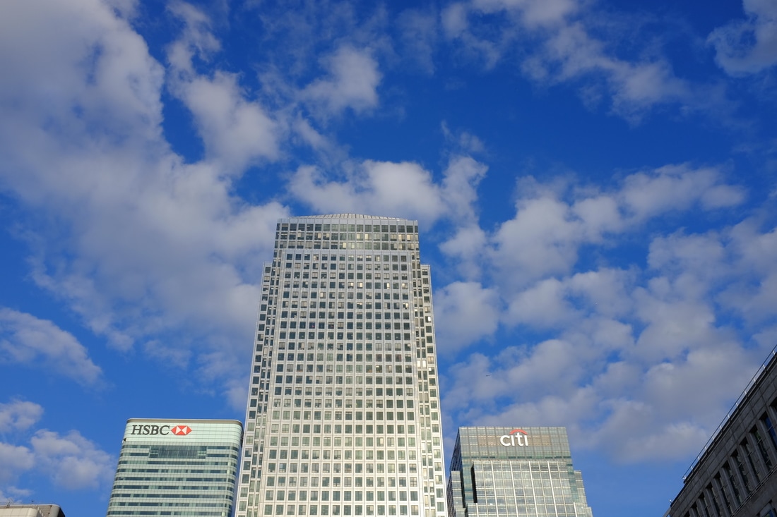
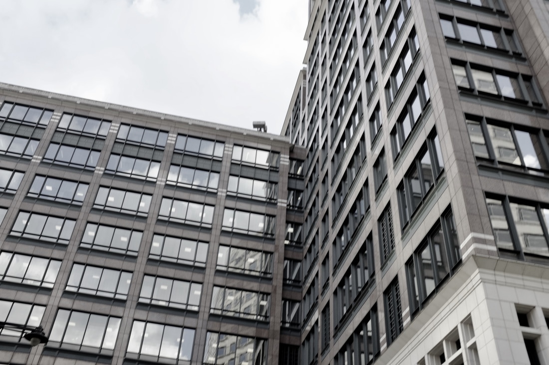
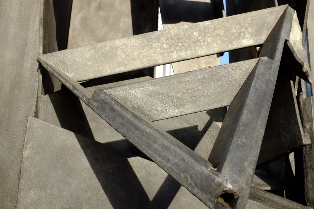
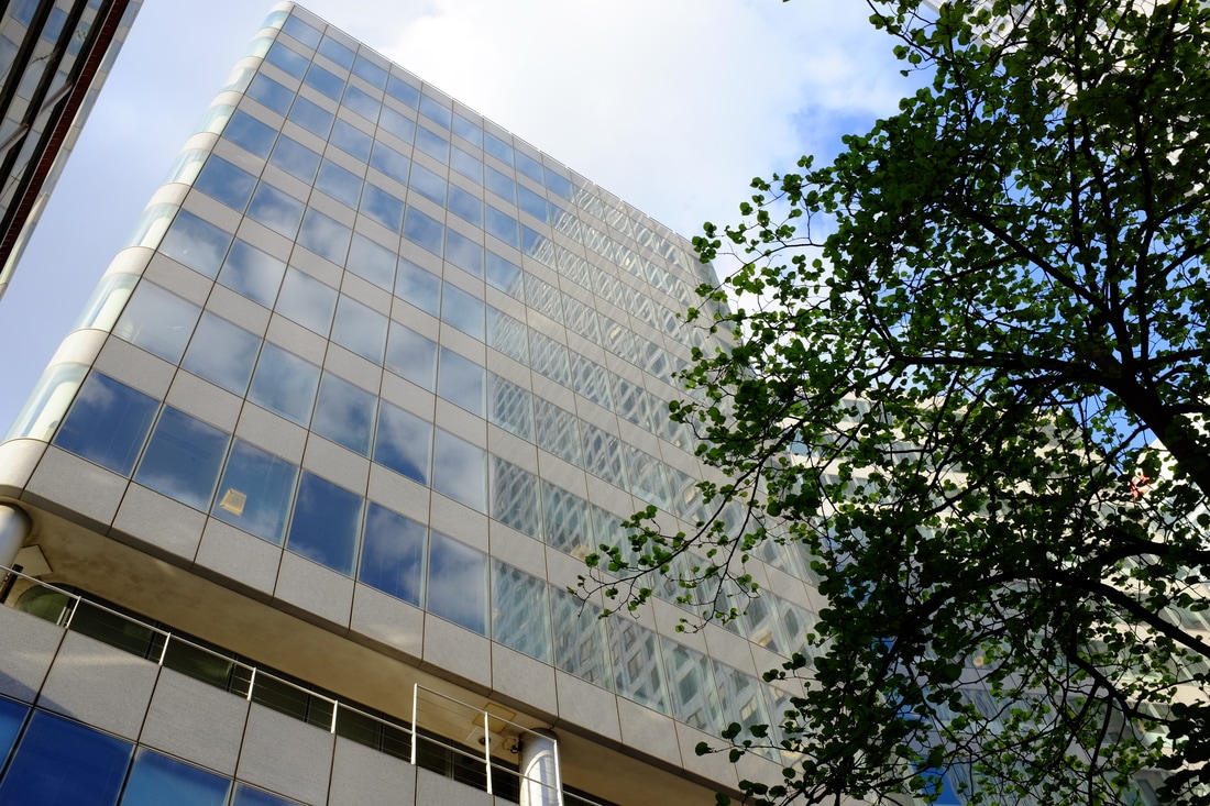
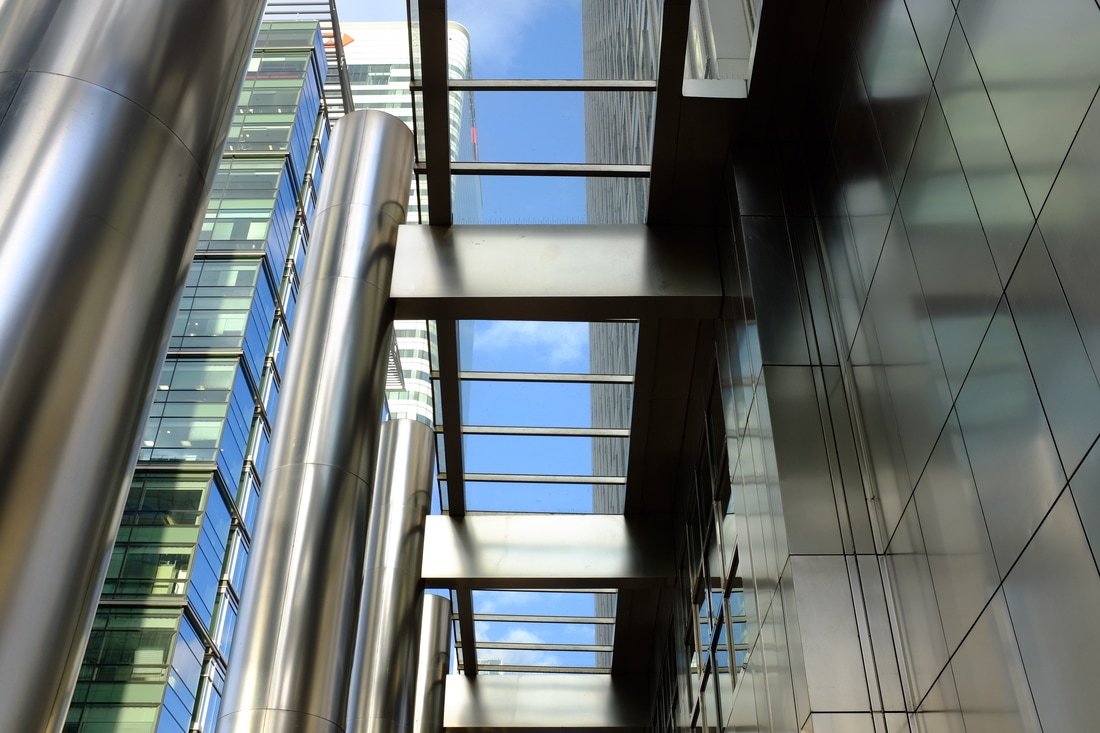
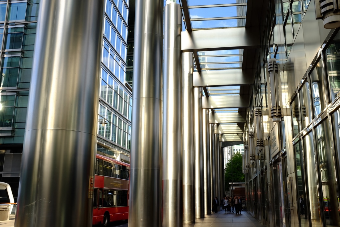
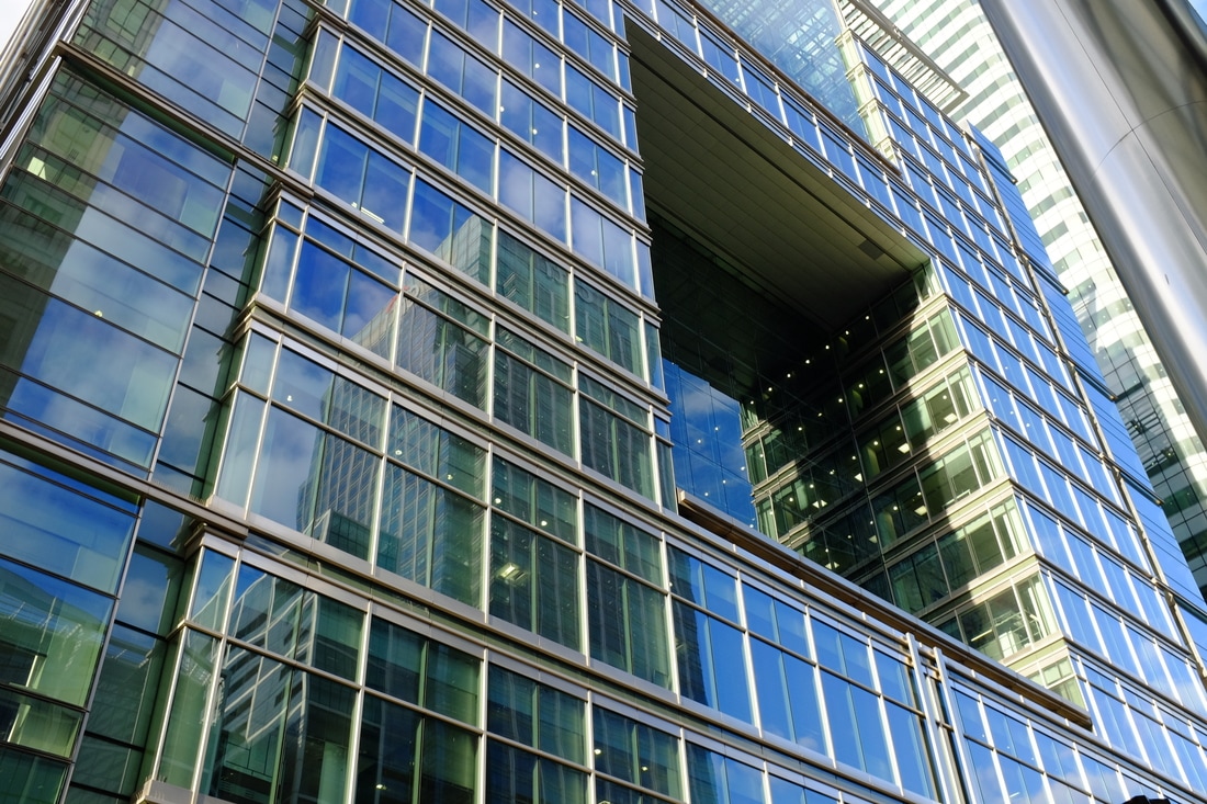
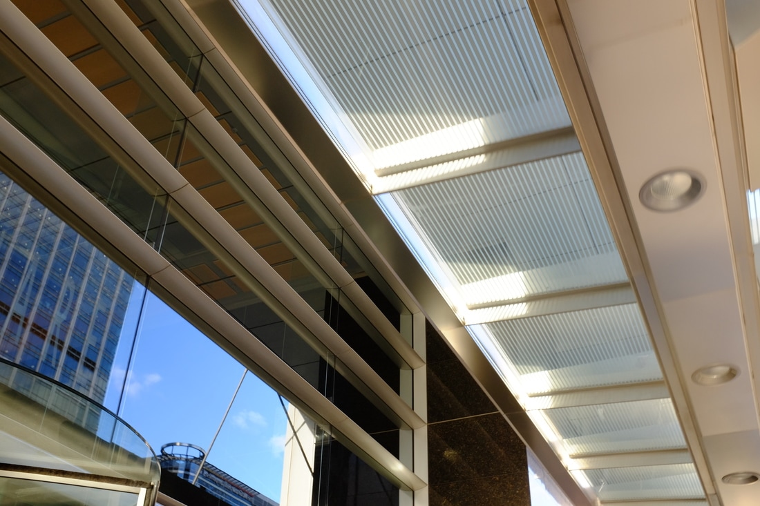
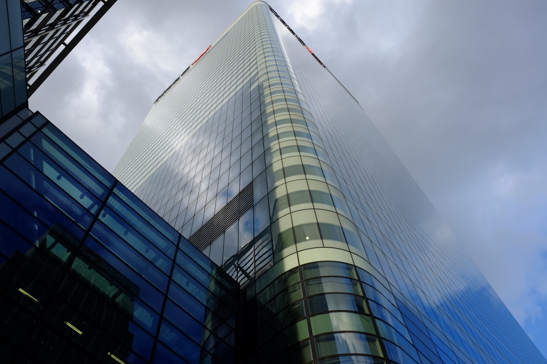
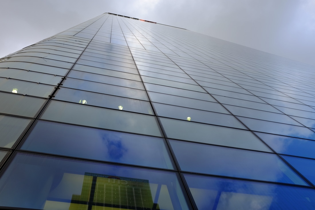
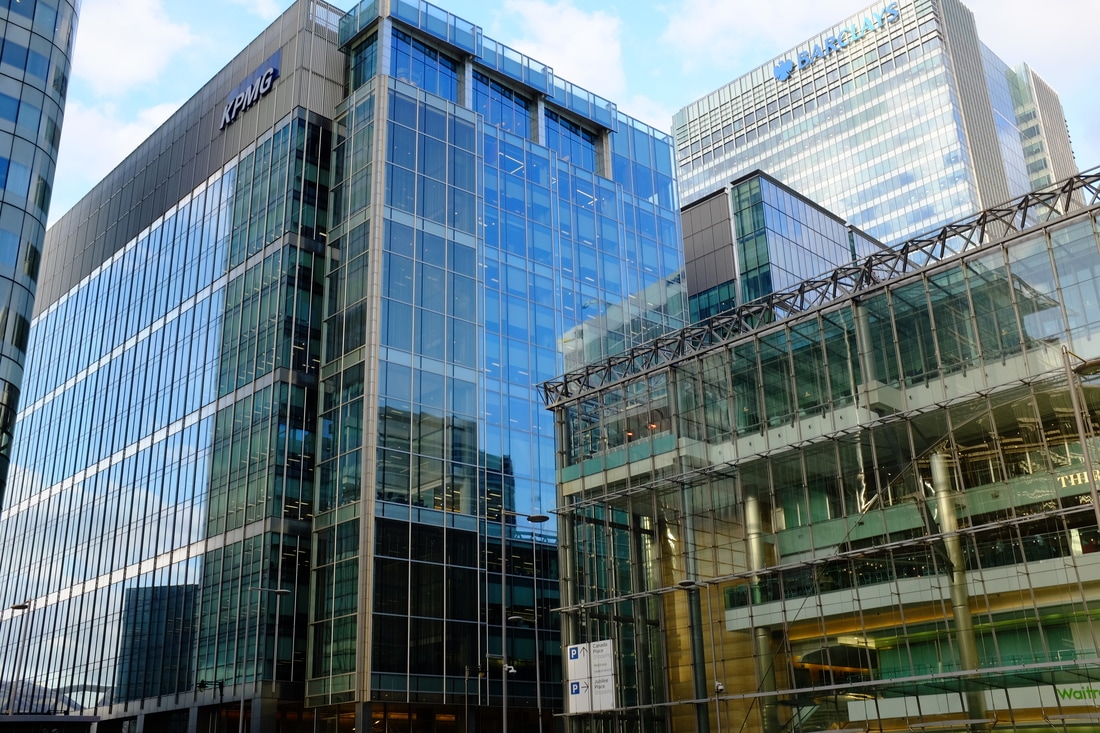
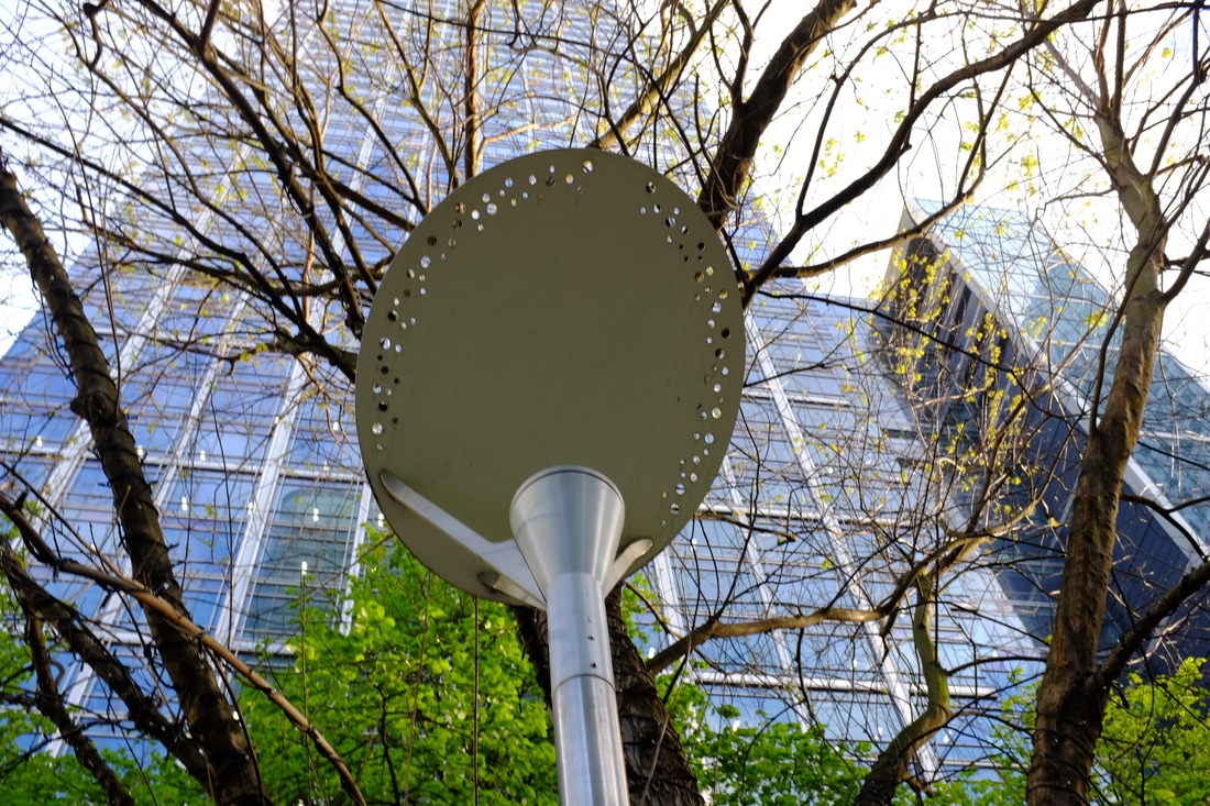
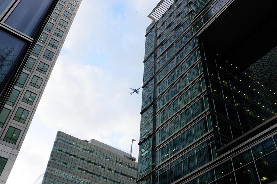
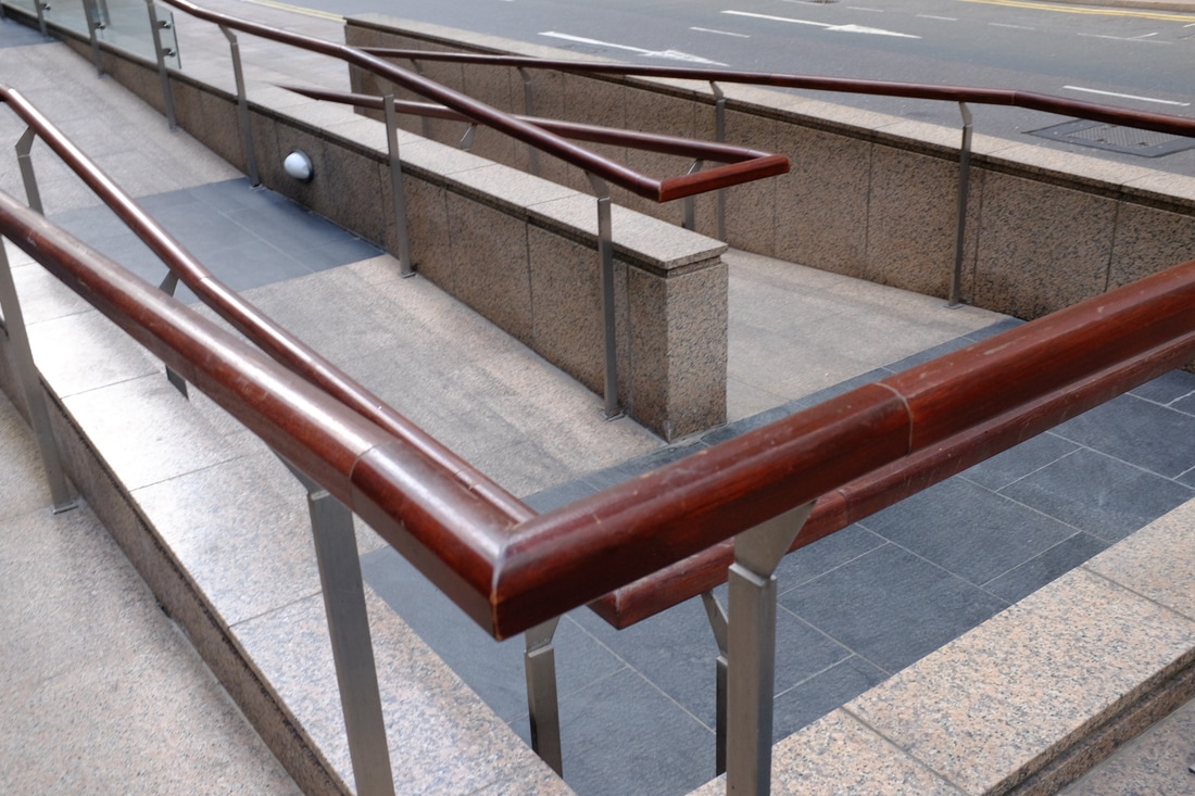
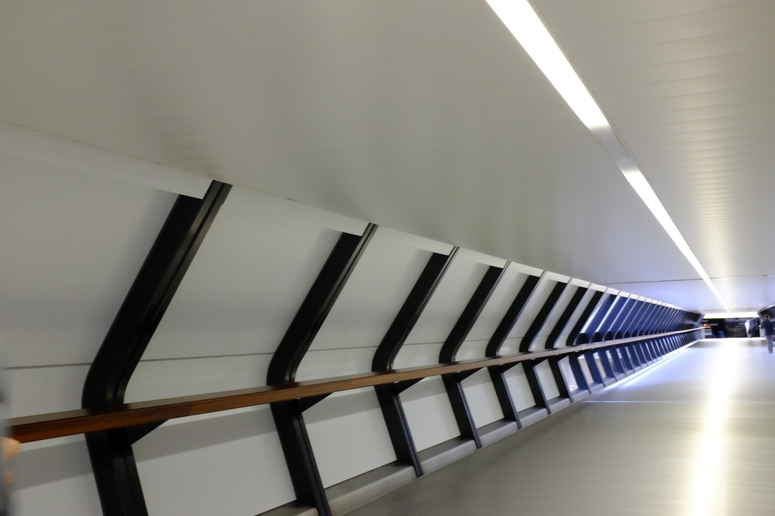
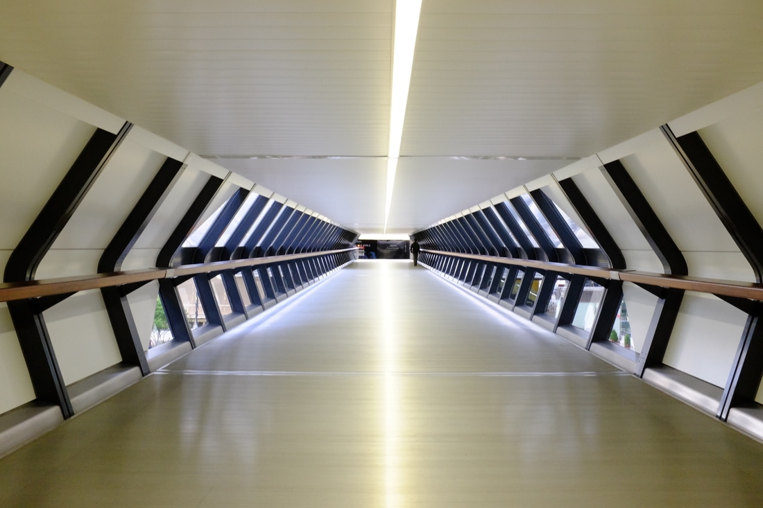
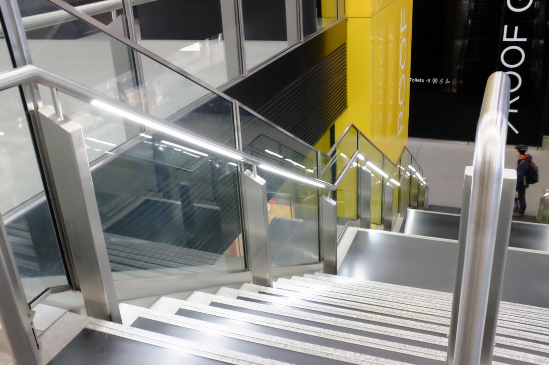
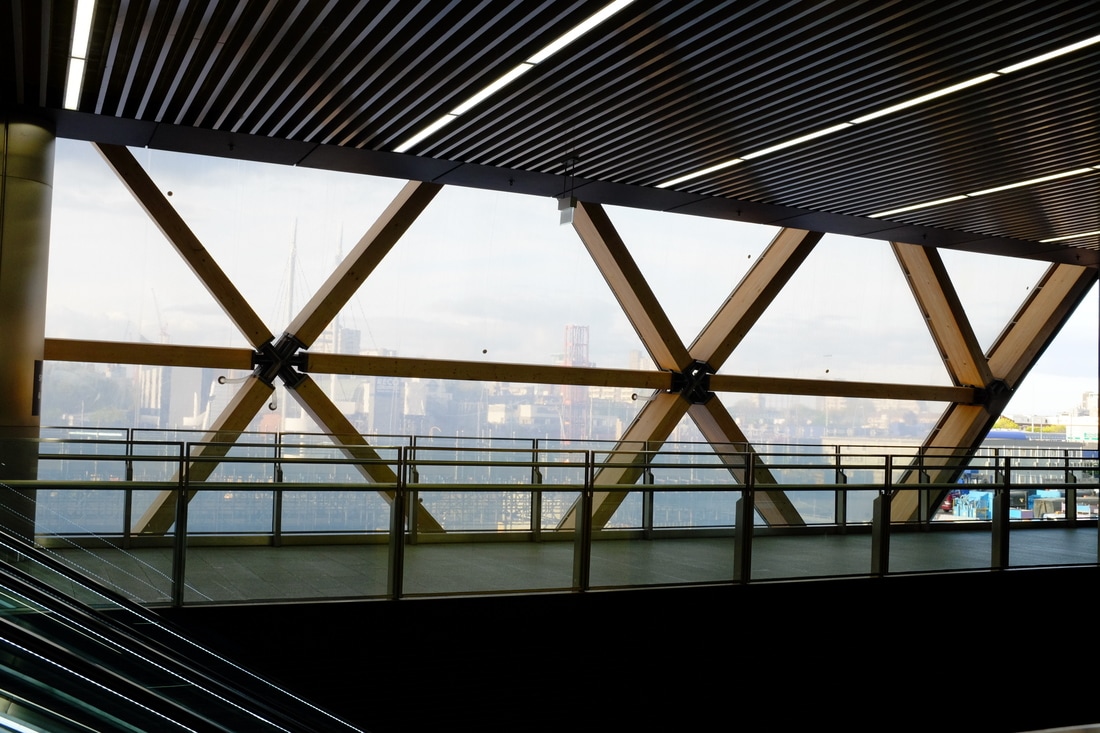
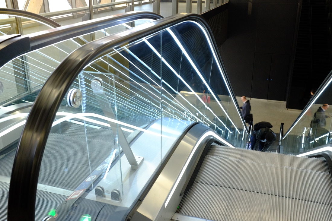
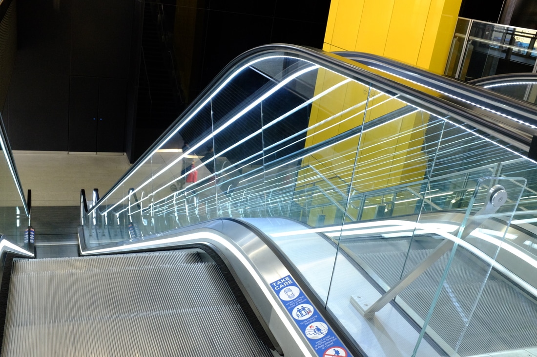
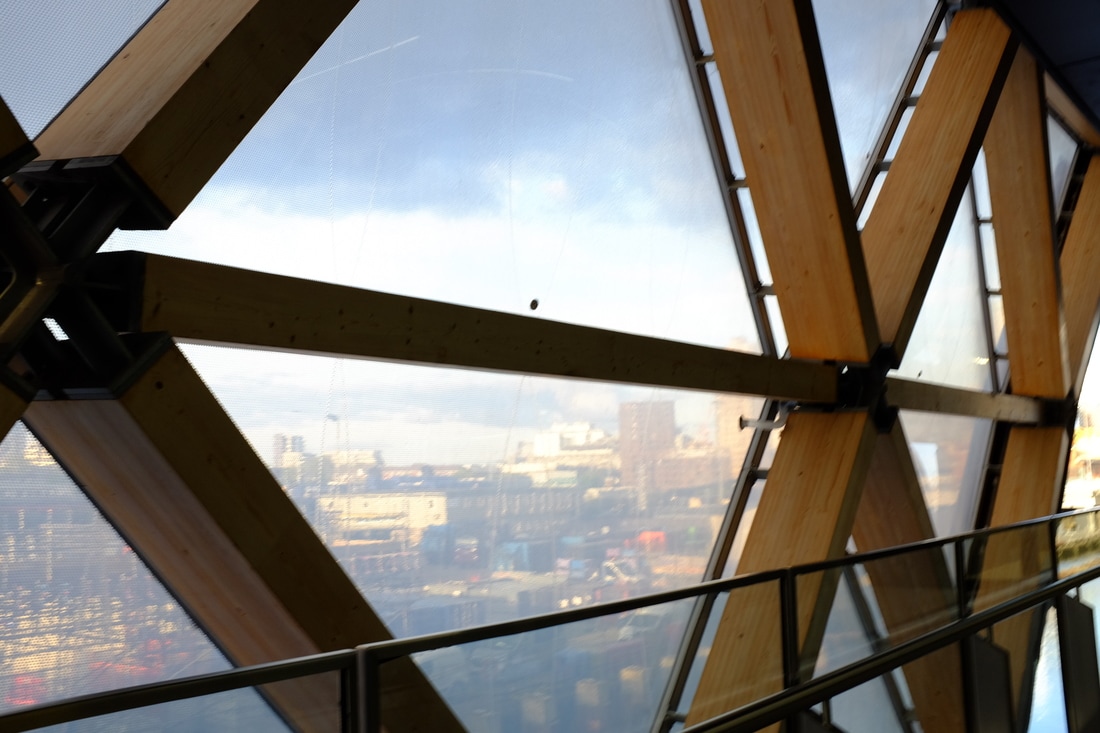
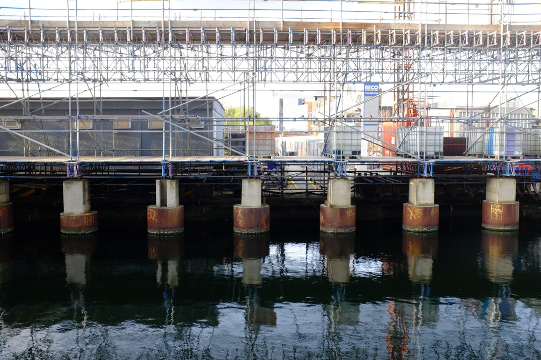
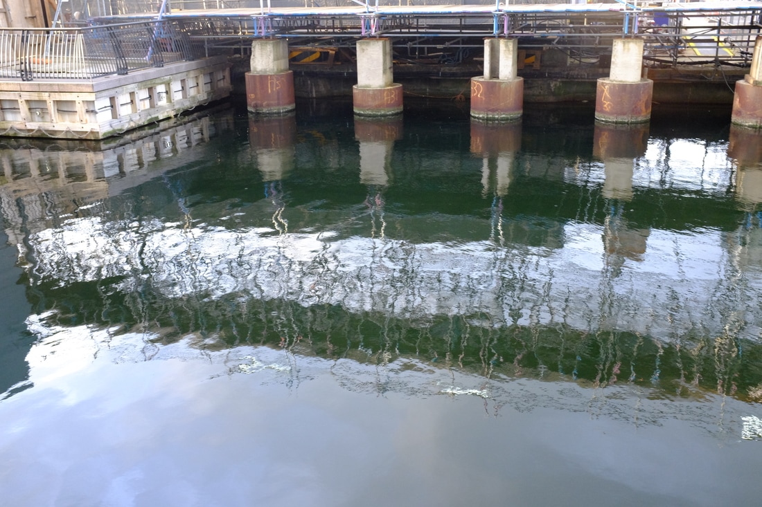
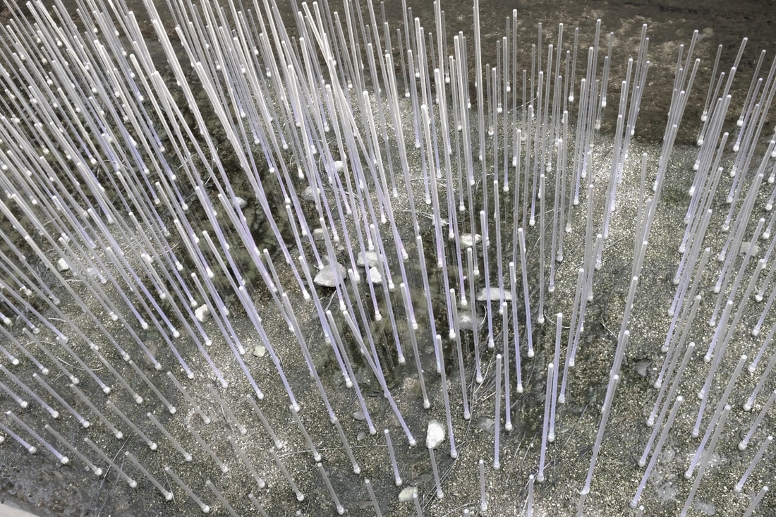
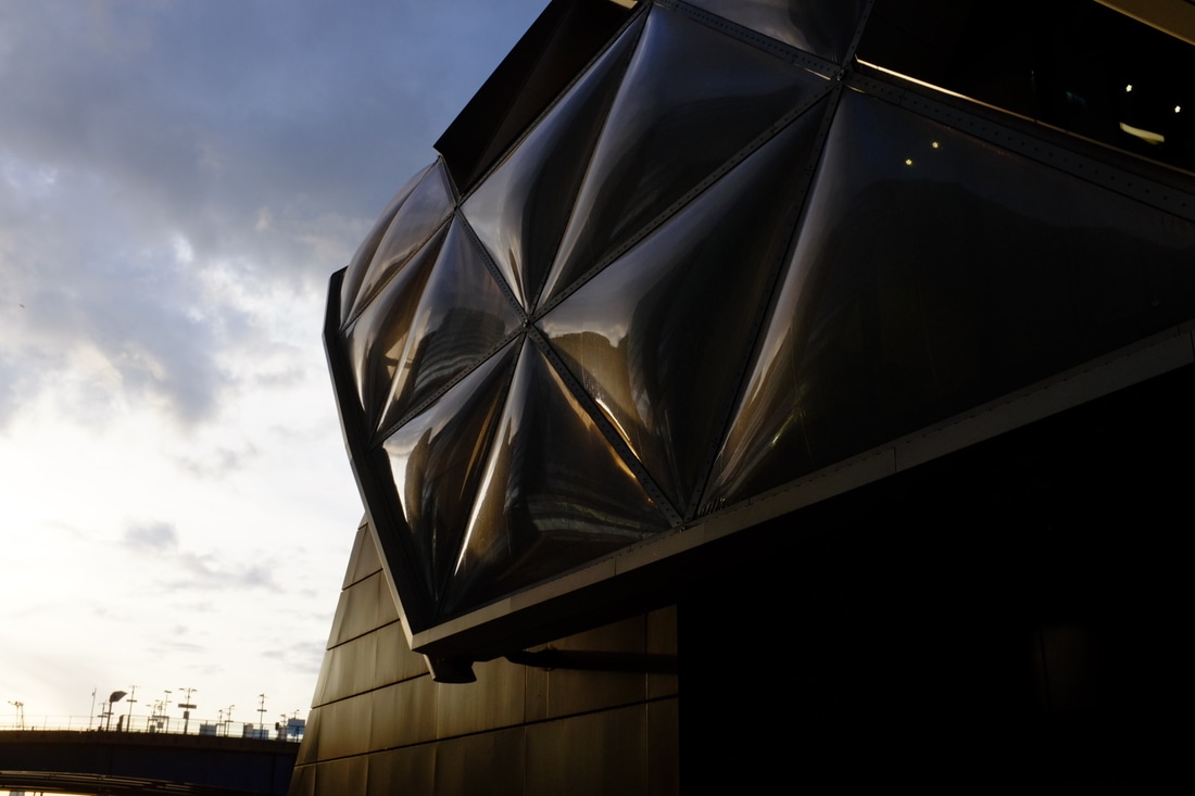
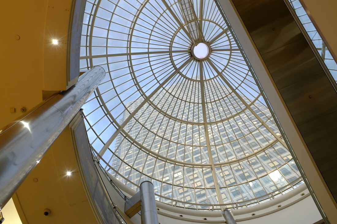
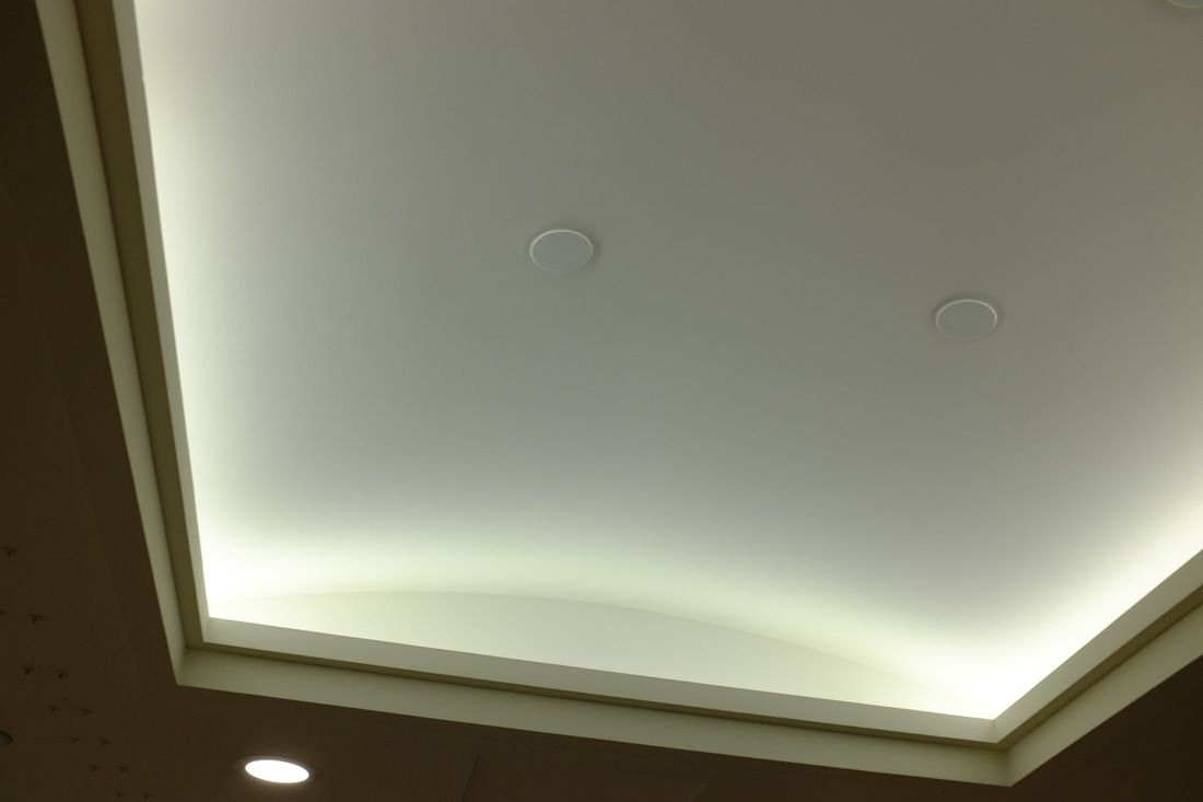
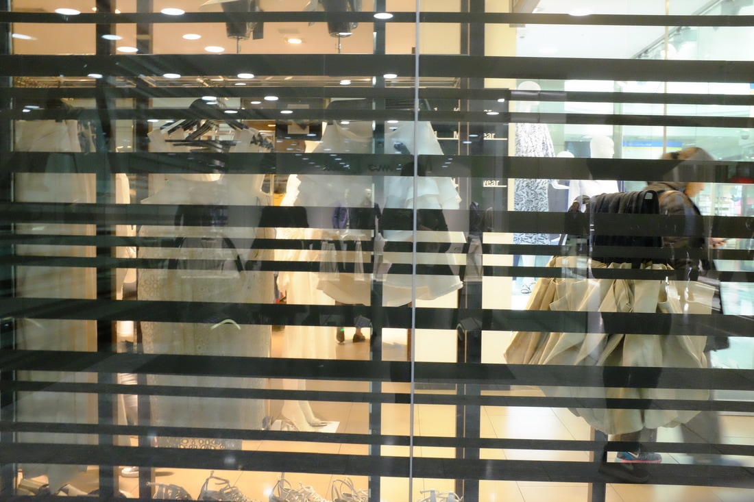
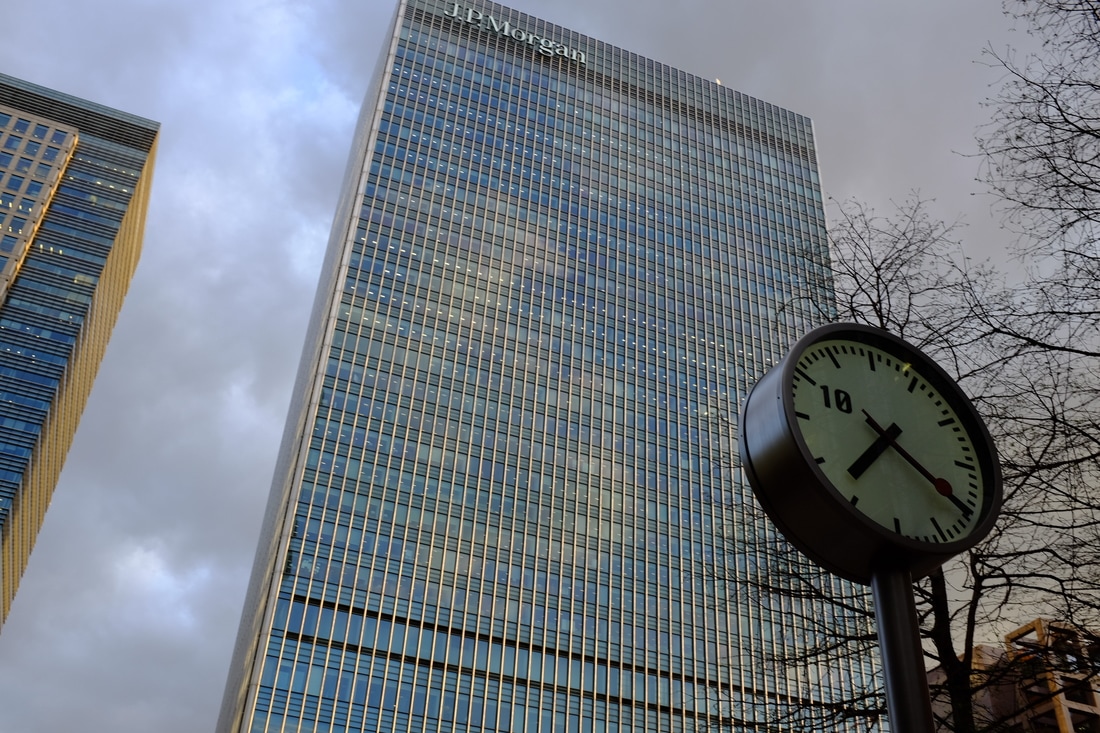
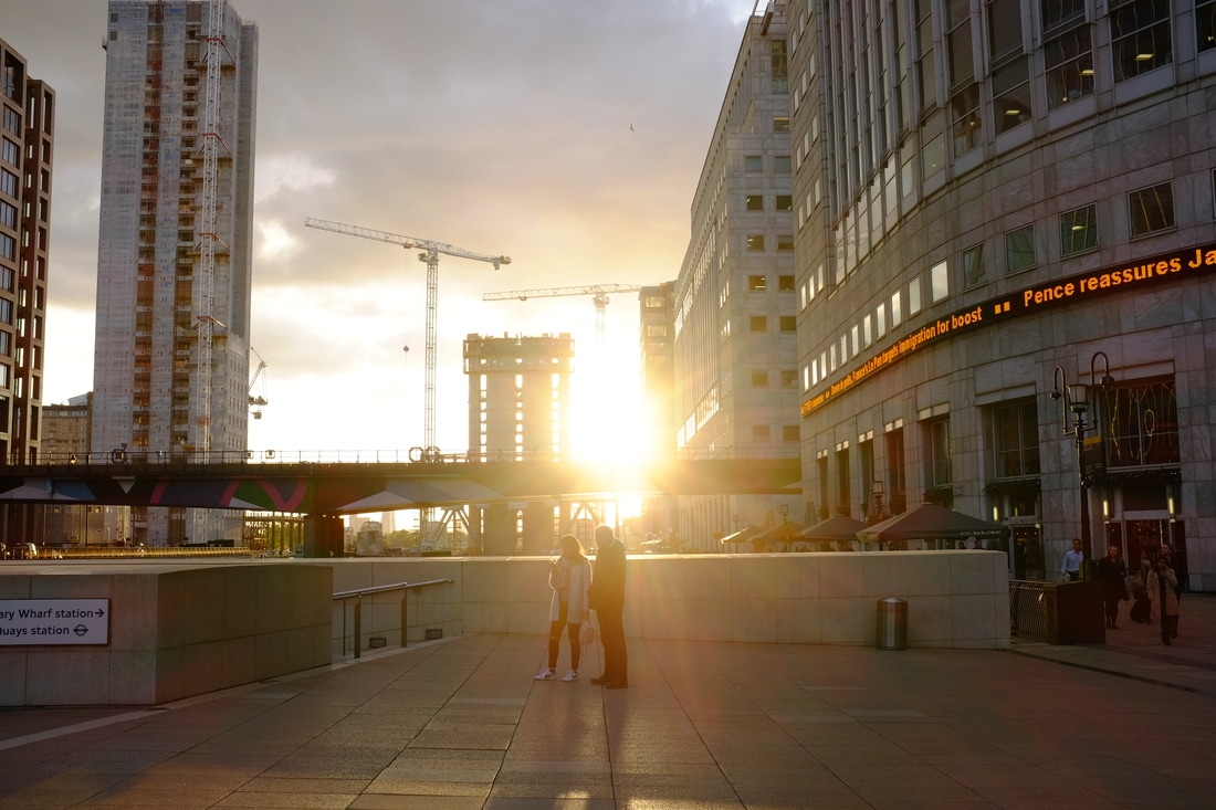
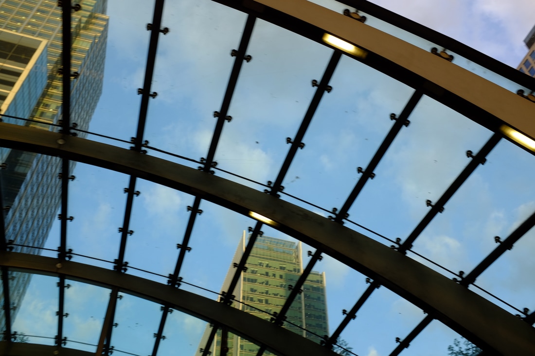
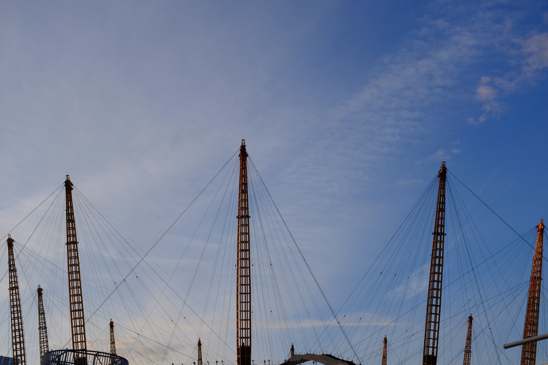
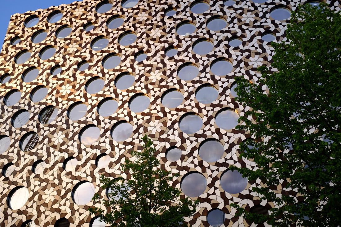
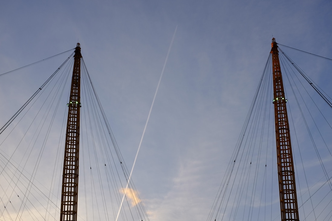
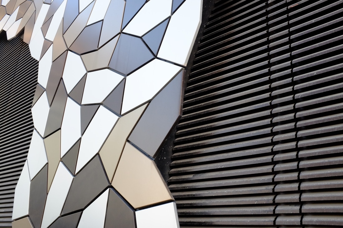
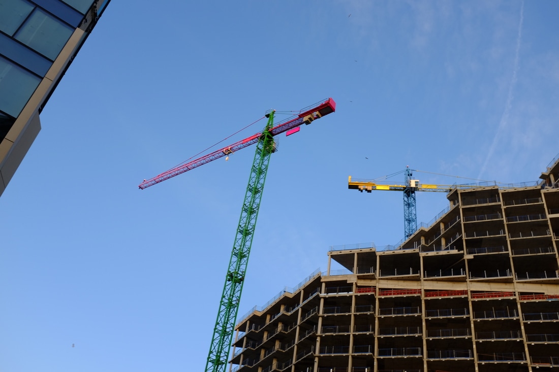
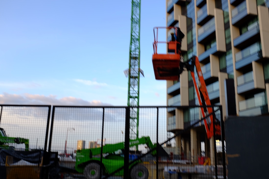
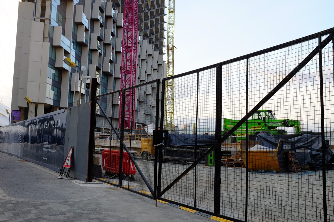
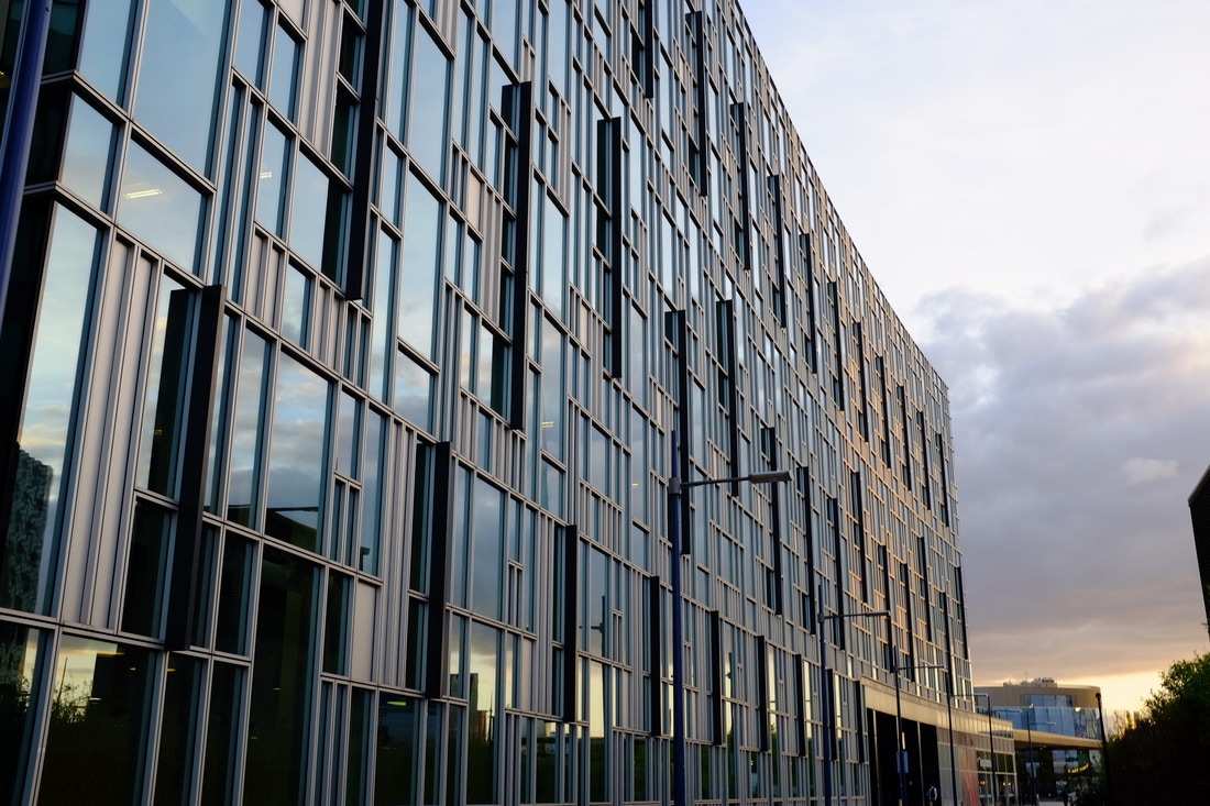
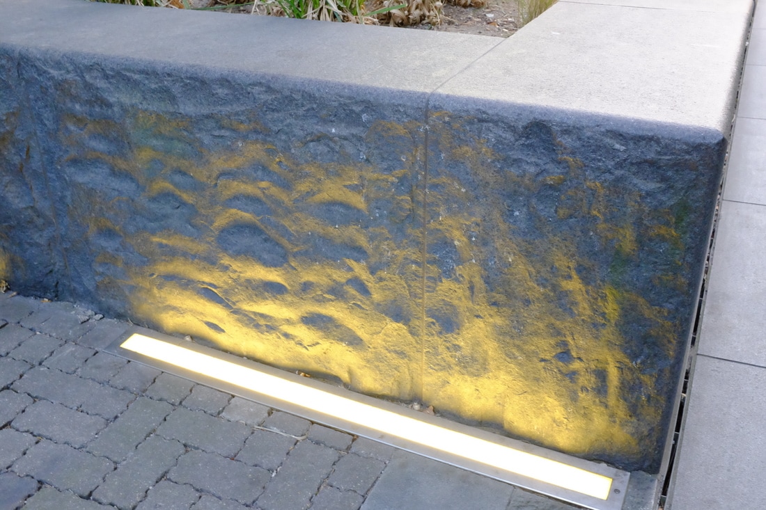
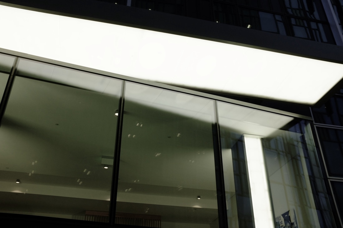
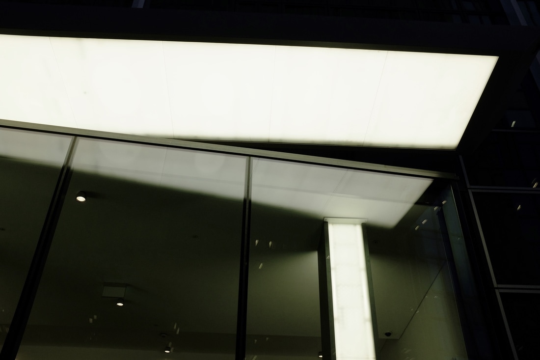
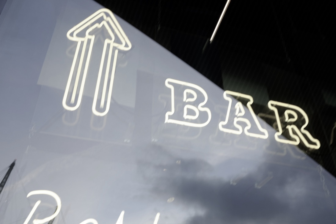
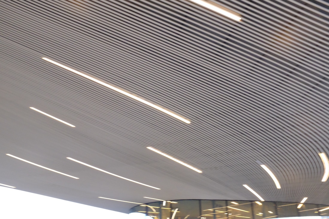
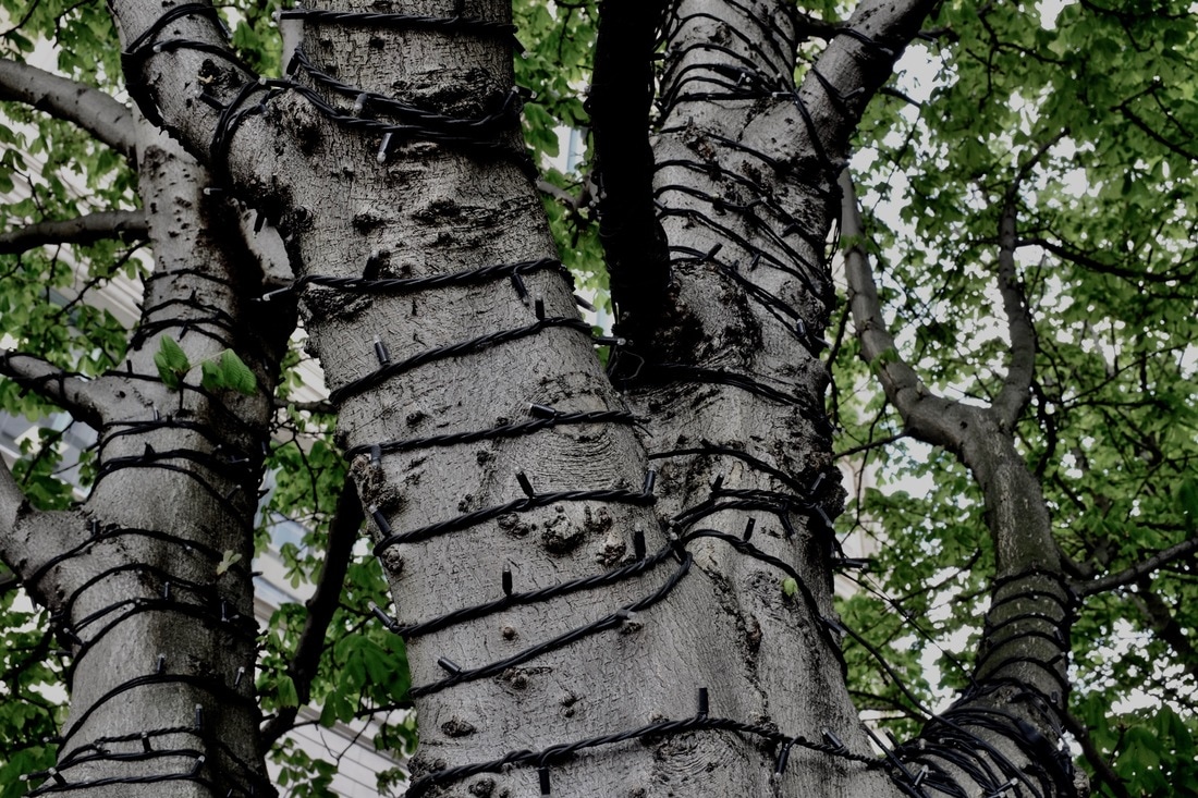
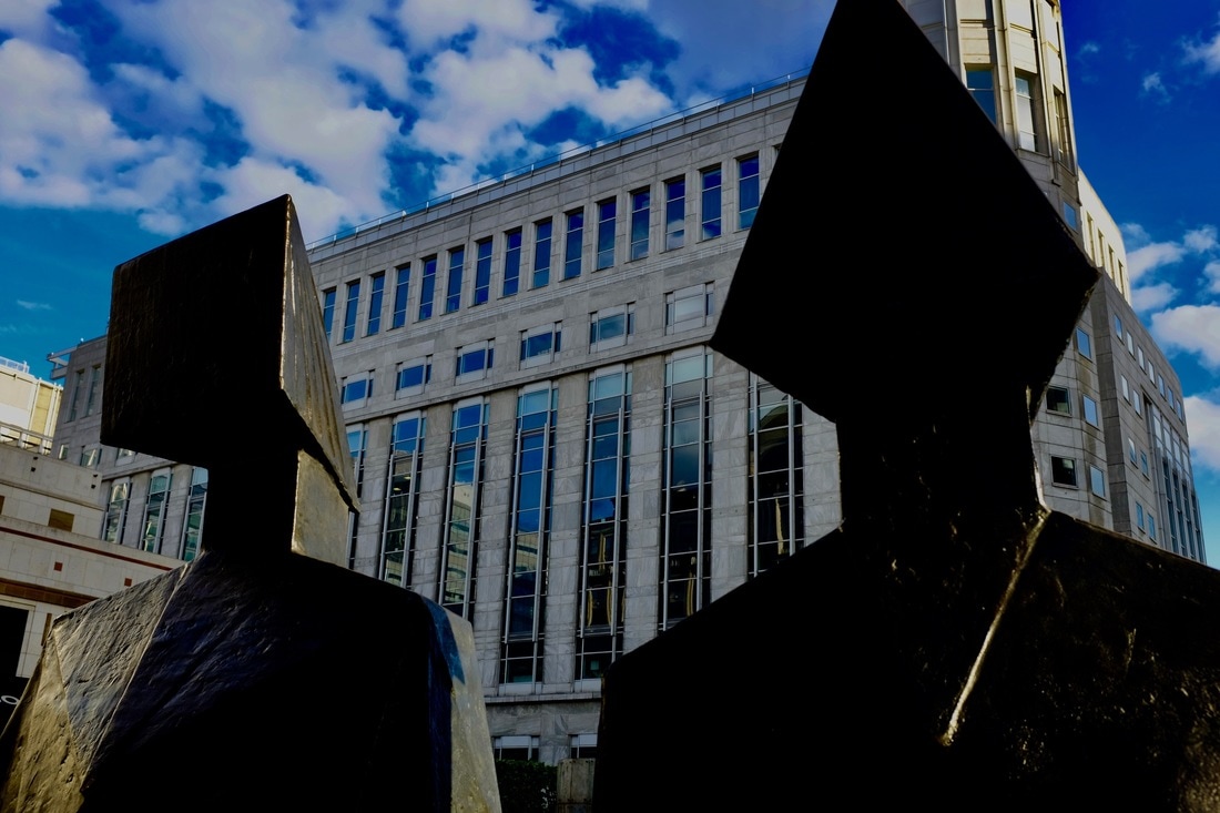
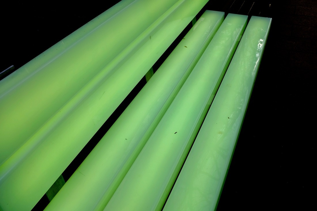
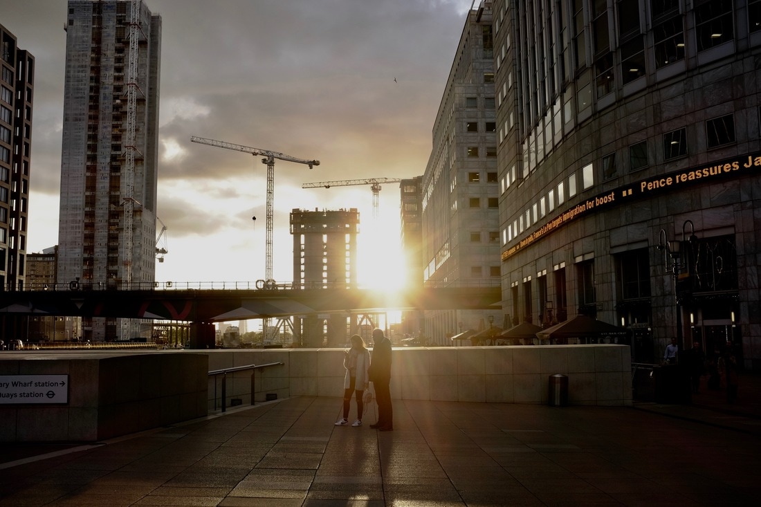
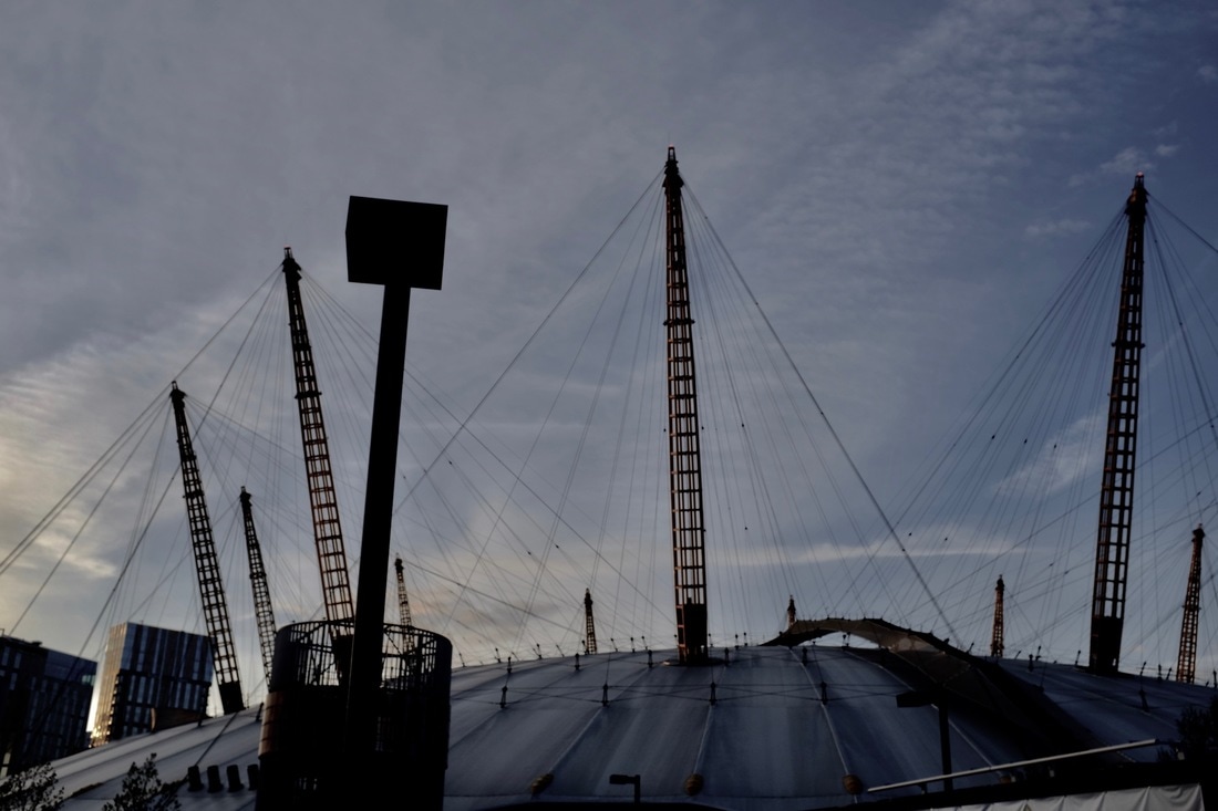
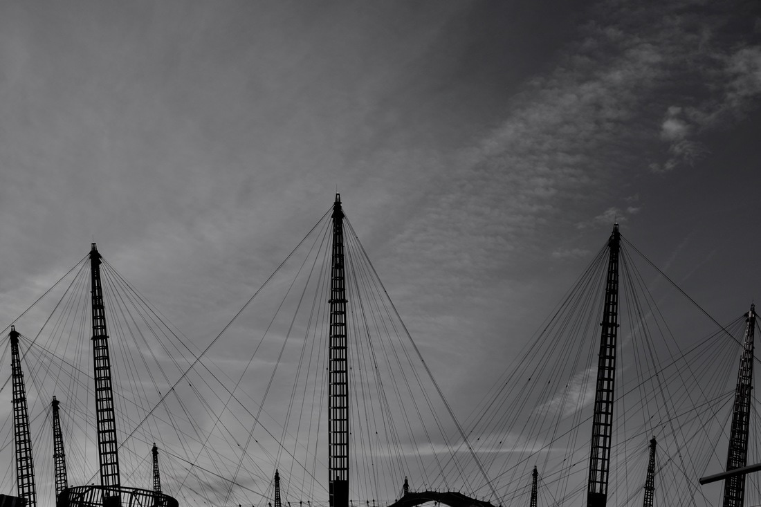
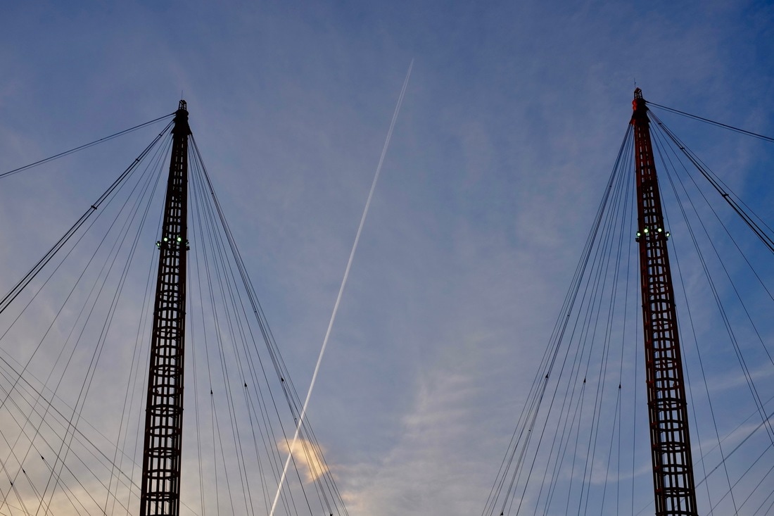
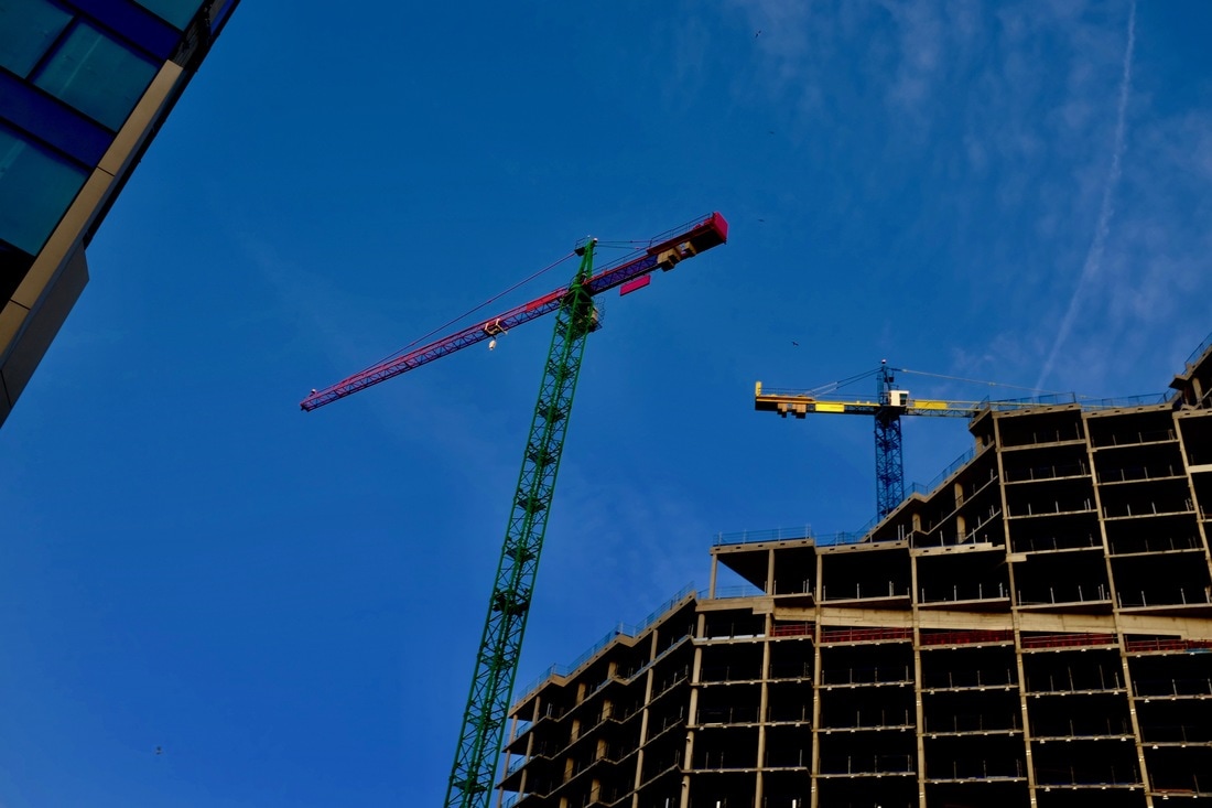
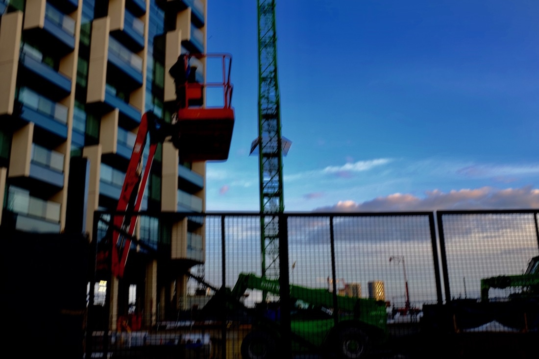
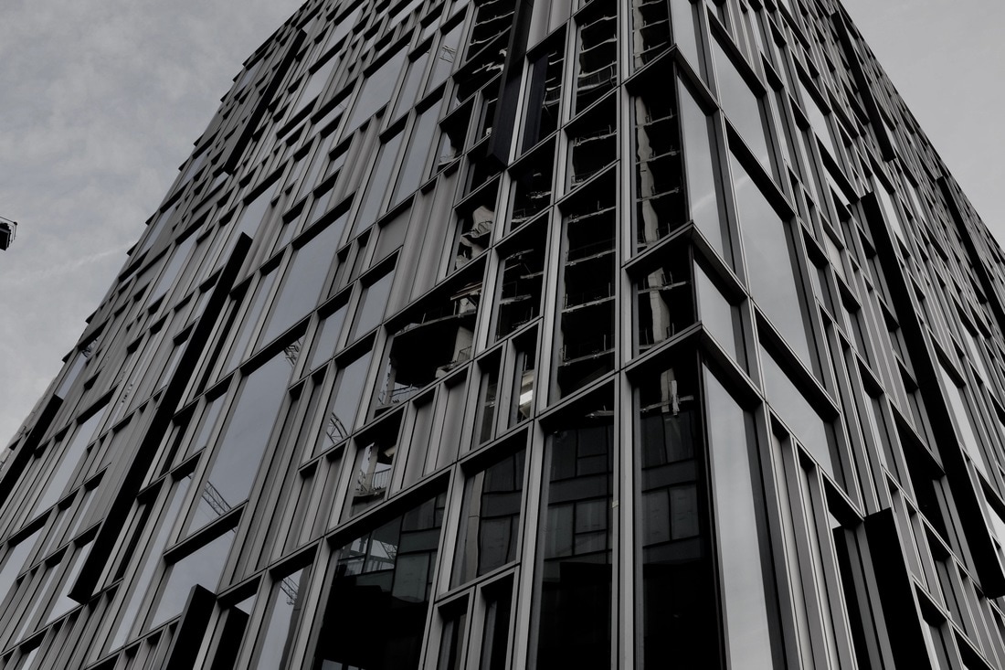
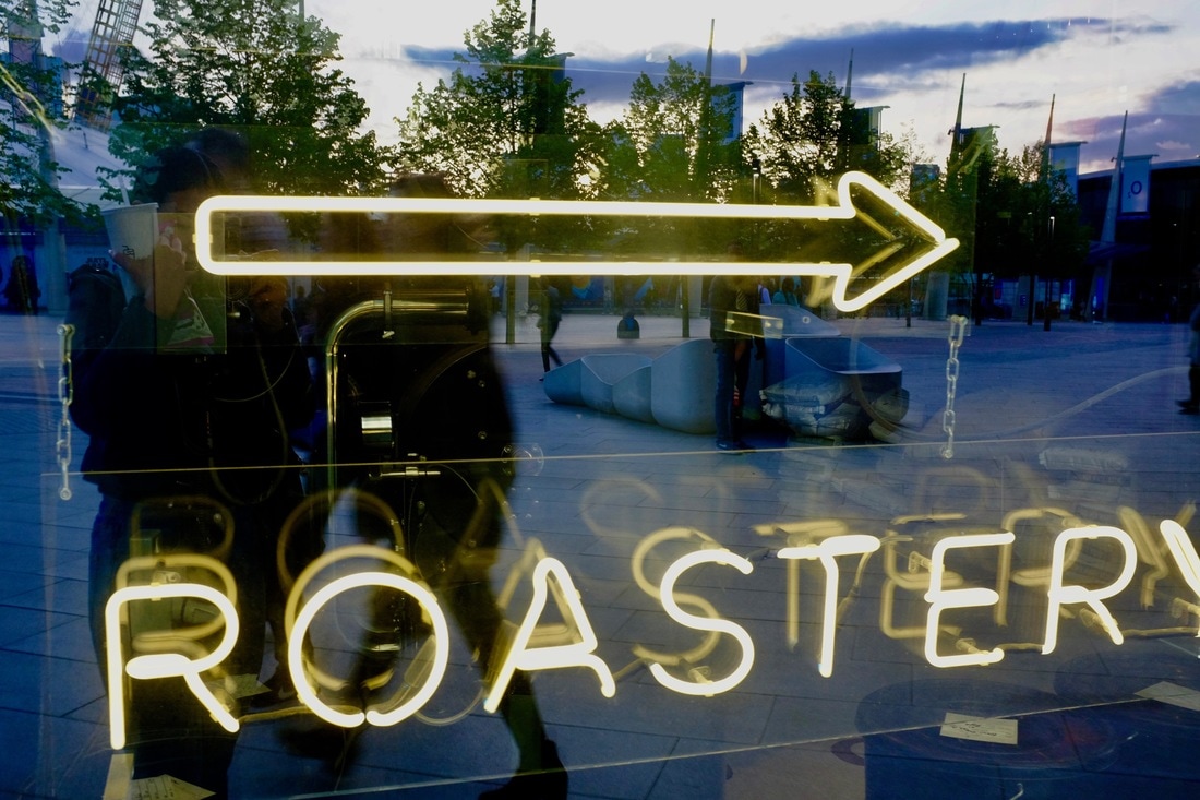
For this task I wanted to take images that were abstract, but also images of the lines and shapes you'll find in manmade objects, such as buildings, as they often have a lot of detail and quirky structures. Especially now, buildings are much more modernised, and come in all shapes and sizes. Although I focused a lot on manmade objects, I wanted to contrast the idea and take images of lines seen in natural objects, but I didn't focus as much time on finding them. I went to areas such as the O2 and Canary Wharf, as they were upcoming areas that had a lot of modernised and different buildings, being around the industrial areas of London had many things that were structured, which presented more variety to what I could take. I enjoyed having the freedom to choose my own theme and take my own images, also being able to go somewhere completely new to take images rather than being in the same area. Although I did find it difficult to begin with as I was stuck for a long time not knowing what I wanted to do, which limited the time I had to take images and I didn't want to waste time taking images that i didn't like. But I do like the outcome of my images, and I intend to make them into diptychs; pairing them and editing them. Some of my favourite images are the cranes, and machinery that were really bright colours which contrasted really well, as they were bright, block colours which made it really stand out, considering modernised buildings are so monichromatic.
Developing my images
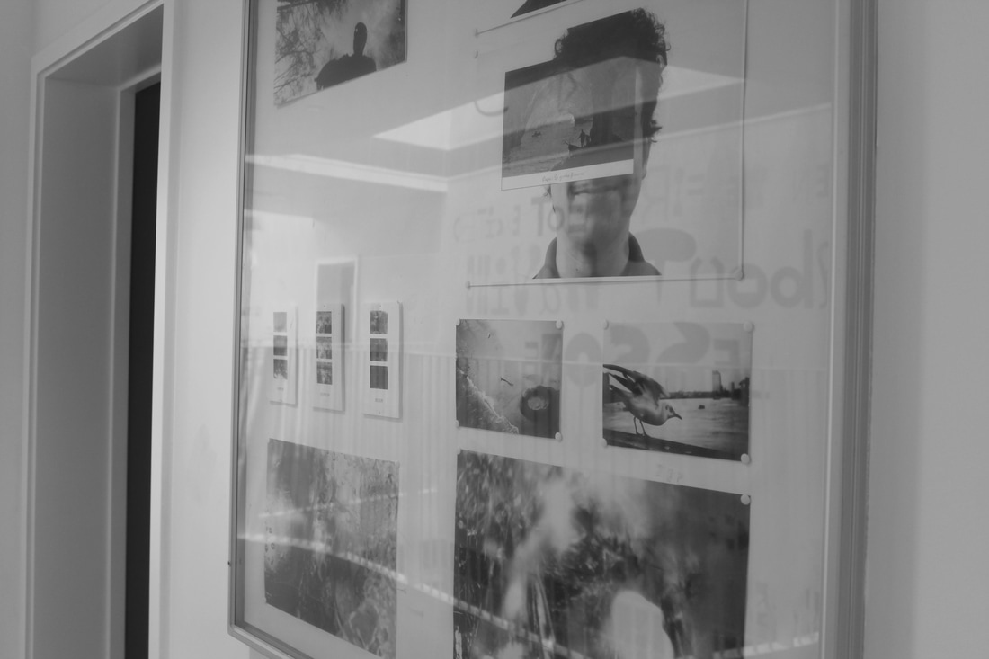
First mock photo book
My first photo book; I decided to do a smaller version of how it was going to be, although I printed off my images smaller than expected which meant the book had a lot of negative space, as the images were so small. I liked how my images had a mix of colour and black and white images, it wasn't just one theme running through the whole book, it made it more questionable and interesting. I also really liked how I edited my images, and how I positioned them in the book because they were not all in the same place making it look boring and repetitive. Although for some images I would like to change how I paired them, because I found some of my other images matched better.
