Keld Helmer-Petersen
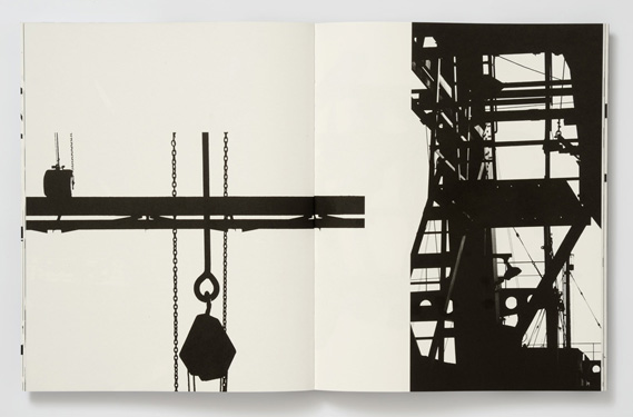
Keld Helmer-Petersen was a Danish photographer who was inspired by Albert Renger-Patzsch, the experiments at The Bauhaus in Germany, and by Harry Callahan and Aaron Siskind at the Art Institute of Chicago. He published several books of black and white images that explore contrasts of tone. He only presents images that are black and white, and all mid tones removed. He created and found these images, using both cameras and flat bed scanners to achieve the effects he was looking for. Helmer-Petersen the developer of Danish Modernist photography; is internationally acclaimed for his images of structures, patterns and details found in industrial areas, cityscapes and nature.
"He started photographing in the late 1930s and first made his name with 122 Colour Photographs in 1948. This book is especially well known due to its innovative use of colour in thoroughly composed photographs of patterns in landscapes and buildings. During the 1950s and 1960s he established himself as a photographer of architecture and design. Simultaneously, his artistic work shifted towards the more abstract, as he found inspiration in German and American photography as well as international abstract art."
"He started photographing in the late 1930s and first made his name with 122 Colour Photographs in 1948. This book is especially well known due to its innovative use of colour in thoroughly composed photographs of patterns in landscapes and buildings. During the 1950s and 1960s he established himself as a photographer of architecture and design. Simultaneously, his artistic work shifted towards the more abstract, as he found inspiration in German and American photography as well as international abstract art."
Editing my images
My Initial Response
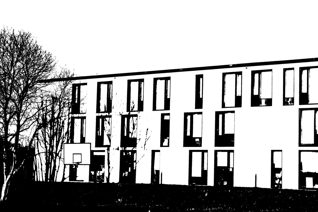
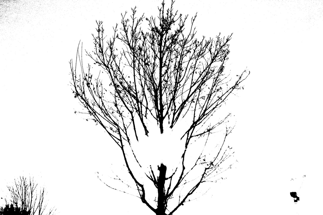
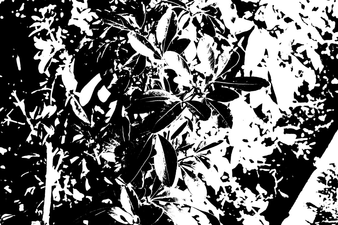
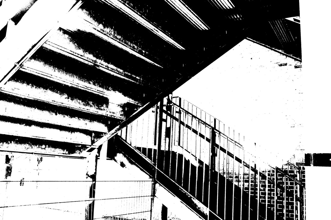
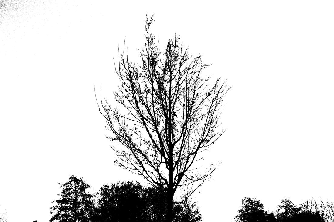
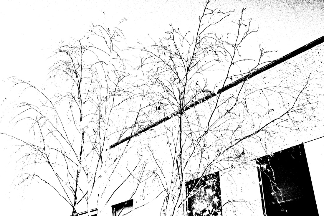
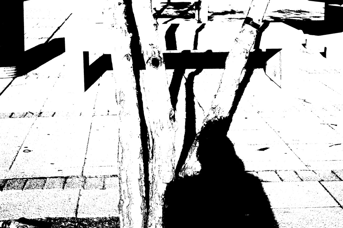
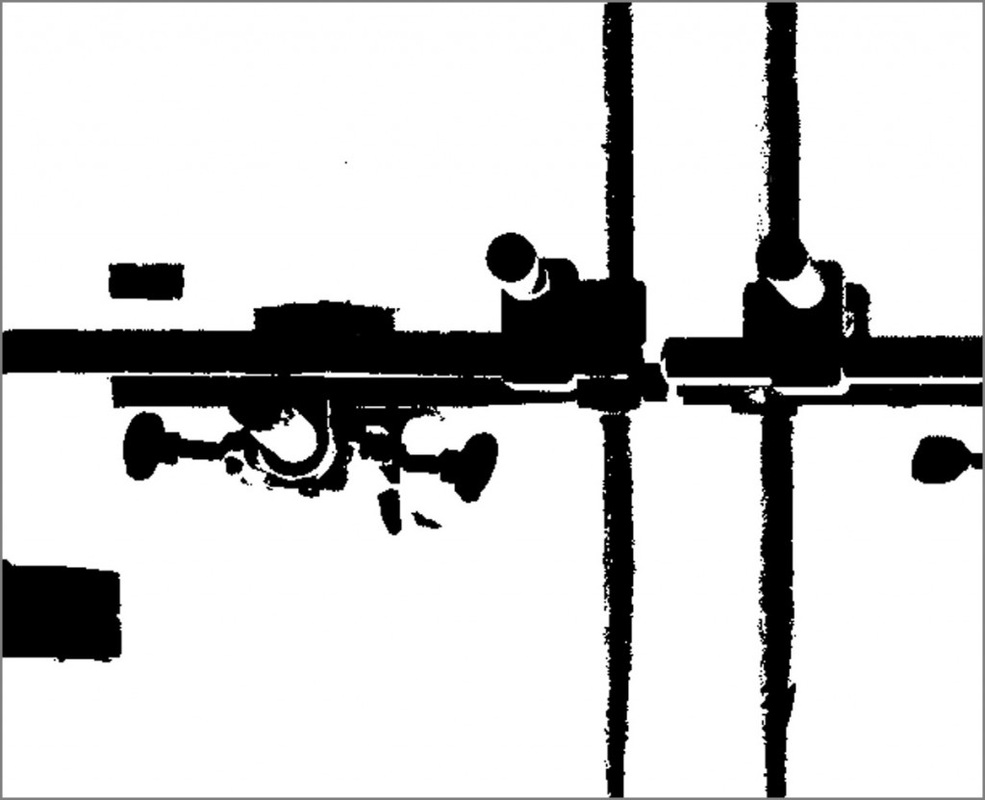
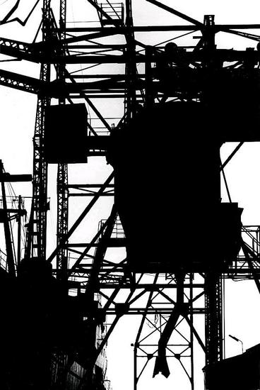
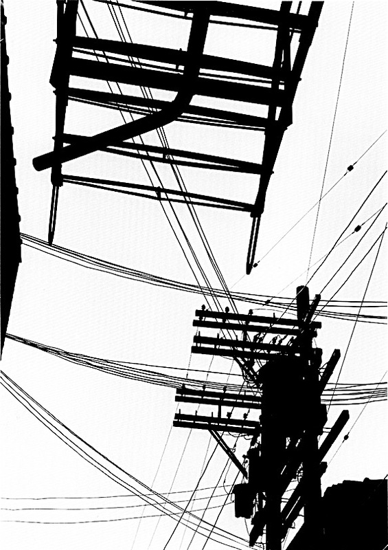
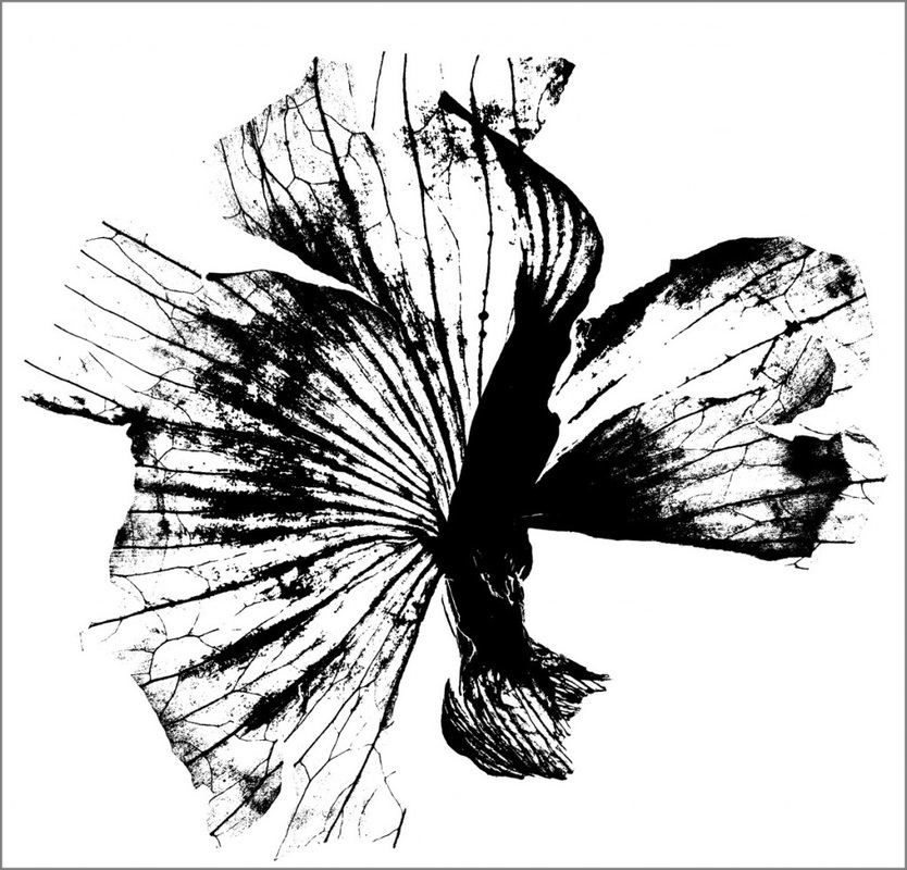
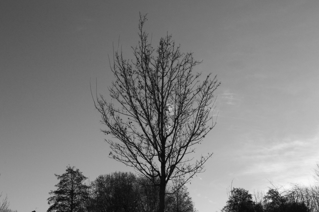
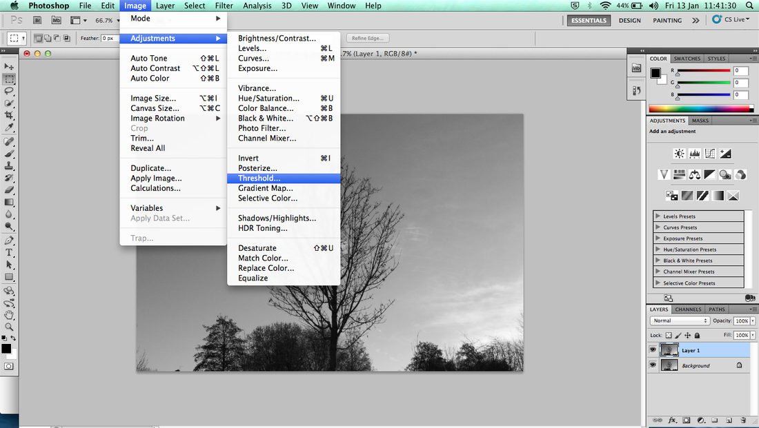
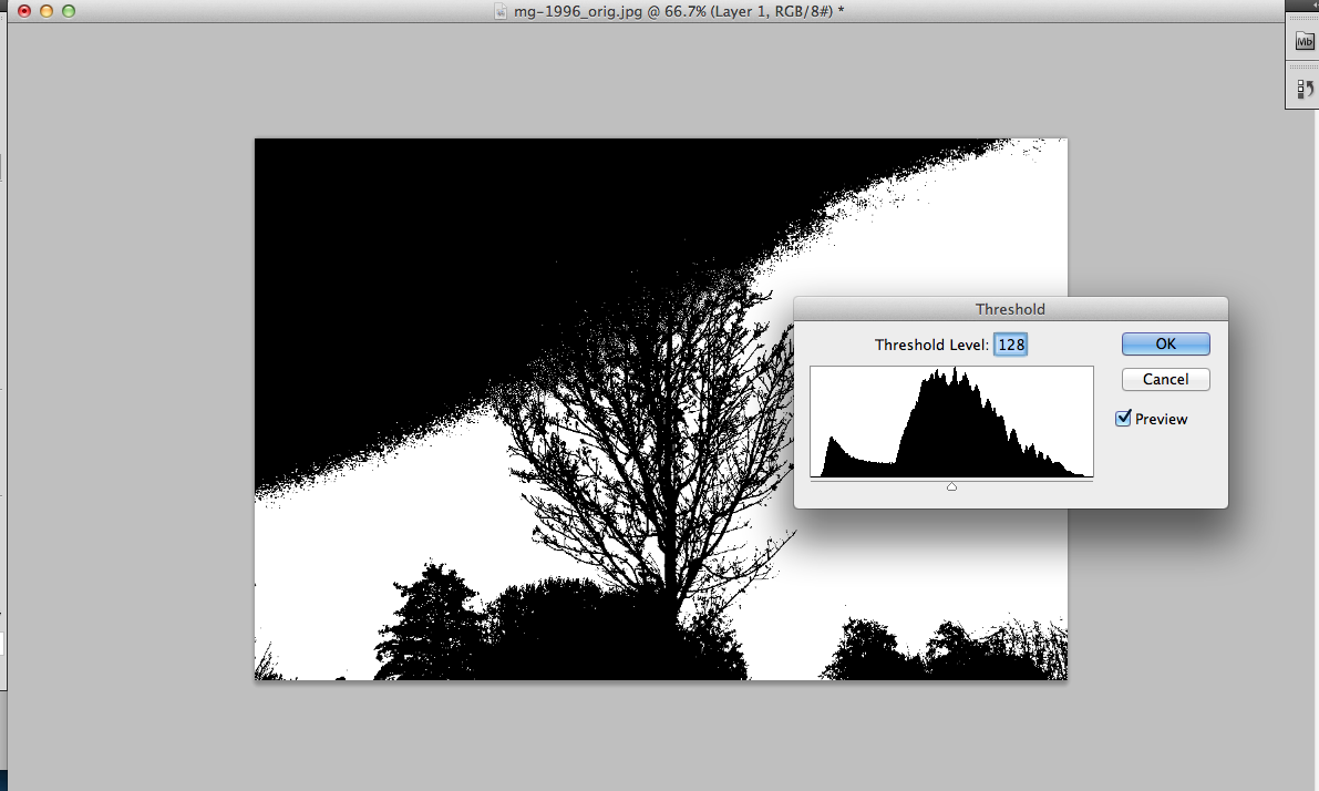
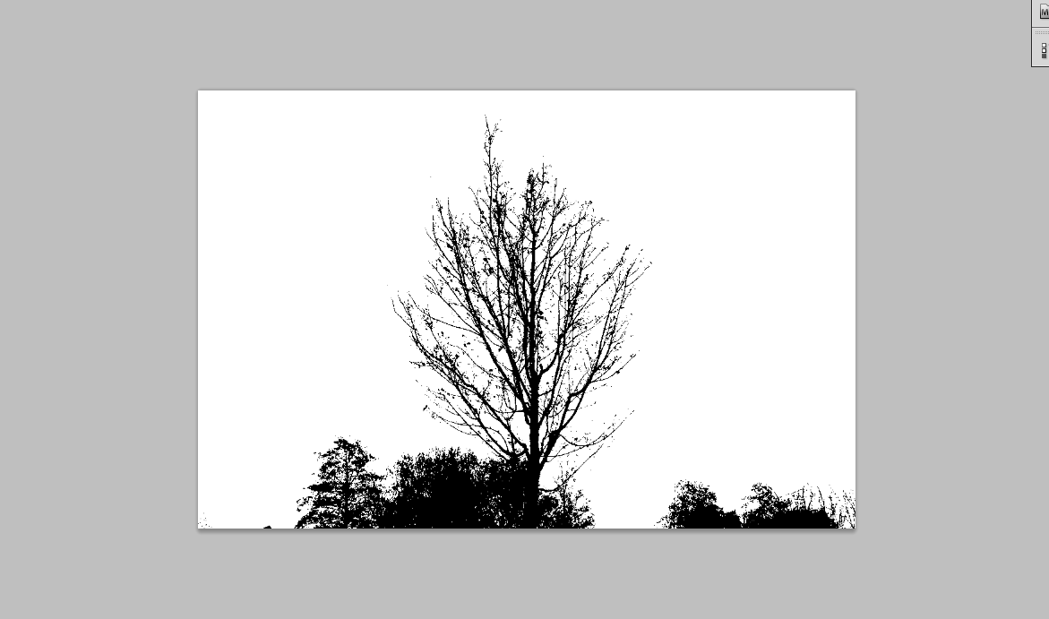
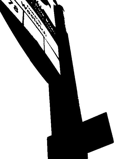
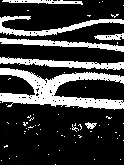
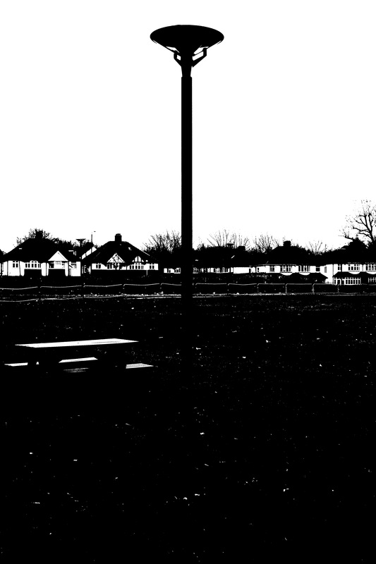
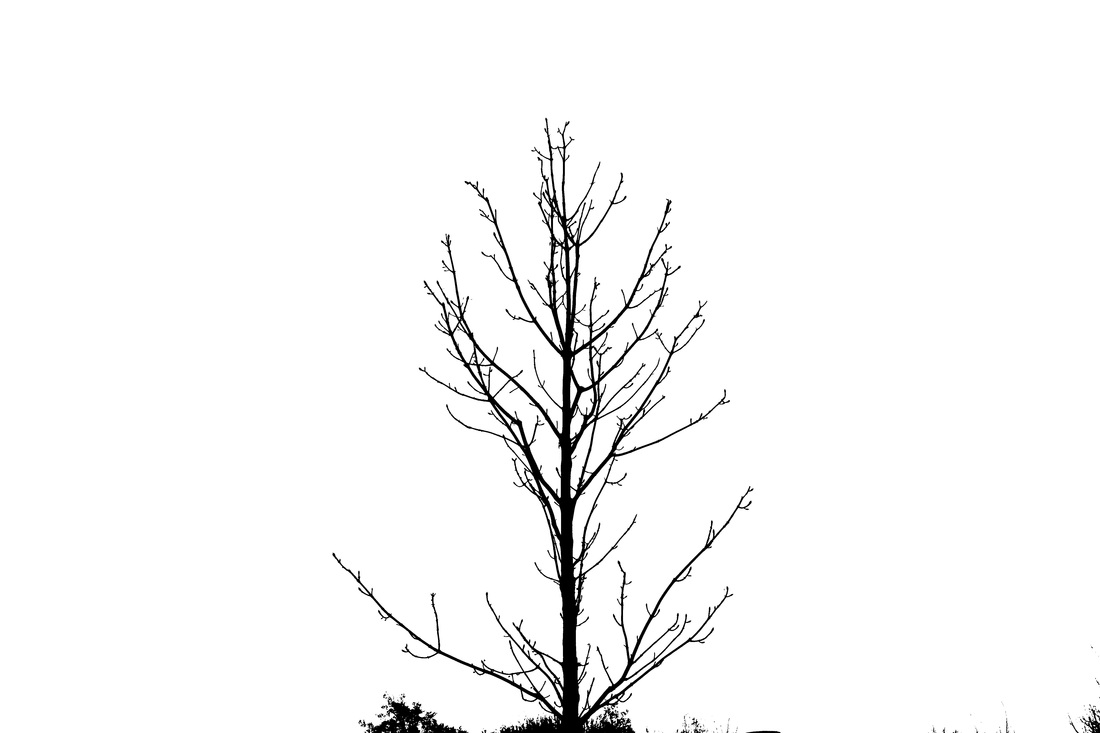
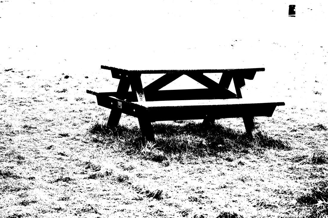
For these images we had to use our own images, that we had already taken previously, rather than going out to take a new set of images. We then had to use photoshop to make the images into black and white and at the same time with blank negative spaces. Using the tool that would make images a silhouette to achieve this, so the images would only make the most solid objects the most prominent. For the task we had to make a booklet, where we had to find a relationship between the images as we had to pair them, so we had to rearrange the images a few times until they 'matched'. Although for some of my images, I would of liked to capture it in better angles or lighting, as the tool we used on photoshop made parts of the image 'speckled' or grainy. We then created a photo book, which we stuck in the paired images. I thought these images worked well together, for example, the image of the tree branches and the image of the tree had a relationship because they were very similar shapes. I also really liked the image of the buildings and the stairs, although for the image of the stairs I rotated it to landscape as I thought it would mimic the same shape and size of the other image, and would make it seem like it was one whole image continuing.
2nd Response
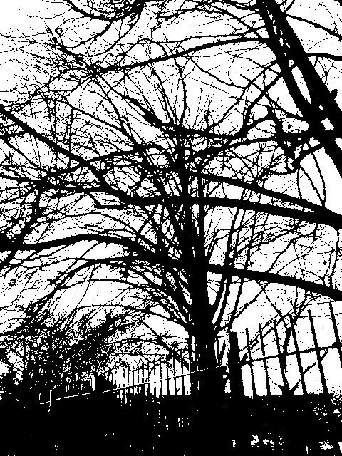
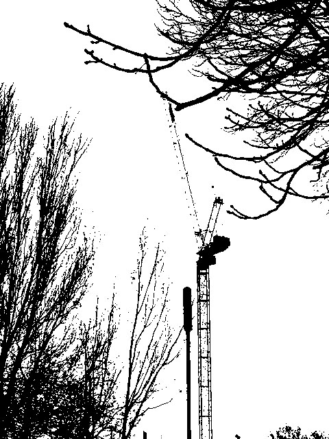
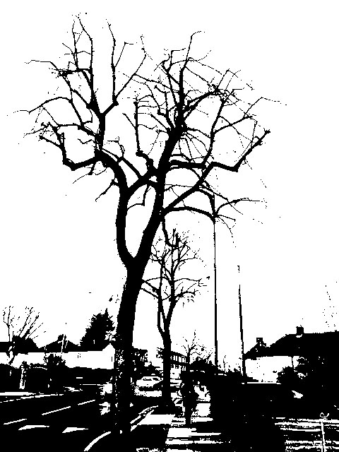
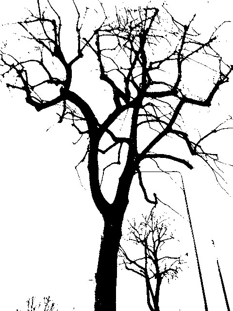
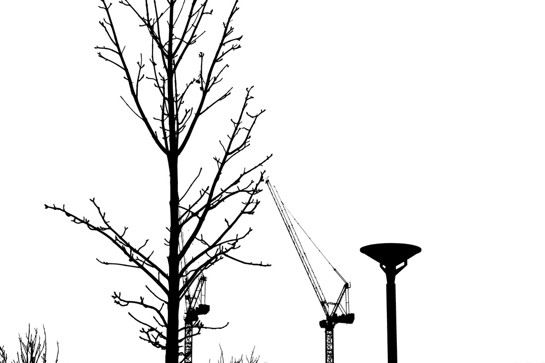
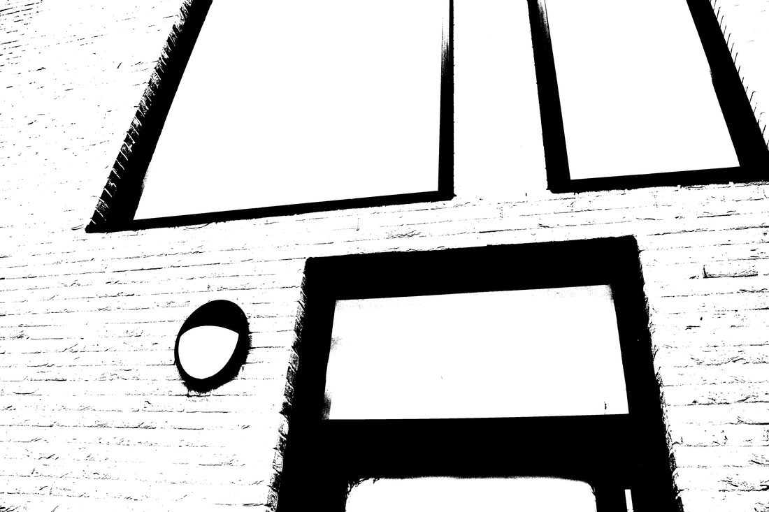
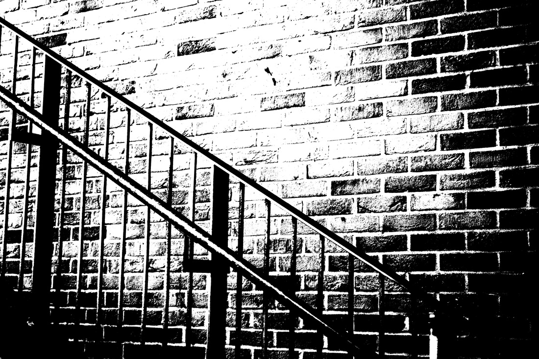
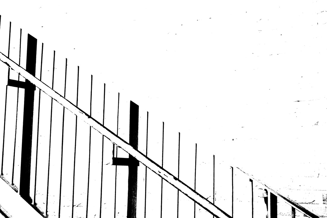
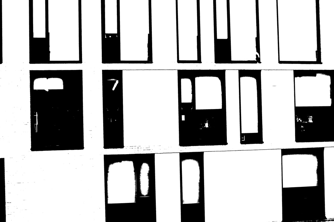
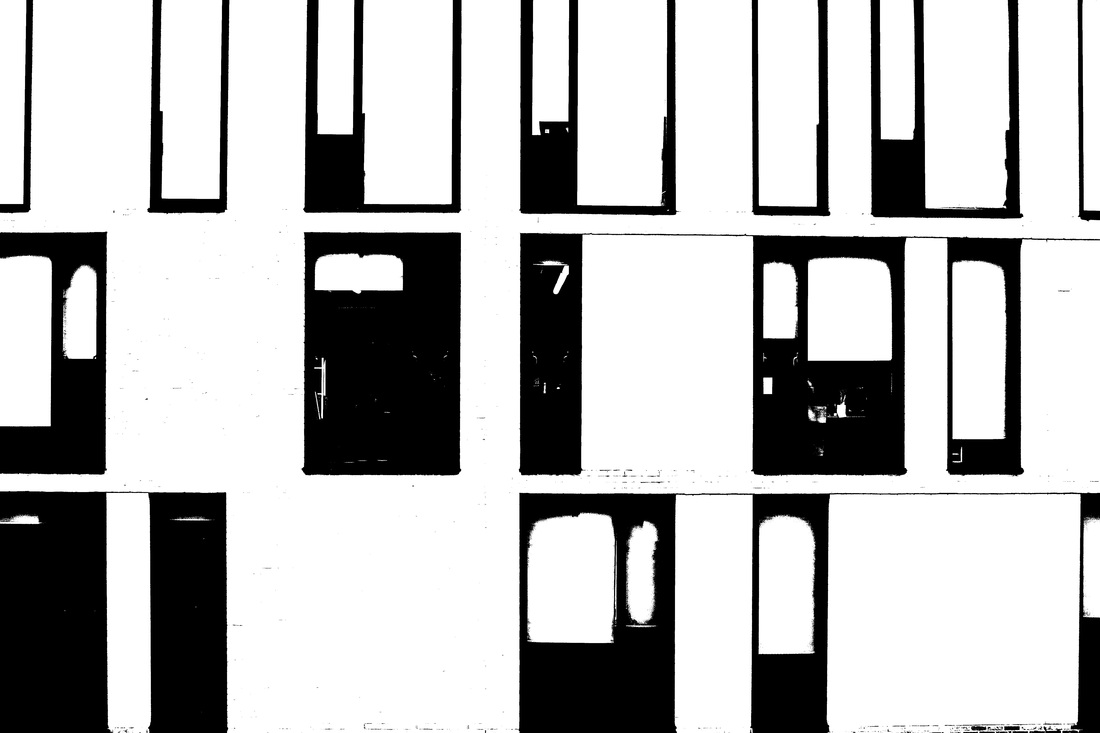
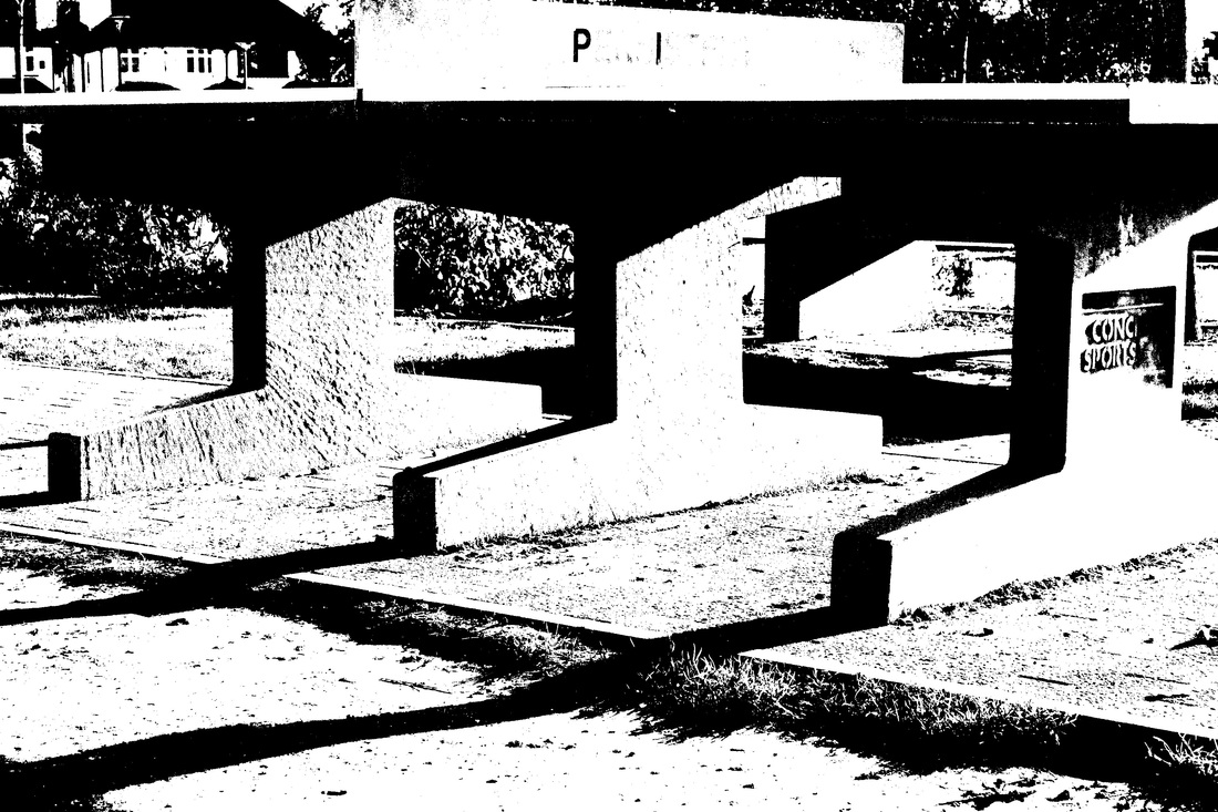
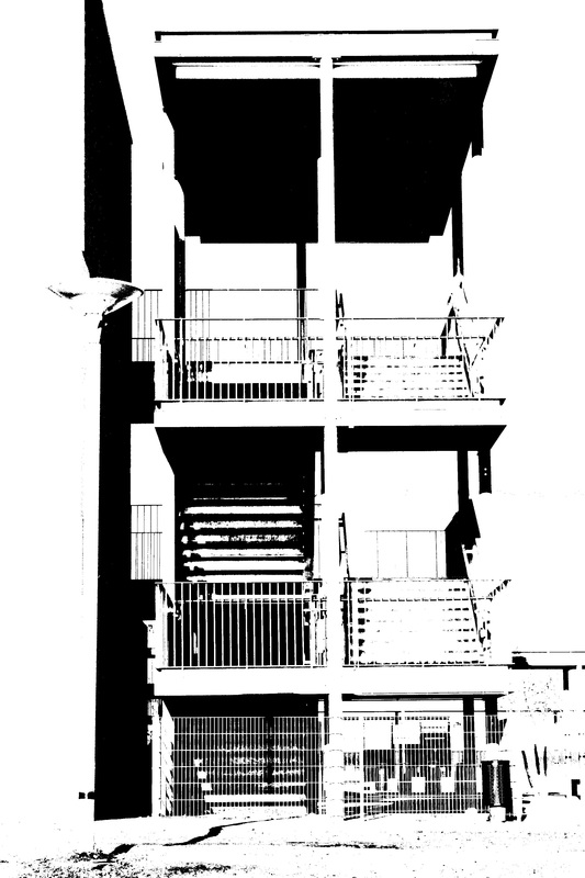
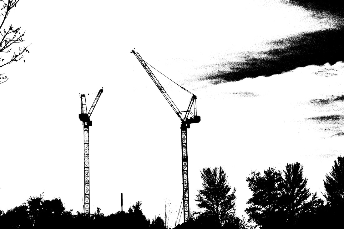
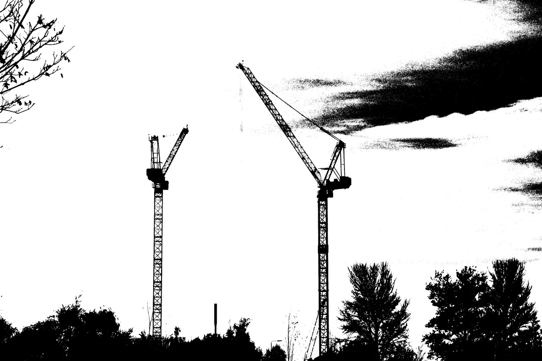
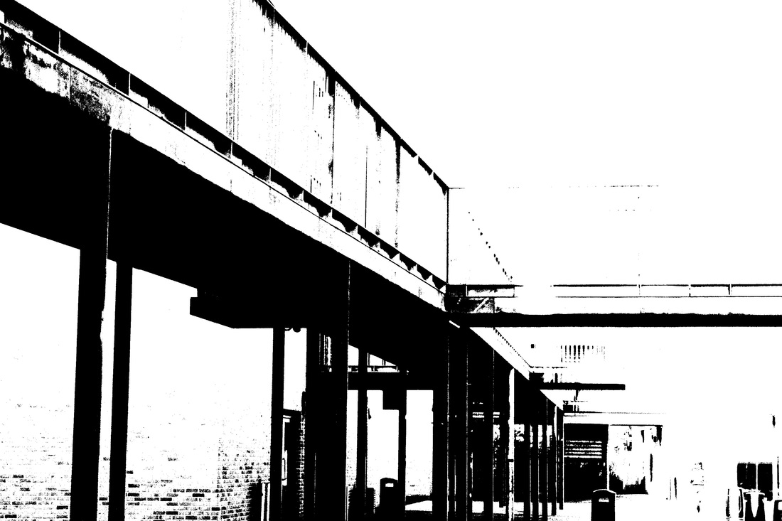
We had to make a second booklet, which involved taking new images, rather than using ones we already had. Again I made the same mistake of taking images of things that had alot of detail which would be highlighted on photoshop. My main focus was on trees and building structures, e.g. the school building and the windows or the stairs. I liked the detail of the branches on the trees, as it gave the image a little more depth. I also really liked the image of the tree, lamp, and crane, as I thought they contrasted each other very well, as they were tall, and vertical shapes; all being very similar but different at the same time. To make further improvements next time, I should focus on finding objects or things that are more solid, rather than detailed, as the images with the most detail had appeared grainy, but the benefits of this were that my images had more tonal range within them, although they didn't portray Helmer-Peterson inspired images.
